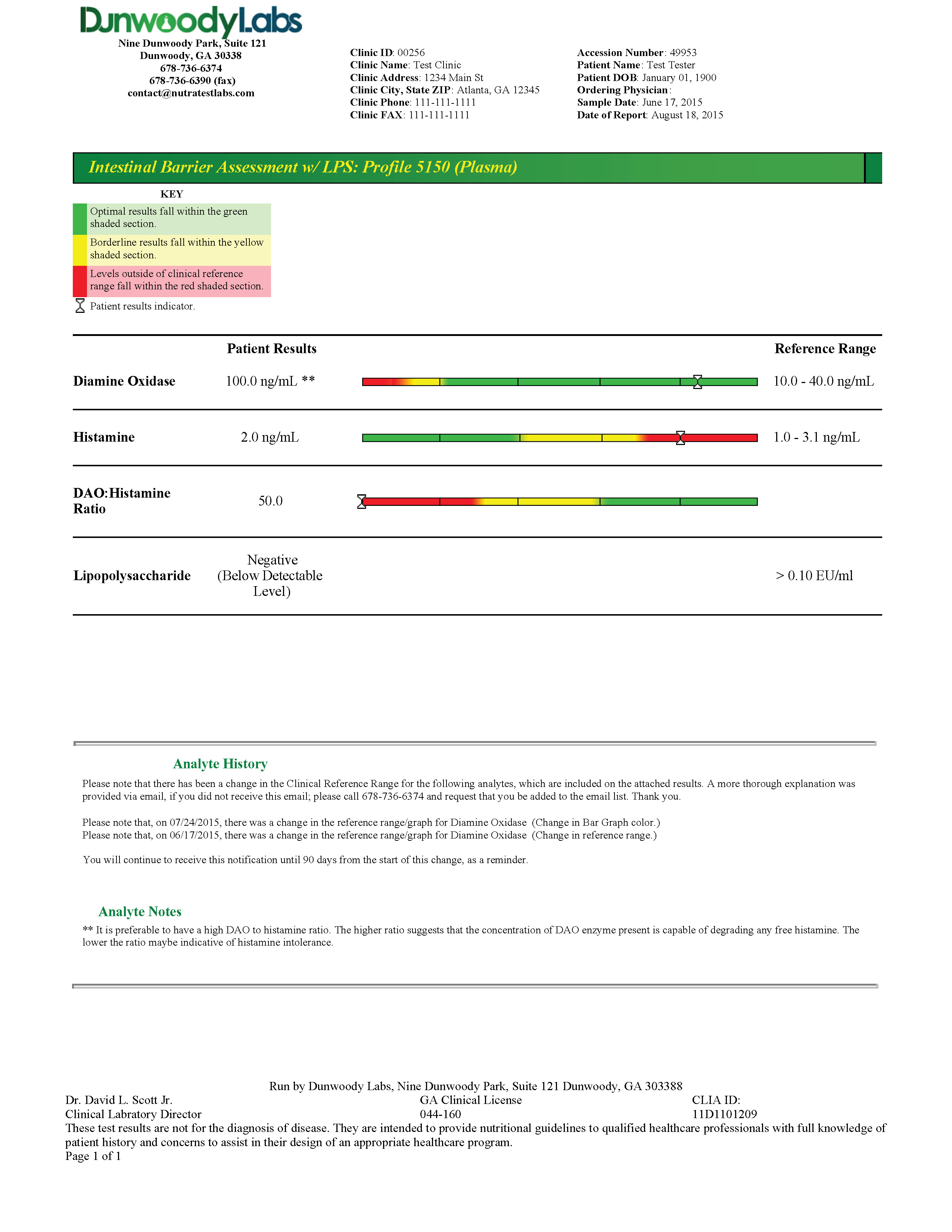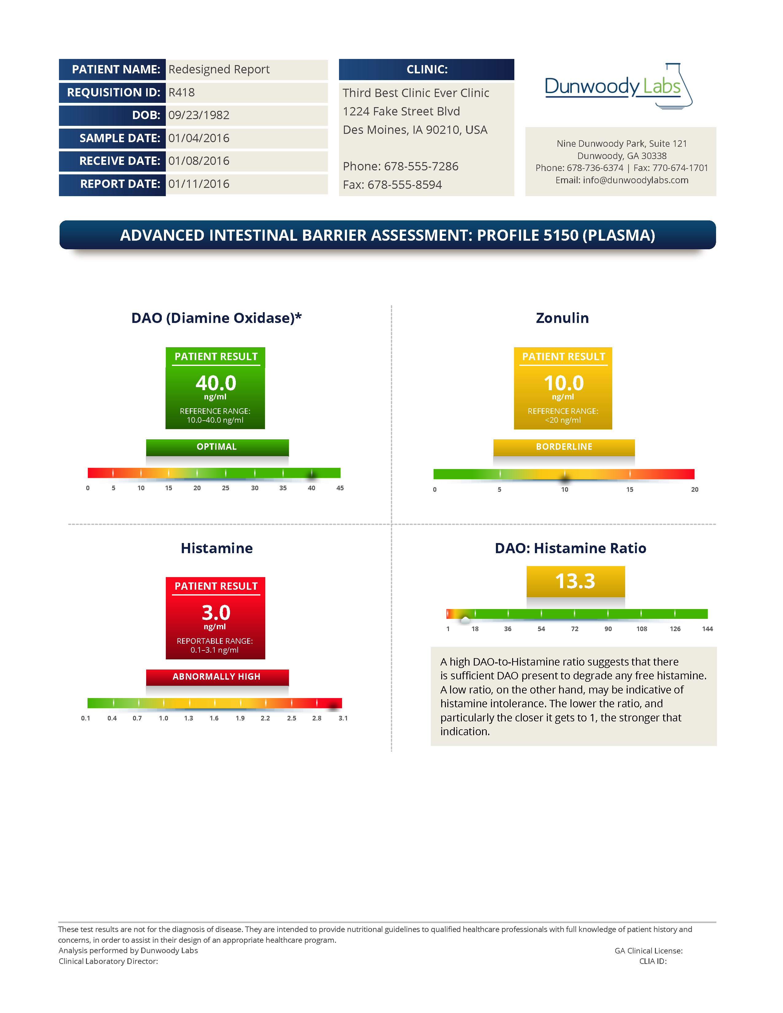


The old one was actually 4 pages, I just showed the first (they all look like that page, anyway). My new, copyrighted report that I designed in secret with a freelancer I hired out of my own pocket, is two pages.
I used the 2nd page for the slider since it shows the foods. The first page is another one of my brilliant ideas and creations, a polar graph. I created and then adjusted the formula, myself.
There's a very important reason
why it can't just be a straight average, but it never occurred to anyone. Well, the entire report never occurred to anyone...
Or just see a pdf of my beautiful report (opens in a new tab).

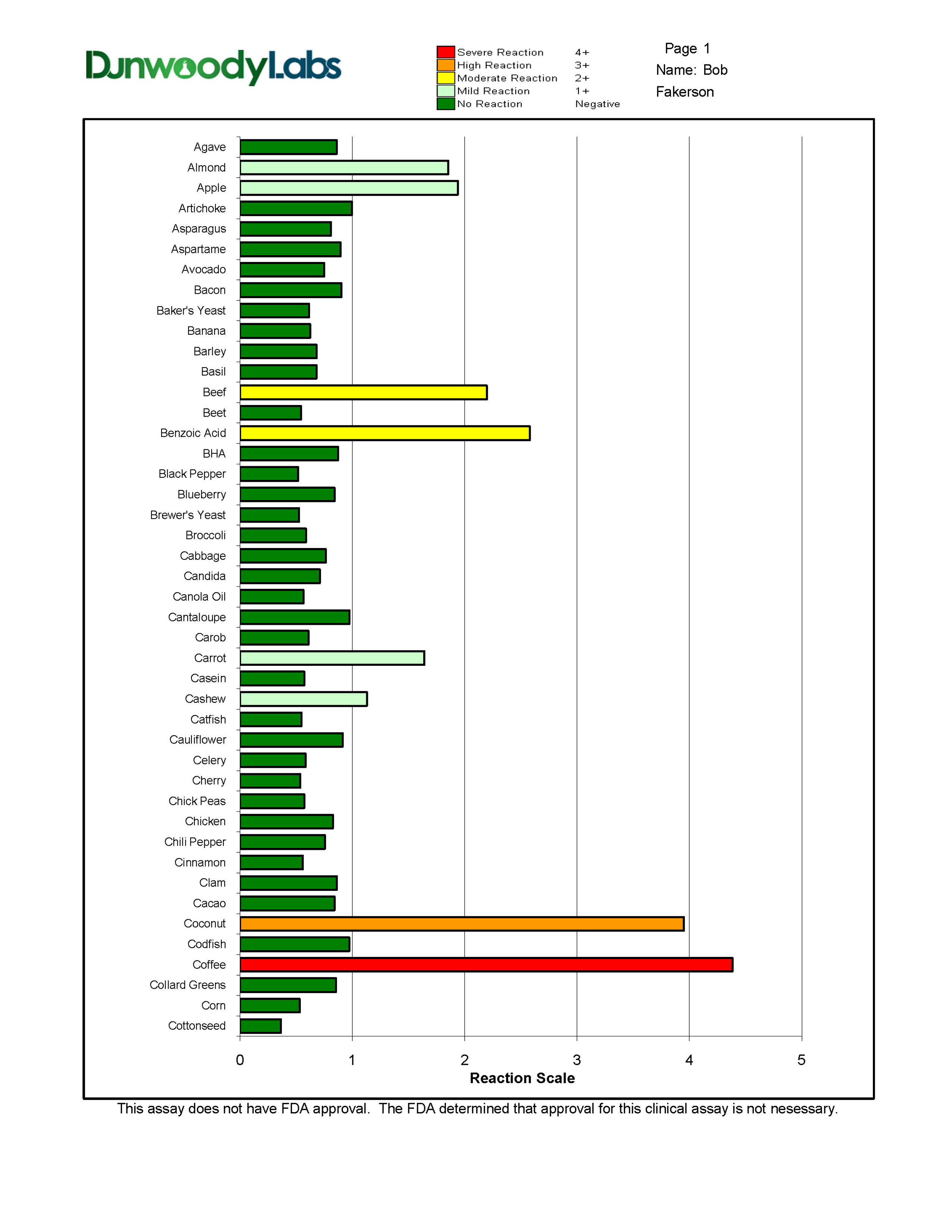
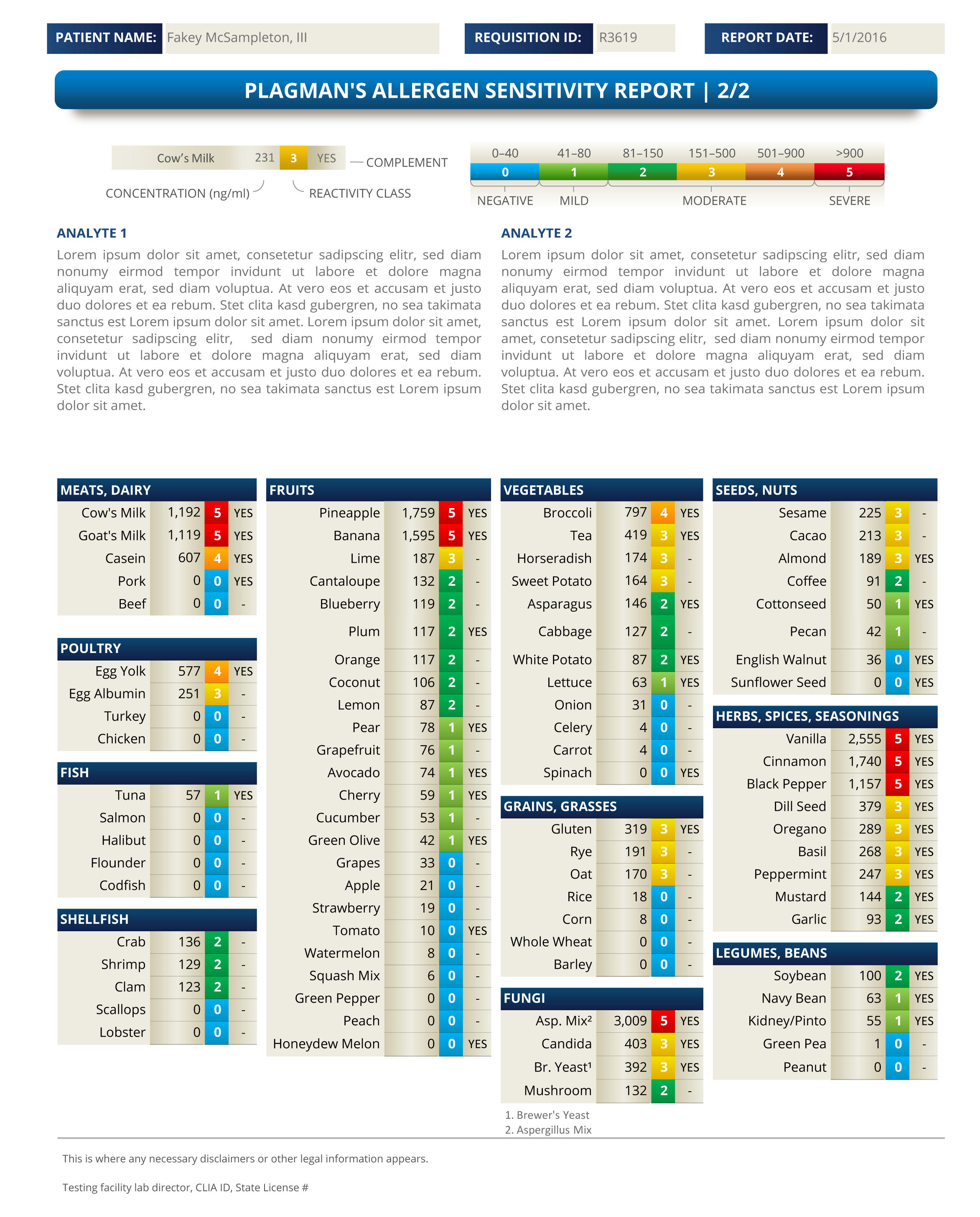

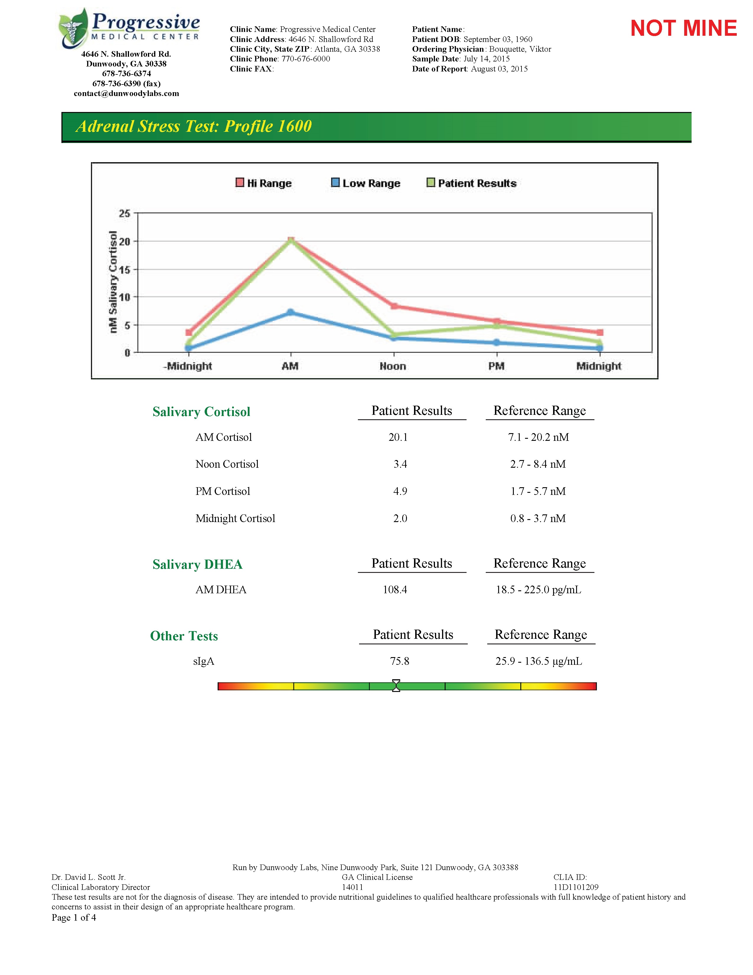
There are a number of problems that should have prevented them from ever using that ugly, older test. For one, it plots five data points when only FOUR samples are being taken. The first one is meant to be like a starting point or something? It's really dumb, is what it is. And yes, I can say that because
this is a diagnostic tool we're talking about, here, that affects the health of human beings, and they weren't smart enough to use common sense. People could get hurt.
The next biggest problem is that they immediately assign the four tubes that come in as am, lunch, pm
and before bed. But the patient could've taken all 4 samples in a span of 10 minutes in the morning and the doctor would have no idea. This report, even if you know the first graph point is fictitious, assumes the patient did everything correctly and has a "normal" sleep schedule. What if they work nights? The first sample is supposed to be within 30 minutes of waking up; what if you wake up at 6pm? In reality, no physician should
have ever given this a second look, it's dangerous.
My report tracked and reported the time on every single tube. If the samples were taken too close together, there's a warning message that shows up to make sure the doctor knows the results are likely skewed.
This report was also being generated by the database automatically; it was wonderfully efficient, and is no doubt being abused without me there to do the reporting. You can verify and report 100 posts in a few mouse clicks if you don't care to actually look at the data and review each one, first.
See the Adrenal Stress Test Report

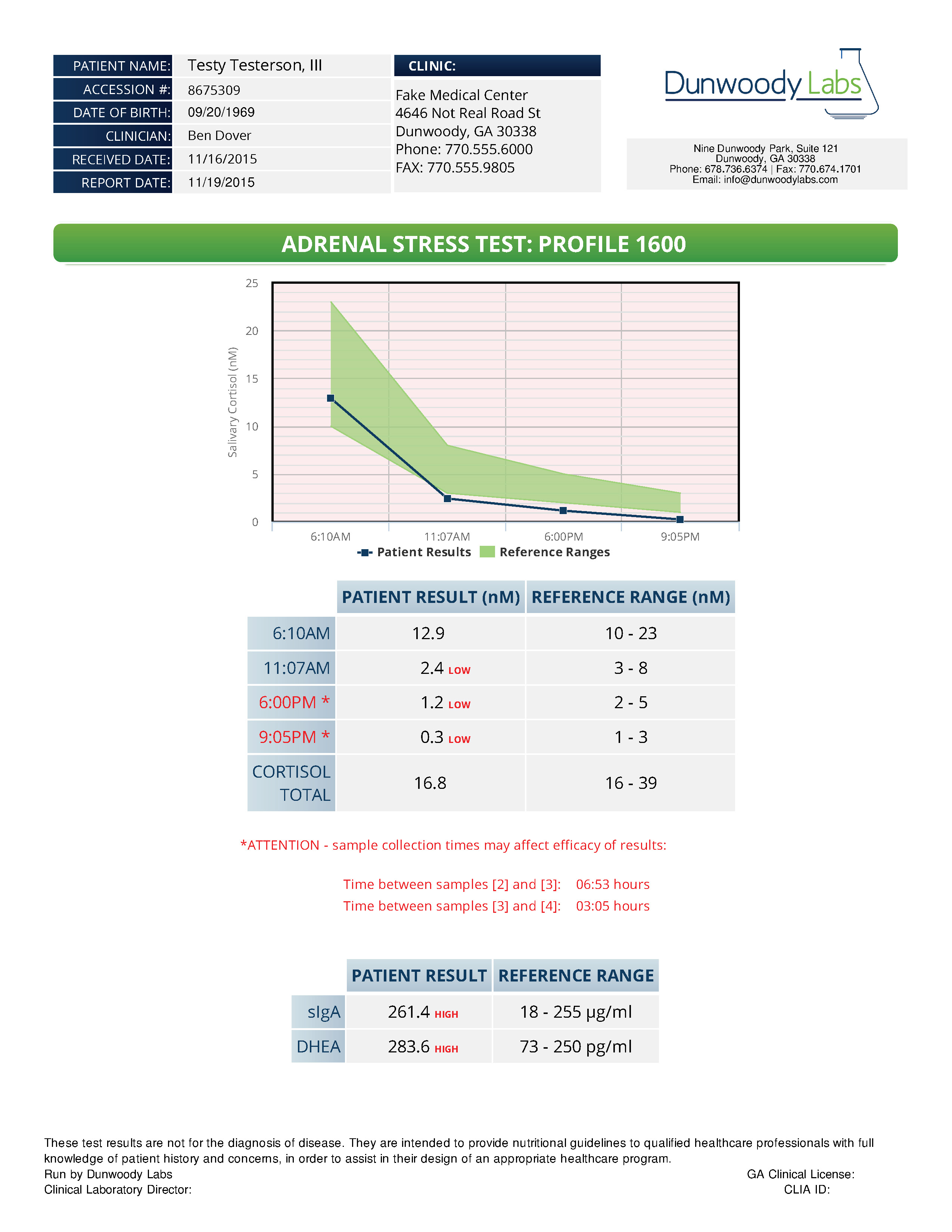
There are so many other ways in which I improved this test for the lab, patients, and their physicians, just ask!

This one I just had to fix because it was so dang ugly, and difficult to produce. They were manually entering results by hand - there's absolutely zero chance that every number was entering correctly every time. ZERO chance.
If they had any sense, they would've at least made the person enter the results, then hide them, then enter them again, and make sure every number matched the previous entry.
Another fun fact: when the histamine result was zero, they had problems because the ratio divides DAO by Histamine, and you can't divide by zero. Very easy problem to fix, even programatically, they just don't have anyone who pays any attention to detail, and their programmer was unreliable on his best day.

