Home Developers Introduce New Mascots
by Estim20, HSM Editor
Advertising in its entirety is a fascinating look into the psyche of business capital and consumer habits. We have given marketers a place to roam free, take drugs that we didn’t know existed, and sell us just about anything in the absurdist camp of advertising. As such, in a world where we can sell anything from ‘sports-scented’ deodorant to Willy Wonka’s cragged rocks of fruit-flavored addiction, we as consumers are accustomed to the numerous tactics companies employ to trick us into buying something. It doesn’t even matter if what they’re peddling is considered part of a faction of items deemed necessary to live – we could be in Water World and real estate agents will still try to market land to us with, Cthulhu help us, David Lynch-inspired motifs and imagery.
It’s why you see such commercials as Kraft’s ‘locker room meltdown.’ You have only the last few seconds of the commercial’s minute length and the tenuous connection between ‘psychotic break’ and ‘cheese melts’ to make the association – and even then, you have to wonder what illicit substances drowned the blood cells of Kraft’s advertising staff. Such commercials need the appropriate amount of time to build and enter the collective unconscious of the consumer base before they don’t question it.
Not pictured: product relevancy.
That’s the lesson corporate mascots learned – on top of adapting the great strategy that is letting animated creatures great and small go wild while shilling out for your product. Ever wondered why anything from breakfast cereals to the Olympics receives a colorful, cheerful, half-times neurotic being of questionable biological accuracy leading the charge? Of course not – as an adult we know what it’s attempting and as kids we don’t care. The last thing we want is to overanalyze the fundamental economic principles of a cuckoo bird addicted to chocolate-flavored Styrofoam peanuts.
Essentially mascots, in the context of merchandise, are fictional spokespersons for products, with cousins in sport teams. As spokespersons, they fill the role of product advocates – since sometimes you don’t trust a real person to associate themselves with what you’re selling. Ideally we form an acceptable level of appreciation for said mascots, such as with Mickey Mouse, which shows what purpose the mascot is supposed to serve. They are meant to be lovable trademarks for which companies can unload onto our television broadcast (or online these days) during appropriate hours. If your audience is uncomfortable – if not outright terrified – of your choice in corporate image, you will face collateral damage soon.
Which is interesting as we have seen some ‘intriguing’ choices over the years. Older members of the audience may remember Ronald McDonald’s original design – he looked, charitably speaking, like a hobo clown dressed in trash outside a McDonald’s franchise. This isn’t even going into the accepted levels of wanton crazy that characters commit. Coco Puffs? Trix? Even Lucky Charms? Without me going any further, you already know what their commercials entail.
Regardless, it’s no surprise that several mascots passed the test of time. Mickey Mouse has existed for nearly 90 years; breakfast mascots have been a staple for decades; and Ronald McDonald celebrated his 50th anniversary of scaring children in 2013 (in honor of his initial appearance when a man known for Bozo the Clown donned the McDonald’s containers). When they work, they work – and once that level of recognition is established, half the work is done for you.
However, sometimes you must make a decision. As time progresses, an older mascot may feel like an artifact of an earlier era. If audiences can’t form the same bond with the mascot as earlier audience once did, it becomes an event flag for the corporation. Do you continue the mascot even as his popularity diminishes? Do you instead opt for no mascot entirely, using your corporate logo in its place? Or do you give another mascot a chance?
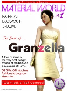
This is the scenario Home developers faced – at least for those that with mascots, such as LKWD. Others face the opportunity to develop their own mascot as a means of brand recognition and serving another outlet for avatar attire. After all, if VICKIE can make the jump from the ‘face’ of Sodium to wearable costume, would it be prudent to attempt it?
As such, three developers – LOOT, Lockwood, and nDreams – have announced new mascots to load out on April 2nd.
Corporate-Tan Mascots
As a preface to this article, one must understand the concept of ‘moe anthropomorphism.’ Those that know the term (or at least what the term looks like) are going to be familiar with the OS-Tans – and they serve as a good foundation.
Artists have a history of interpreting anything from non-human creatures to inanimate objects in anthropomorphic form. The United States, for example, has a proud, well-documented history via Disney, Looney Tunes and more; Disney’s very mascot is a talking mouse and Looney Tunes (and Disney for that matter) are built on the interaction of anthropomorphic critters wreaking havoc in their wake. Many early animated shorts utilized talking animals for comedic effect, setting the tone for the following years as well as a standard for what qualifies as a ‘popular character.’ It’s perhaps here why numerous cereal mascots utilized anthropomorphism as opposed to going straight-up human being.
It isn’t a concept limited to one nation though, which should come as no surprise. Anyone who watched “Powers Hetalia” should know it’s something Japan is fond of as well, if with decidedly unique results. It’s where we understand that anything can – and often will – receive such a representation, often in artistic or animated form. As a bit of quick foreshadowing: if you find an abundance of female character designs disappointing, you will feel a sense of ennui easily here.
So, moe anthropomorphism. There is an unspoken, commonly-adopted rubric covering basic components that appear frequently among such designs. Exceptions will always exist, but there still exists a sense of standardization behind moe designs, essentially communally-accepted factors that create a general concept for any aspiring artist to work with. As such, if you were to look at the majority of moe anthropomorphic characters, you would be seeing: a female character given the suffix ‘-tan’ (as in Windows-tan or Coca Cola-tan) and designed to appear either cute or otherwise attractive. They frequently represent popular products, such as operating systems, cars, or food, but can be extended to anything from vehicles as a whole to everyday objects, and so forth. Personalities are focused on popular anime tropes, especially those that gravitate around the concept of ‘moe’ (‘cute’) but one can develop the personality of a Tan around the company or item’s overall perception and utility. Costume designs can be designed similarly to personality (Opera-tan, for example, based on the web browser, has a French opera-like design to her uniform).
So, fellow Homelings, what should you anticipate when April 2nd’s moe output hits Home’s store shelves?
LOOT-Tan: Machinima and Movie Aficionado
Loot is best known for its machinima tools and movie licenses, plus its brand of humor and its off-Home IP, Forsaken Planet. Chances are numerous people reading this have seen the EOD TV, danced with the LOOT Radio, and can name a machinimist video they thoroughly enjoyed as it graced the numerous channels on the aforementioned EOD. For those of you yet to peruse Forsaken Planet: DO IT NAAOW!
As for the mascot, incorporating its massively important functions and licensing to Home became imperative for the design of LOOT-Tan. LOOT copy, ahoy!
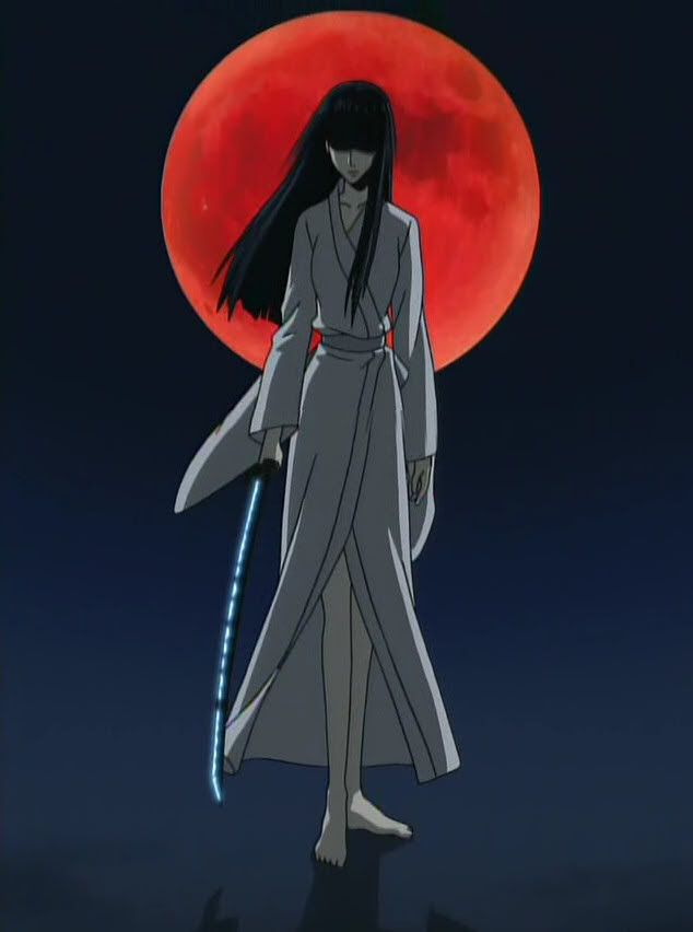
“First off, yes, LOOT-Tan is, indeed, female. Such is the sign of our times when most residents of the Internet Age expect a female character. Beyond that, we wanted to incorporate some of the atmosphere around the LOOT offices and how Home perceived our products. Naturally, once we identified how LOOT as a group behaved (and how people perceived LOOT during our tenure as developer), ‘cute’ didn’t exactly cut it for LOOT-Tan’s aesthetics.
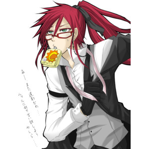
Not LOOT-Tan, but can you imagine?
The obvious choice for clothing came from directorial inspirations. The red beret felt appropriate – a classy cap from an old standby. However, we aren’t commonly viewed as auteurs or old-timey directors, barking orders to Charlie Chaplin or a cast of unknowns as we ‘paint our visions.’ As such, we decided to give LOOT-tan an otherwise timeless approach to professional dress.
To that end, we implemented a classic white formal shirt with requisite black jacket. Some might feel it bears a resemblance to the Turks from Final Fantasy 7, which isn’t inaccurate. In fact, her entire ensemble is meant to invoke the clapboard used in film-making to this day – admirably clean lines, black and white color scheme, and black gloves that only come off when she is under the throes of cinematic passion. Or if she’s about to slug someone for the audacity to interfere with artistic expression.
As for the free-flowing red hair and thin-frame, low-riding glasses? The latter felt necessary for the aura she gives. The former is, well – no comment.”
All in all, LOOT-Tan is a feisty red-headed director with a passion for cinematic expression. She is a full-body costume and comes with three custom animations: a director’s chair, a handheld camera animation, and a megaphone for those moments when shouting just won’t cut it.
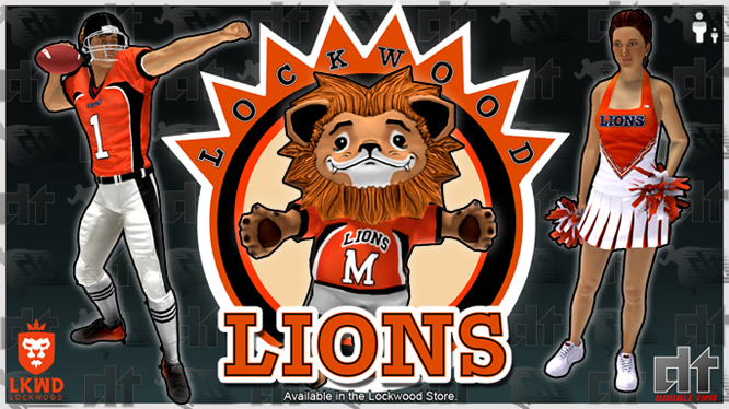
LKWD-Tan
Lockwood needs no introduction. After unleashing LKWD Life, it proved to us how invaluable its catalog is – and how its presence is mind-bogglingly expansive. Anything mentioned at this stage would be restating accolades repeated a thousand-fold. If anyone stands a chance of being the ‘face’ of Home, Lockwood stands out the most.
To that end, what can we expect from Lockwood-Tan? LKWD weighs in on their move towards the new mascot:
“We are not new to the world of mascots – in fact, Maliki served as our personal mascot, even being featured on our corporate logo. He served his purpose well and we still feel attached to our dearest lion. However, we decided to incorporate a new mascot that fits the general
Example of Nadeshiko not standing idly by.
view held by our customers. You can say you contributed to this design!
‘Tans’ are popular among anime circles, so LKWD-Tan incorporates elements of ‘yamato nadeshiko’ into her design. Her lengthy hime cut frames a face and mind known for serving the community with a calm and cheerful disposition, and being keenly aware of the audience’s temperament and needs.
We designed a pink cherry blossom pattern kimono for her in anticipation of spring – as is the reason we given her dichromatic eyes (blue and green). The fact her hime cut ended in ponytail, supported by a bow, developed mostly from positive feedback during the design phase; it wound up being between that or short, neck-length hair, which (while still generated interest) eventually lost to the current style. Sandals became a natural progression for her ensemble after everything else was said and done.
We’re also working on a school uniform variant for LWKD-Tan – anticipate that they will also be available in separate pieces in future updates!”
Much like LOOT-Tan, LWKD-Tan is a full-body costume with unique animations. Pull up the R1 menu and you will receive the option to spawn an umbrella (akin to the Iron Fusion geisha bots), draw a sword and pose, or sit and enjoy a cup of tea.
nDreams-Tan
Let’s face it: nDreams is best known for its quirky designs. Taking a stroll through Aurora alone supports their penchant for inventiveness, never mind the Thing in a Box, Blueprint: Home or the Land Shark. Heck, Xi – that one word describes everything you need to know about them. How, then, does such a company create a company-tan that distinguishes itself from the others? Well, as nDreams describes:
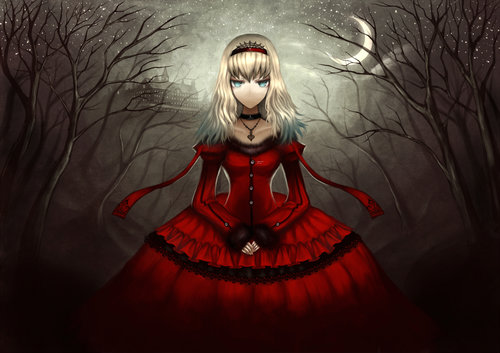
Alice (in one of many anime interpretations)
“When you construct a catalog around the concept of ‘strangeness,’ especially with the success of Xi, a mascot needs to showcase that talent. So we knew going into this that nDreams-Tan must be ‘out there.’ Simply being ‘cute and colorful’ wasn’t going to be enough. She needs to be . . . special.
‘Going down the rabbit hole’ became her central motif, so Alice in Wonderland served as her first inspiration. Visually she crosses American McGee and Tim Burton, giving a fantastic grin that would make the Chesire Cat green with envy. Sadako from ‘Ring’ leaked into the design, meaning nDreams-Tan’s hair covered her eyes – but that crazy smile of hers.
It isn’t to say she’s murderously crazy, however. nDreams-Tan has, instead, this ‘mind in the clouds’ feel to her that one cannot shrug off, as if she embraced Wonderland’s chaos and is enjoying life. Her Alice-inspired dress has red, black, and white across it that, along with the card-inspired designs, looks like she earned her dress when her ‘real world’ smacked against the Red Queen’s castle.”
nDreams-Tan lacks the same number of animations as its counterparts, limited to only two: spawning a cat-like fantasy creature that she hugs and keeps in her arms (an animation which remains active until ‘switched off’) and her peeling back her hair to reveal broad ‘crazy eyes’ that look more like she sees something that you don’t – and that’s fine to her. However, she does come with two companions as well: said cat-like creature (a purple-tinted menagerie of fur and ‘NO!’ face) and a playing card ‘guard.’
Expect these to hit April 2nd!
April 1st, 2014 by Estim20 | 0 comments
Share
| Tweet |