
You Are Here
by NorseGamer, HSM Editor-in-Chief
When I was a small child, my father took me to New York’s Museum of Natural History. Being so young, my reading comprehension and speed weren’t all that great; I tried to soak in as much as I could, but certain things just take longer when you’re a child.
We were moving from exhibit to exhibit at a pace an adult would define as casually brisk. For me, it was just too fast. Dammit, I wanted to learn more. I wanted to absorb what I was reading and seeing. So at one exhibit, I finally planted my feet, tuned out the world around me, and studied the display until I was satisfied. When I was done, I turned the rest of the world around me back on.
My dad was gone.
This is a pretty bad scenario. You’re a young kid, physically diminutive, in an unfamiliar building sited in the middle of an unfamiliar city. Your lifeline, whom you depend on, is gone. It is late afternoon, and you suddenly become intimately aware of just how potentially bad this situation can get. You are alone.
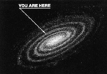
The first thing I looked for was one of those “YOU ARE HERE” maps. Holding my dad’s hand, I didn’t have to worry about wondering where I was in relation to everything. I could be carefree. Now I needed to somehow figure out the layout of the building (which had spontaneously gotten a lot bigger and somehow more claustrophobic at the same time) and how to navigate back to anything that looked or felt familiar.
 There was no map. And when you’re a kid, you don’t talk to strangers. You need to look like you know exactly what you’re doing and why you’re there. A child, alone, in distress, is not something one advertises to the world.
Fortunately, my father backtracked his steps and found me. Time expands and slows down in crisis situations; it felt like I was on my own for half an hour, when I’m sure it wasn’t more than a few minutes. He was concerned, but not upset; we simply picked up where we’d left off. I never bothered really reading the rest of the displays; I simply nodded and pretended I was reading. Interestingly enough, I think that one event is one of the key reasons why I prioritize rapid absorption and processing of information as an adult.
But what’s never left me was the shock of looking for a YOU ARE HERE and not finding one.
And this is the problem with the Hub.
Now, before we begin, let’s put a disclaimer up front: this isn’t an article contrasting the Hub versus Central Plaza. The plaza did a lot of things right, but the plaza’s gone now. No, this article has to do with something I see as a design flaw within the Hub: no navigation map. No YOU ARE HERE.
When you spawn in the Hub, what do you see first? A promotional area for Home’s latest flavor of the week. First it was Cogs. Currently, at the time of this writing, it’s No Man’s Land. And while this might drive traffic to that specific promotion, it does so at the expense of a lot of other content fighting for visibility.
 What else do you see when you enter the Hub? Well, if you maneuver forward, you’ll see the Activity Board — a clusterfrak of user-generated obscenity that hardly lends itself to a good first impression of Sony’s MMO experience. You see some storefronts, trying to get you to shop. And, if you rotate the camera over your right shoulder, you finally see a transporter (not clearly labeled as such from a distance) which takes you to other Hub districts. This means that the most overt method of moving from one space to another isn’t even on a direct sight-line when you first enter the PlayStation Home world.
I haven’t written much about this because, after all, I’m just a consumer. I’m not a game developer, I don’t have access to the mountains of data Sony undoubtedly pored over when designing the Hub, and I’m sure there are various justifications for why the Hub is designed the way it is, and why the spawn point is set the way it is. And I wanted to let some of the noise about the Hub versus the old plaza die down a bit. That said, I also can’t get past my personal belief that the lack of a giant YOU ARE HERE interactive navigation map, on a direct sight line with the spawn point’s orientation, would be a far more effective means of promoting content within Home.
You could at this juncture point out that a user could simply press Start and go to the navigator, but frankly that’s flawed, too. A lot of content in Home is submerged under a distressing number of menus, sub-menus and clicks, and unless something happens to be the promotional flavor of the fortnight, it’s really easy for it to get lost in the shuffle. Personally, were I a content developer for the platform, I’d probably be wondering how much lost traffic this current interface represents.
HSM has a cardinal rule: if you bring a problem, you have to bring a solution. Otherwise, you’re of little use in trying to effect change. And it’s rare that I call for a high-cost solution, but given that the Hub is supposed to be…well, the Hub, this is kinda important.
 The solution is to develop an interactive, navigable “world map” for Home. A giant YOU ARE HERE system. If you’re familiar with the sphere grid from Final Fantasy X, then you’re seeing more or less what I have in my head. The easiest way to sort this kind of hub-and-spoke system is by genre (much like how the districts are currently set up), with sub-categories listed by developer. So, for instance, if I want to play an action game, my cursor moves from the Hub to the Action District, at which point various spokes light up for Juggernaut, Lockwood, et cetera. And if I select one of those entries, a pop-up menu screen would reveal what the developer had to offer in this genre; one click on the entry of my choice would instantly transport me there.
Yes, I’m sure there are doubtlessly technical hurdles which would need to be overcome, and I’m aware that it’s not a panacea for all of Home. For one thing, a space created by a third-party developer probably couldn’t be required to place an interactive navigation map inside of it, I’m guessing. But let’s remember that Home’s old “tile” navigator interface, prior to the current one, functioned similarly to a giant YOU ARE HERE navigation map — it just didn’t give enough detail on where you were going.
The goal with this proposal is simple: to flatten the number of clicks required to get from one point to another in Home, and to make it easy for a Home user to see all of Home at a glance, rather than having to navigate back and forth through sub-menus to find something. The benefit of this is that it would likely help drive some additional traffic to spaces which aren’t the latest soup du jour, which increases the likelihood of them generating some incremental revenue gains above what they’re currently producing. Further, by having some semblance of an in-world interactive navigation map, it makes the Home experience itself feel more unified and less like a splintered platform for various amusements.
The PR tagline with the Hub was that Home itself was going to become more of a game. And I wholeheartedly agree with this, because in order to do that, Sony has to deepen the Home experience itself, not just make it a platform for others to develop games and enticements upon. If Home is itself to truly become a game, then it really ought to start having the immersive-world interface of one.
Because no one wants to feel lost.
July 8th, 2012 by NorseGamer | 10 comments
NorseGamer is the product manager for LOOT Entertainment at Sony Pictures, as well as the founder and publisher of HomeStation Magazine. Born and raised in Silicon Valley, he holds a B.A. in English/Creative Writing from San Francisco State University and presently lives in Los Angeles. All opinions expressed in HSM are solely his and do not necessarily reflect the views of Sony DADC.
 LinkedIn
 Twitter
Navigation map and interactive help desk. We asked for that many times now and the only answer i saw was brief and clear.: Not happening, use the help in your navigator…
The sphere grid you mention from FFX reminds me of one good suggestion I saw on the psn/home forum. With the number of peoples on home now i think we do need such, more interactive, help/navigation system.
Theres a great article on here about selling home to the older generation ( Home away from home?) I think the two go side by side.
I remember reading the board at the old plaza. Giving basic rules about home. It was’nt much but it was something. I can imagine a new user, not experienced in MMO.He (she) must feel somewhat like a child lost in a museum. Affraid to ask for help and reveal his (her) fragility.
I met such a person Doc, I could almost see the confusion on their Avi’s face. I’m not sure why they singled me out but, it was probably a good thing. They’d never played a game on their new PS3 before, intact Home was apparently the first time they’d ever set foot in a virtual world, and “overwhelmed” didn’t even begin to describe how they felt.
I gave them a few pointers, and spent about half am hour explaining Home and online world-rules as best I could. But even tring to nut-shell it, as I explained I realized how complex the whole situation was for them. I think scary is about the right word here lol.
Home BADLY needs a more concrete navagation system. Maybe it’s coz I’m a guy, but if I see a map of a place I’m in; town, city, mall or game map, it just solidifies where I am in my head and my auto-pilot kicks in from there. My auto-pilot is a wonderful thing, it’s got me home drunk so many times, even in cities I’ve never visited before intoxication! I call it pigeon sense haha!
Anyways, we need some kinda tutorial for navigation coupled with a new way to navigate. The old tiles (to my mind) were just as useless really, I mean, a spray of little plastic tags being thrown at your screen is hardly helpful! Never played FF, so my suggestion would be to go with the “spokes” idea, but maybe categorized by content rather than developer. Let’s face it, most people don’t know who makes what, hell, if half the CoD playing kids knew that every second game was made by a sub-dev would they still play it? For laymen, I’d say content description is more importiant than giving Devs that semblance of recognition they crave.
Nothing will ever replace human kindness… and it is the greatest advocate for coming back to HOME
I think that anything that will help a new user understand what they have gotten themselves into is a no-brainer. I was that lost child when I first arrived in Home, just like the person Krazy described I had never been in anything like it either. This was over 30 months ago, and with so much more added material in Home since then it must be exponentially worse.
I helped someone out the other day as well by explaining the navigation system and making a few suggestions where to try first, but it can be a very daunting experience for anyone who is new. There are probably many who don’t listen to the tutorial that appears when they arrive much, and finding it in the menu doesn’t occur to them.
Something concrete in front of their face when they go to the Hub and all of the other core spaces would be of great value, no matter what form it takes. Good idea Norse.
The chips sort of did this. Since Home isnt a connected system (most of it anyway) a map wouldn’t make much sense becausse theres really no direction to here or there. The Vita got rid of the XMB for the tile system of smartphones, which has proven a popular way to present users with a large quantity of information in a quickly scannable and easily navigable way. I find it odd that Home’s navigation went the opposite direction. The chips worked, the current system? Not so much.
What might work for the newcomers is a keyword-search engine. A big “What Would You Like To Do” board, where you can select things like “Play Games”, “Meet People”, “Go Shopping”, “Win Free Stuff”. Then some sub-categories for Games, such as “Puzzle Games”, “Action Games”, “Adventure Games”, “Classic Games”, “New Arrivals”. Then a menu of tiles is presented, and the user can select where they want to go.
i think the fault incomb to sony itself!
since the new “HUB” (curious name for a space connected to nowhere…), its difficult to orient in home. the design and ergonomy is awfull, no link nowhere!
HOME MUST be a GLOBAL space, like the plazza was, remember, wen you go out of ur appt, u appear on a central place with VISUAL and integrated connections with the principal fonction of home…
INSTEAD continue toward this way (that is an obvious evidence for all architect and designers)
Sony decides to blast this unity into small area with no links, i think the soluce is not a map, but a REAL GOOD ARCHITECT, or here, a real level designer!
Ive seen this mentioned so many times. Yet its never been sorted, the hub or as that younglady called it in the home community theatre segment the shopping center first floor. If the first things you realise about home as you arrive in the hub is lots of ads and shops and an events board for beggers, pervs and loners, all we need is a basic interactive Map or search engine, but does that fit with who has priority over ads etc Devs are they going to be happy if they advertising they new game in the hub if I can search the alternative out.
you know what would be really cool? If the map was on the ground. And the Transporters were attached to it. and if you wanted to see the whole map you could go to the second level with the glass floor and get an over view. So you could sort of stand at one hub and all these things could flash up telling you what games are connected to that location… you know they do something similar when you go into x7. Its a great idea Norse! I am just running with it. But I do think that all the transporters to all the different main places should be put together in the hub. There should be one for each main space.