Using tables for information graphics
In February, 2011 Charles Blow had a column in The New York Times, The Kindling of Change, in which there was this graphic:
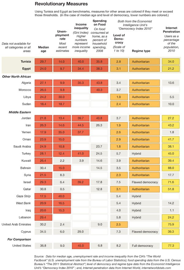
It is full of very interesting and illuminating information, but is hard to read because of the small font and color, and, more importantly, since it is an image file, it is not accessible to anyone who is blind or has limited vision.
I took the information and put it in a table in html, and slightly reordered some of the information about the sources of the information and the meaning of the colors.
Revolutionary Measures as an html file.
Look at both and let me know what you think about the different formats and how useful they are for you and what their strengths and weakness are.