Share this Page
CS491 Project 2 - Leaving on a Jet Plane
This project focuses on building a mini application for visualizing data of flights collected from O'Hare Airport Chicago. The data collected was over a period of one week and had numerous files which had be converted to some usable format. Microsoft's Interactive Modestmaps has been used for the initial layout. The Visualization has been done using Processing. The visualization has all the obvious controls like pan, zoom and click together with quite a few very interesting features as well.
Data Preprocessing
Data cleansing being an indispensable part of any Visualization project, was naturally the first thing we dealt with in this project. Firstly, the Format of Data provided was modified and converted into a more usable and readable format. We have used Python to perform this task. Here we got rid of all the unnecessary characters and newlines which were present in the original data files. The original size of the data files was 51 Mb. The size was brought down to as low as 21 Mb and then used for the project.
Count of the files was brought down to 8 by classifying data based on days. In these files one of the columns -'Airline' was replaced with integers. We created another file which maintains the mapping of these integers with the appropriate Airlines. This was done by keeping in mind that while processing data for the 'Airline Select' functionality which is one of the main features of the project it would be easier to handle integers than handling strings.
Features
Basic Interaction
We have only used mouse operated interactions in this Visualization.
- Mouse Wheel - For Zoom In/Zoom Out we use the Mouse wheel.
- Mouse Click - For Rest of the operations we just use Mouse click.
Timeline
Situated at the bottom of the Map. As you click on any point on the timeline it shows the changes in the map as per the selection made on the other panels. Before the beginning of timeline a small play button has been placed which automaticlly increments and moves the marker on the timeline and performs all the functions that have been selected before clicking on it.
Toolbar
The toolbar has four main functionalities.
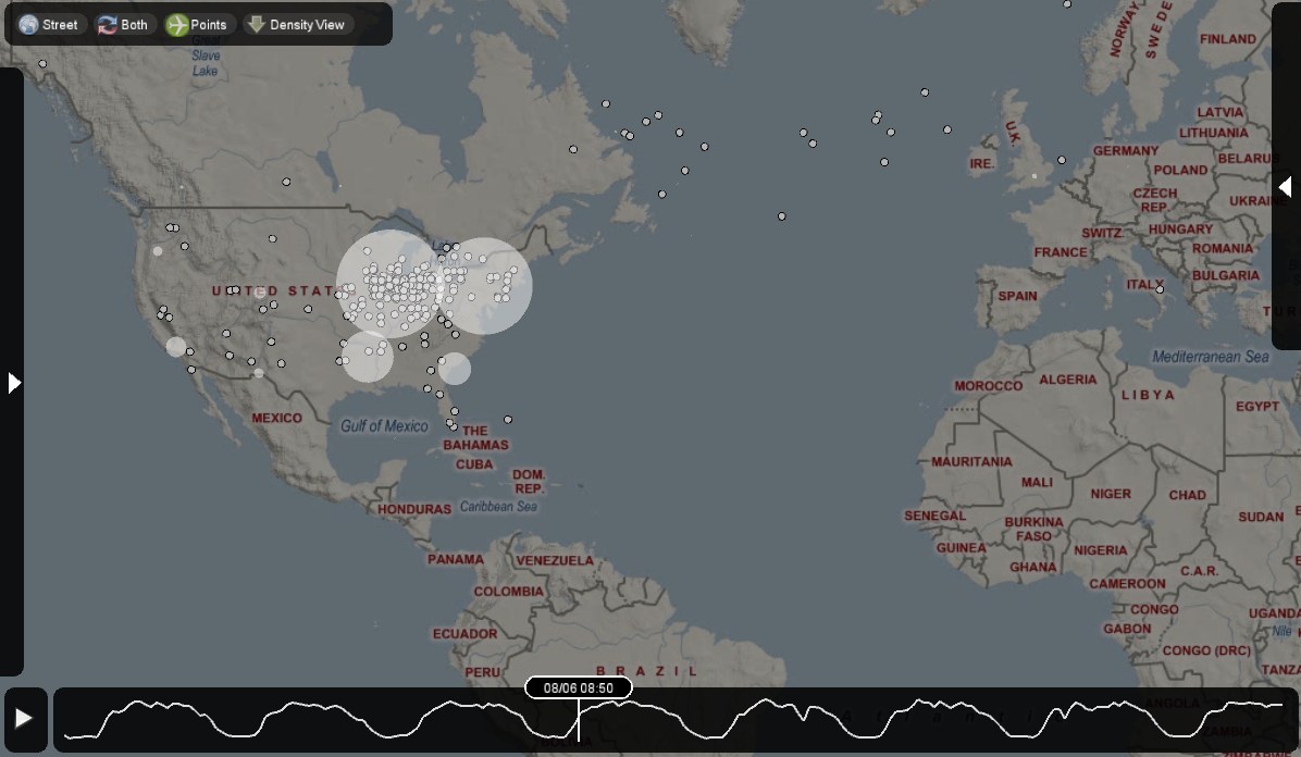
Map Mode
Situated at the top left corner of the Map.
In this we have a choice of selecting between three map modes.
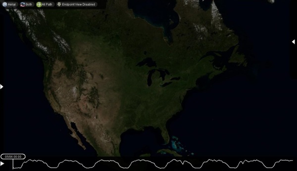
- Hybrid mode (Default) - This mode overlays the satellite image of the world with names.
- Aerial - This mode gives the diagrammatical representation of the map with street names.
- Road. - This mode just gives the satellite image of the earth.(Road is called Street in our Map)
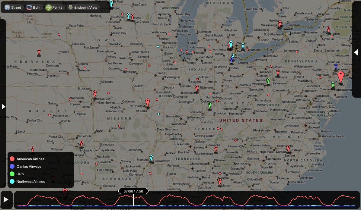
In this we have three modes.
- Both (Default) - This feature Displays all the inbound and outbound flights for either all the airlines or only those that have been selected.
- Departing Only - This option displays only the outbound flights for either all the airlines or only those that have been selected.
- Arriving only - This option displays only the inbound flights for either all the airlines or only those that have been selected.
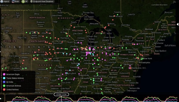
- All Path (Default) - This feature enables us to view the entire path for the selected airlines at any particular point in time.
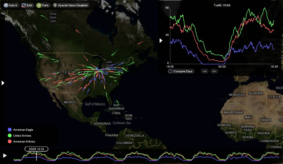
- Trails - This feature enables us to view the path of the flight upto the selected point on the timeline.
- Point - This feature enables us to view just the current position of the flight. (Depicted with a point.)
- SpecialViewsDisabled - does not show any major visual cue.
- EndPoint View Enabled - When enabled it shows the end points of the flights based on whether we have selected few airlines or all the airlines. This feature basically averages out the destination locations and gives a point (location) which is closer to a group of close enough destinations.
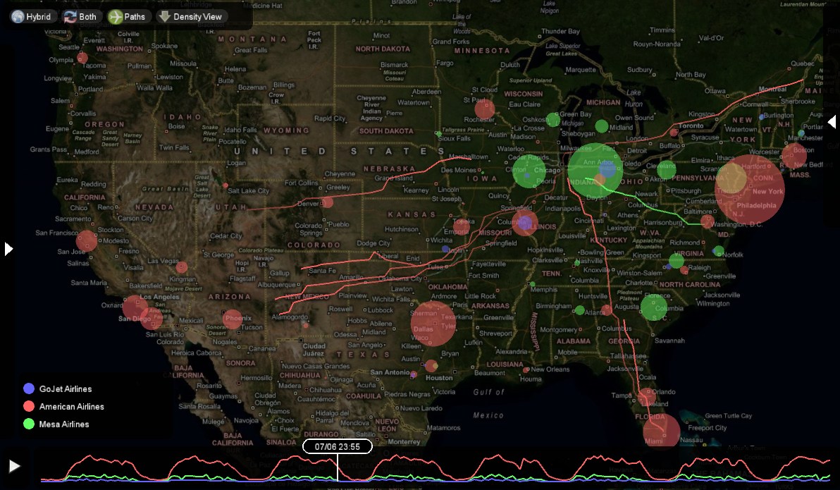
- Density View
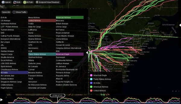
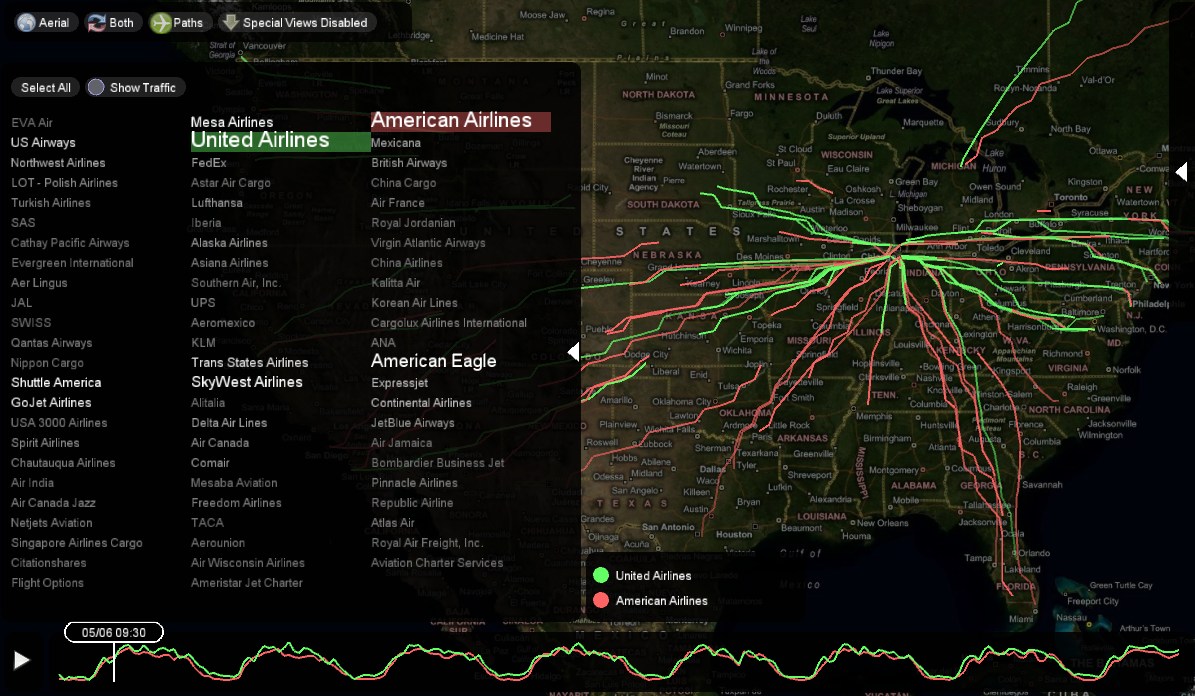
Situated at the left of the Map. This panel has names of all the flights that commute To and From O'hare Airport. (As per the data) There are two features in this Panel.
- Select All (Default) - Selects all the Airlines on the list and is set to true by default. We have an option of selecting up to 5 Airlines on this Slider. This helps in viewing/comparing the details of each of these selected airlines.
- Show Traffic - The most interesting feature of this Panel is the 'Show Traffic' functionality. This shows us the density of the flights by increase in font size. We could confirm this fact by selecting these flights and either viewing the continuous graph on the timeline or by opening the Traffic Plot Panel.
The Legend
The legend pops up next to the Airline Selector panel when we select any of the Airlines. This gives the color and the name of the selected Airline and makes it easier to view the selected airlines even after closing the 'Airline Selector' Panel. This little piece of information continues to remain on the screen until and unless we unselect all of the Airlines or click on 'Select All' on the 'Airine Selector' panel.
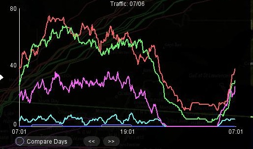
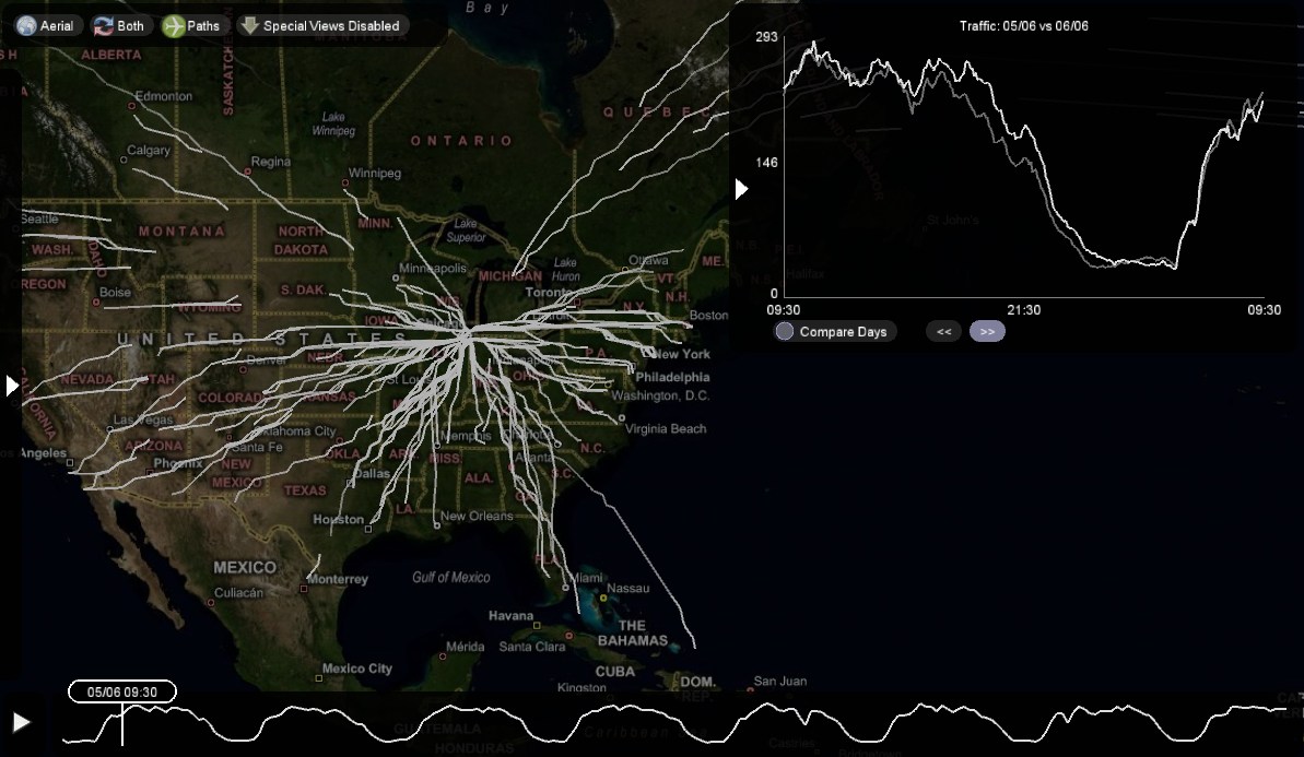
The Traffic Plot Panel
Situated at the right of the Map. This panel again has two functionality.
- Graph of the Flights which has Time vs No. Of Flights. - The plot changes based on the selection we make on the 'Timeline' as well as the 'Airline Selector.' This panel gives us an insight as to how much each of the Airlines differ from one another.
- Compare Days - This helps us to know the trend of flights on two consecutive days by use of Forward and Backward buttons.