Share this Page
CS491 Project 1 - Bridge Over Troubled Water
For This project we had to create an interactive version of the John Snow cholera map, using additional related dynamic data. The tool used for developing the visualization is Processing.
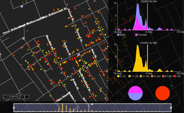
The application displays a simple map of the area of interest on the left side of the screen. The user can right click and move the mouse to pan around, and click with the middlew button and move the mouse to increase or decrease the level of zoom. Some street names dynamically appear depending on the zoom level.
The bottom part of the application shows the Timeline. It is possible to click on one of the three active areas of the selection slider (identified with small circles) to change the selection size or move it around the timeline.
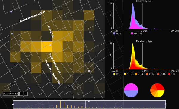
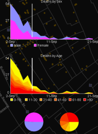 The left application panel displays some graph representation of the source data. The two top plots display
the deaths categorized by sex and age range. Two pie charts on the bottom offer an aggregated qualitative view
of the data displayed in the plots. All of the graph time ranges are linked with the range selected in the timeline.
The plot y scales also change dynamically depending on the current data.
The left application panel displays some graph representation of the source data. The two top plots display
the deaths categorized by sex and age range. Two pie charts on the bottom offer an aggregated qualitative view
of the data displayed in the plots. All of the graph time ranges are linked with the range selected in the timeline.
The plot y scales also change dynamically depending on the current data.
Clicking on any of the legend boxes allows to filter data by the selected legend category. For instance, clicking on the female box, only data related to female deaths will be displayed in the graphs. Also the main view dots change from the standard color to display deaths categorized by sex. A similar feature is active for the age plot.
Three buttons on the bottom left corner of the application control the data clustering feature. Cluster size can be customized using the two + and - buttons. The cluster color is also influenced by the filtering functionality explained in the previous paragraph.