 Share this Page
Looking Glass Tutorial

A Quick introduction
The following annotated video quickly shows how to use some of looking glass functionalities. You can use it as a quick tutorial on how to use the program. Keep on reading the sections following if you need additional information about program features.
View Interaction

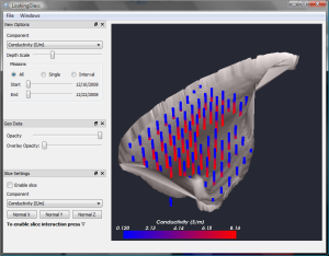
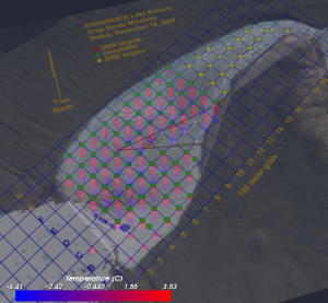
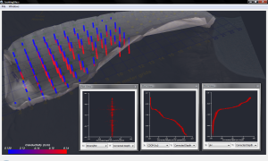
The Main View area displays the default representation of the dataset. Each sonde drop is represented by a column, colored depending on the currently visualized component. The displayed bathymetric model is derived from the available pre-ENDURANCE lake data.
- NOTE: The occasional inconsistencies between sonde drop columns and the bathymetric model (i.e. columns going beyond the bathymetry max depth) are probably hints about errors in the original bathymetry. A new bathymetry generated from sonde information will be included in the next version of the application, to allow comparisons between the two models.
- Left mouse button press + movement: rotates the view
- Middle mouse button press + movement: translates the view
- Right mouse button press + movement: zooms the view
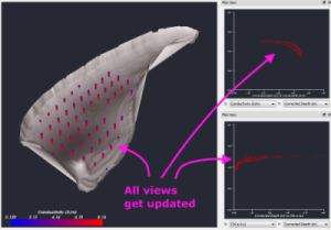
- Click on a data point: Selects the specific sonde drop. This function is used in conjunction with Plot Views, explained in step 6. To disable the selection, click on an clear area of the main view.
View Options
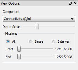
The view options panel allows to configure some basic parameters of the main view visualization:
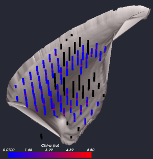
- The component box: allows to select the currently displayed data component. When sonde drops are missing information for a specific component, they are displayed in black, as shown in the second figure (Chl-a)
- The depth scale slider: can be used to change the depth exaggeration factor.
- The mission filter: allows to display data for all the missions, a single day, or a day interval. The sliders can be used to control filtering.
Geographic Data
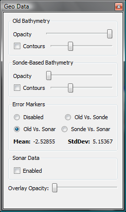
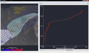
Through the Geo Data panel it is possible to set the batymetric model opacity, and display an annotated aerial image of the lake on top of the datapoints. It is possible to observe how the sonde drop positions map pretty well with the grid points.
The geo data panel also allows to control the rendering of the sonde-based bathymetry model. Buth the old bathymetric model and the sonde-based model support the rendering of a user specified number of contours. Through the geo data panel it is also possible to enable the rendering of sonar data and to visualize Error Markers. The error markers give a qualitative idea of the difference between two of the visualized bathymetric models:
- Old vs. Sonde-Based
- Old vs. Sonar-Based
- Sonde-Based vs. Sonar-Based
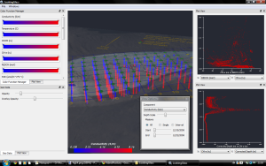
The Color Transfer Function Manager

To change the color used to display a data component in the main view, open the Color Function Manager selecting the specific option in the Windows menu. A dock will open in the right side of the application, showing the default color maps for all the displayable components. It is possible to interact with a color map in the following way:
- Click on a point of the color bar to add a new interpolation point there.
- Double click on an interpolation point to change its color.
- Click on an interpolation point and drag to change its position. The start and end points cannot be dragged
- Click on an interpolation point and press delete to remove it. The start and end points cannot be removed
2D Plots
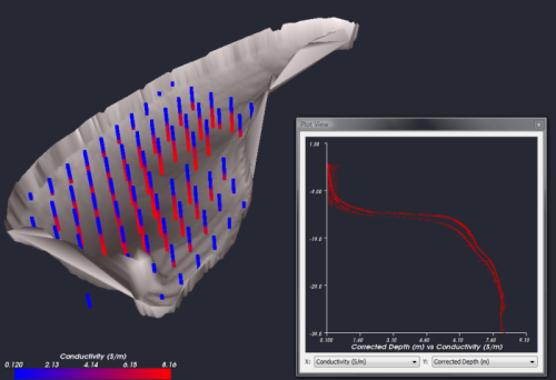
To display a 2D plot of data, select a plot view from the Windows menu. Up to 4 plot views can be opened at the same time. Use the two boxes at the bottom of the plot view to choose what component to use for the X or Y axis.
- Select a sonde drop from the main view to have it outlined in the plot views.
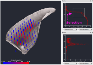
- Select an area on the plot window by left-clicking and dragging the mouse, to select a subset of datapoints. (see following figures) Only those datapoints will be shown in the main view and in every other plot view currently opened.
- To clear datapoint selection just click on a plot view without dragging.
- When using the mission filter, all plot views get updated accordingly to show just the selected mission sonde drops.
Customizing the Application Layout
All the application panels (Geo View, Plot Views, Slice View, etc.) can be moved around and docked to the application borders to customize the application layout depending on visualization needs. The following images show some examples of possible customized layouts.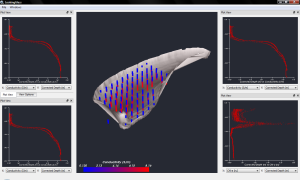
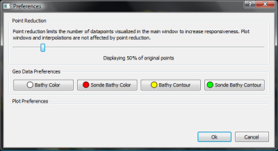
Preferences
myMigthyStats