- World Population Map
- Age Structure
- New Birth in Five Continents
- World Population and GDP per Capita
- World GDP and Birth Rate in Developed and Developing Countries
World Population Map
* Click the image below to open up the full interactive world population
map
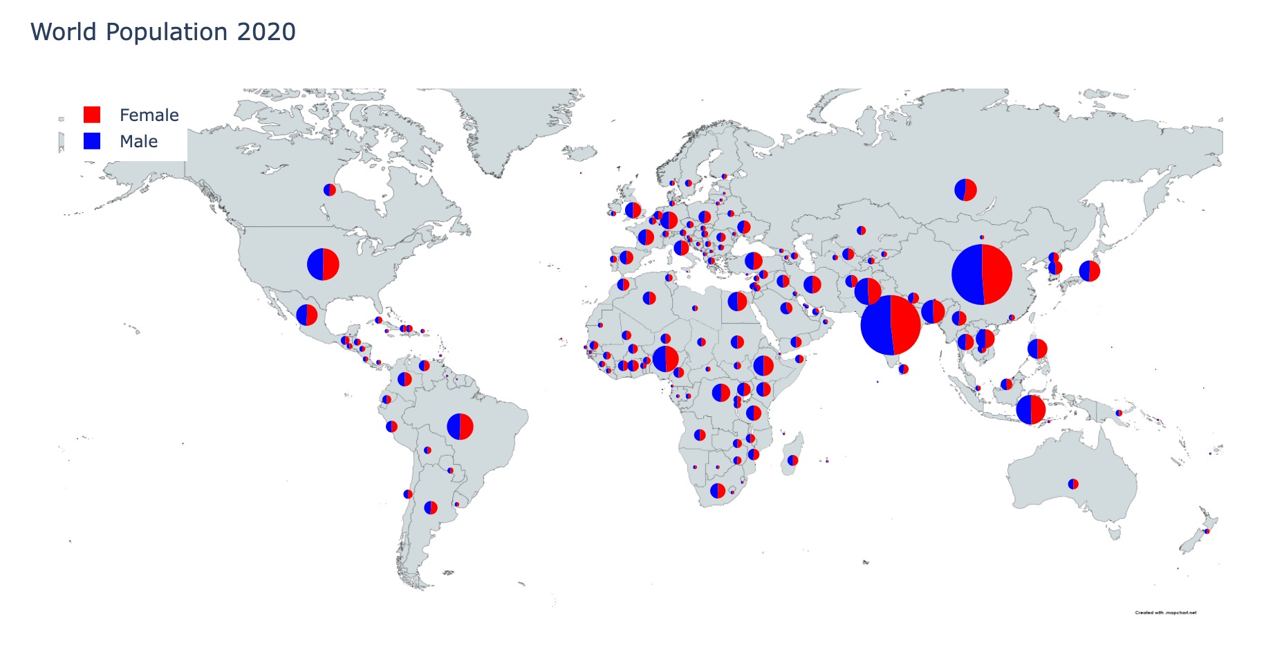
Viewers can hover the mouse over the pie chart slices to get the country name, female/male population, and female/male percentage of the country population. This plot can give people an overview of the world population by country and gender groups.
Based on this plot, some simple conclusions can be drawn:
- China has the world largest population, India has the second largest population
- The female-to-male ratios for almost every contries are close to 50% to 50%
Age Structure
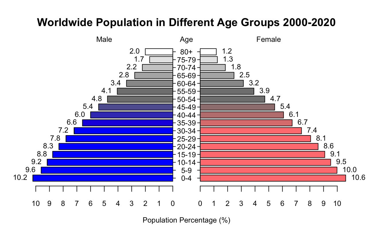
Population pyramids can also be used to predict how a population will grow in the future. An ageing population that is not reproducing will eventually face problems such as having enough children to care for the old. Other hypotheses, such as the "Youth Bulge," claim that a large age gap between 16 and 30 years old, especially among men, leads to societal discontent, war, and terrorism. This makes Population Pyramids useful for fields such as Ecology, Sociology and Economics.
New Birth in Five Continents
Africa's new population is in a stable growth trend, with the fastest growth rate from 2000 to 2009, adding 700,000 more newborns per year compared to the previous year. 2010-2019, the new population growth rate slows down, adding 400,000 newborns per year compared to last year. As of 2019, Africa has reached 43 million new people per year, making it the state with the most potential for population growth.
Asia's new population is on a steady trend, thanks to a large population, adding 70 million people per year, making it the most populous state in the world.
North America's new population has not changed much, fluctuating between 8 million and 8.5 million new people per year.
Europe's new population is not changing much, fluctuating between 6 million new people per year.
South America's new population is on a slow downward trend, declining from 7.3 million new people in 2000 to 6.4 million new people in 2019.
World Population and GDP per Capita
A search of the news reveals that some economists predict that the recession triggered by the subprime financial crisis in the U.S. in 2008 will begin to show up in 2011. The sovereign debt crisis in Europe and the U.S. officially broke out in 2011, triggering a four- or five-year-long recession, like the Great Depression of 1929-1933 in the 20th century in the U.S. After 2016, the world GDP per capita resumed its growth trend.
The economic situation of the world's developed economies has a significant impact on the world GDP per capita indicator. The developed economies have large GDP volumes and close relationships with developing economies. If a recession occurs in developed economies, it will spread to developing countries and thus affect the whole world economy.
World GDP and Birth Rate in Developed and Developing Countries
From this graph we can learn that the difference in the value of total GDP in most developing countries is small and largely lower than in developed countries. Most of the countries with high birth rates are developing countries, and developed countries generally have lower birth rates. There are almost no countries with high birth rates and high GDP, and most bubbles are concentrated in low birth rates and low GDP.
It is worth noting that the total GDP of developing countries is not necessarily less than that of developed countries. China's total GDP, for example, is outstanding and is accompanied by a huge population size.
The temporal trend shows a decreasing trend in birth rates and a tendency for total GDP to increase in all countries globally.