Mapping with Public Data 101
Copy + Paste -> http://bit.ly/1jTnQbk
(Press right on your keyboard to begin)
Open Data NJ Summit May 15, 2014
-
Carla Astudillo
- NJ.com Data Reporter
- @carla_astudi
- castudil@nj.com
Fred Kaimann
- Star-Ledger Data Reporter
- fkaimann@starledger.com
Time for some basics
To use maps to tell a story you need:
- Geographic info
- Counties, cities, states
- Addresses
- Coordinates (40.860987,-74.197648)
- Data to compare
- Keep it simple
- Think to yourself: How are my readers gonna understand the story better with a map? Is a map even necessary?
Types of Maps
Point-based Maps
Uses specific location data to tell the story
via WNYC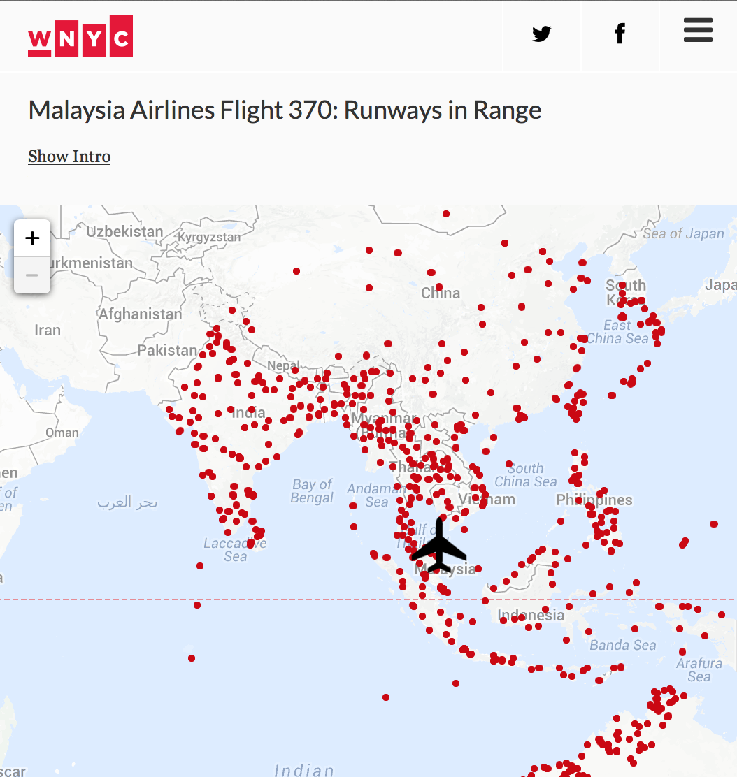
Point-based Maps
Uses specific location data to tell the story
via NPR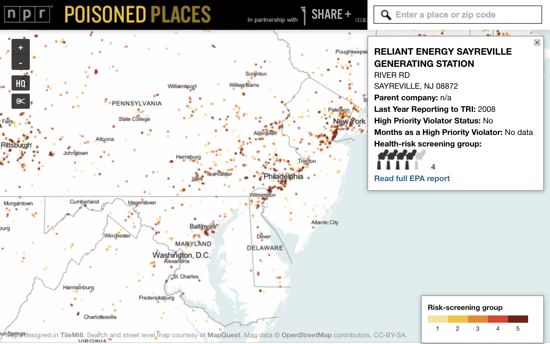
Point-based Maps
Uses specific location data to tell the story
via USA Today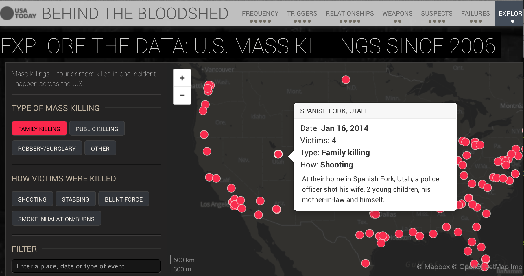
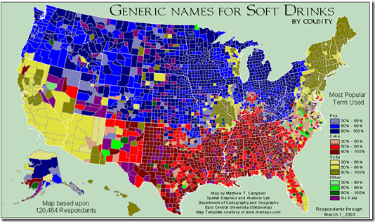
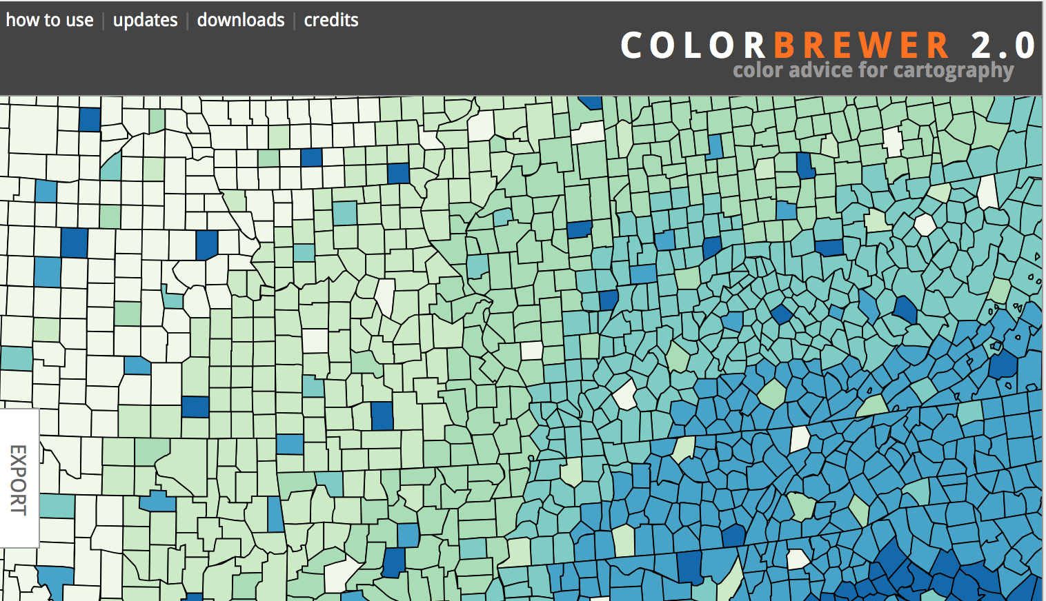
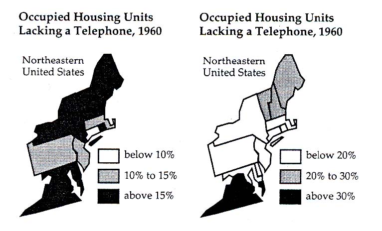
Choropleth Maps
Shades areas (or shapefiles) based on data
via NJ.com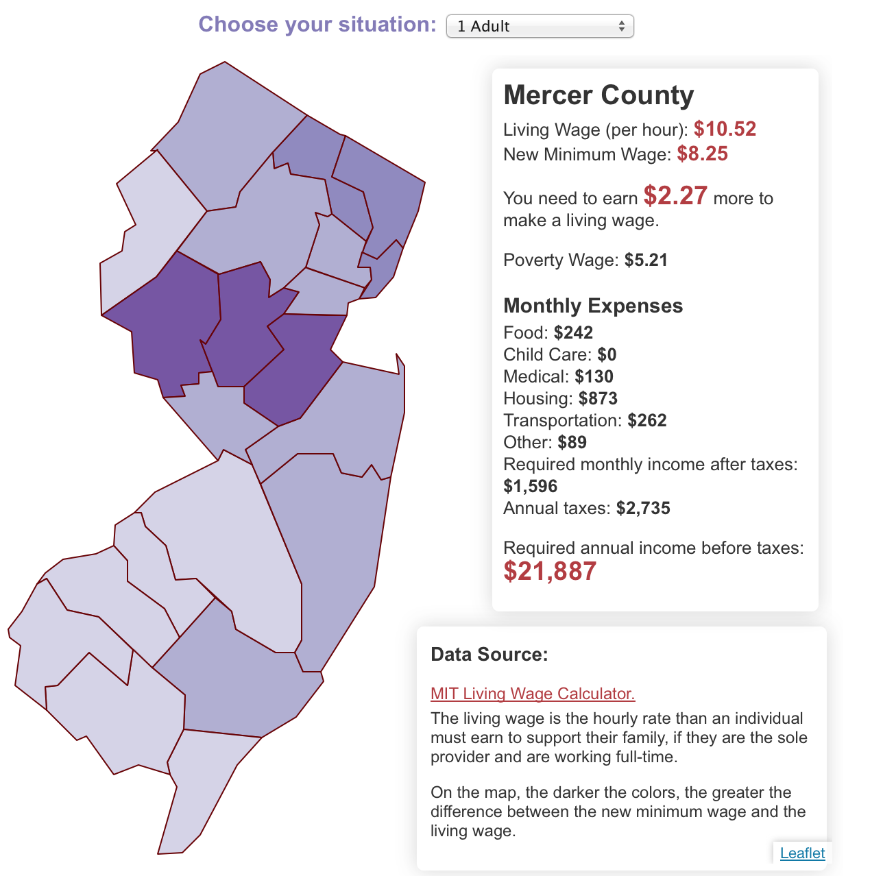
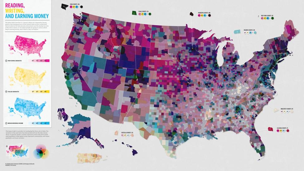
Choropleth Maps
Shades areas (or shapefiles) based on data
via NYTimes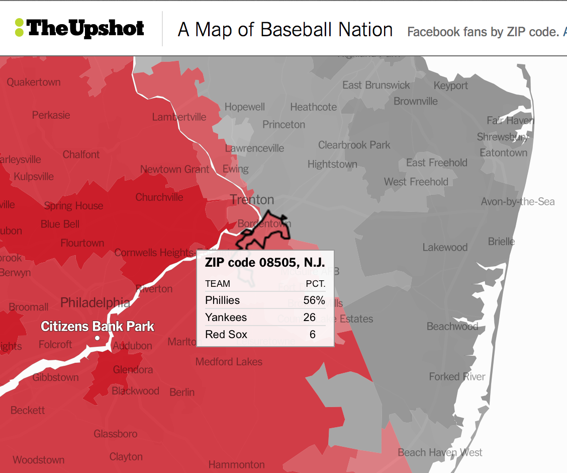
Choropleth Maps
Shades areas (or shapefiles) based on data
via The Guardian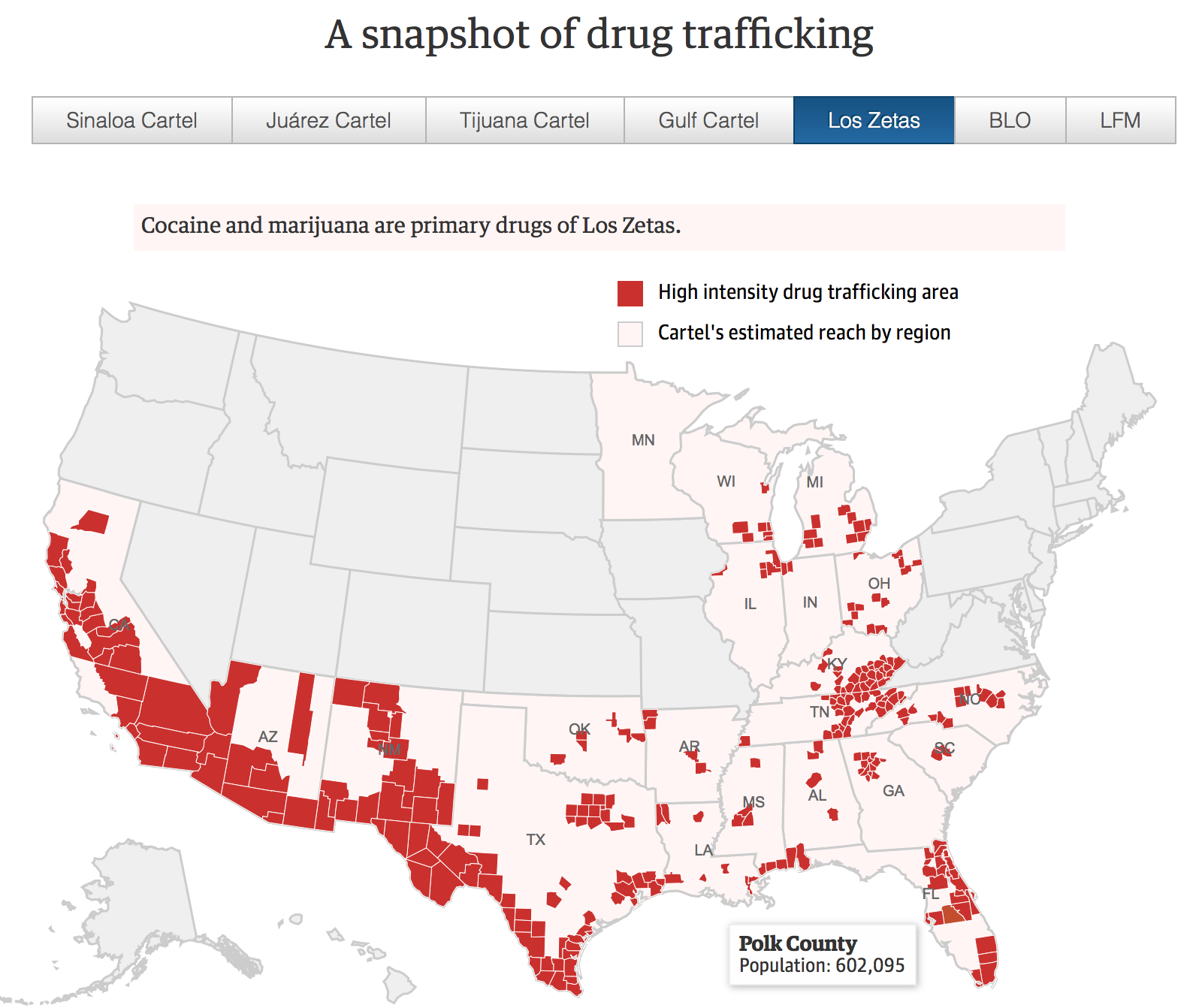
Heat Maps
Use intensity to show the amount of times something happens at a specific location
via The Washington Post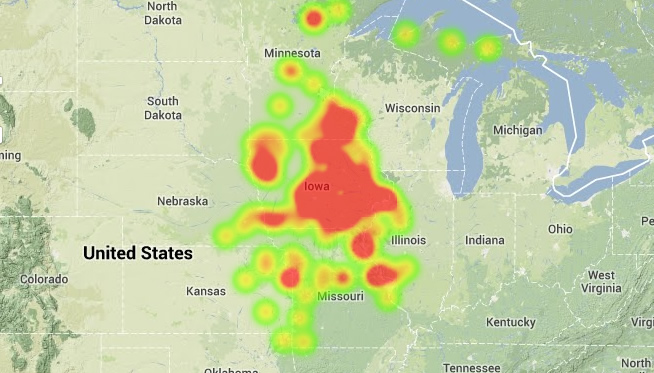
Heat Maps
Use intensity to show the amount of times something happens at a specific location
via Streetsblog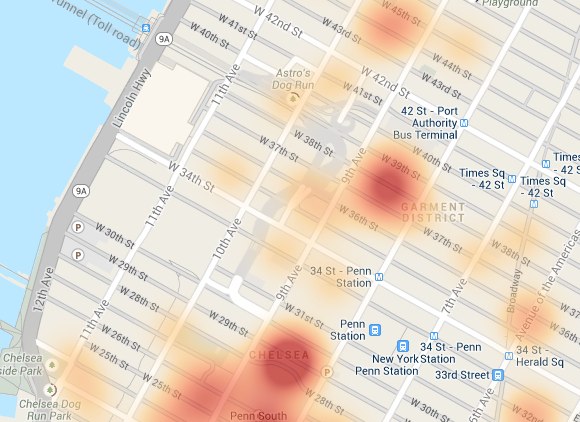
Bubble Maps
Allows you to show multiple values
via NYTimes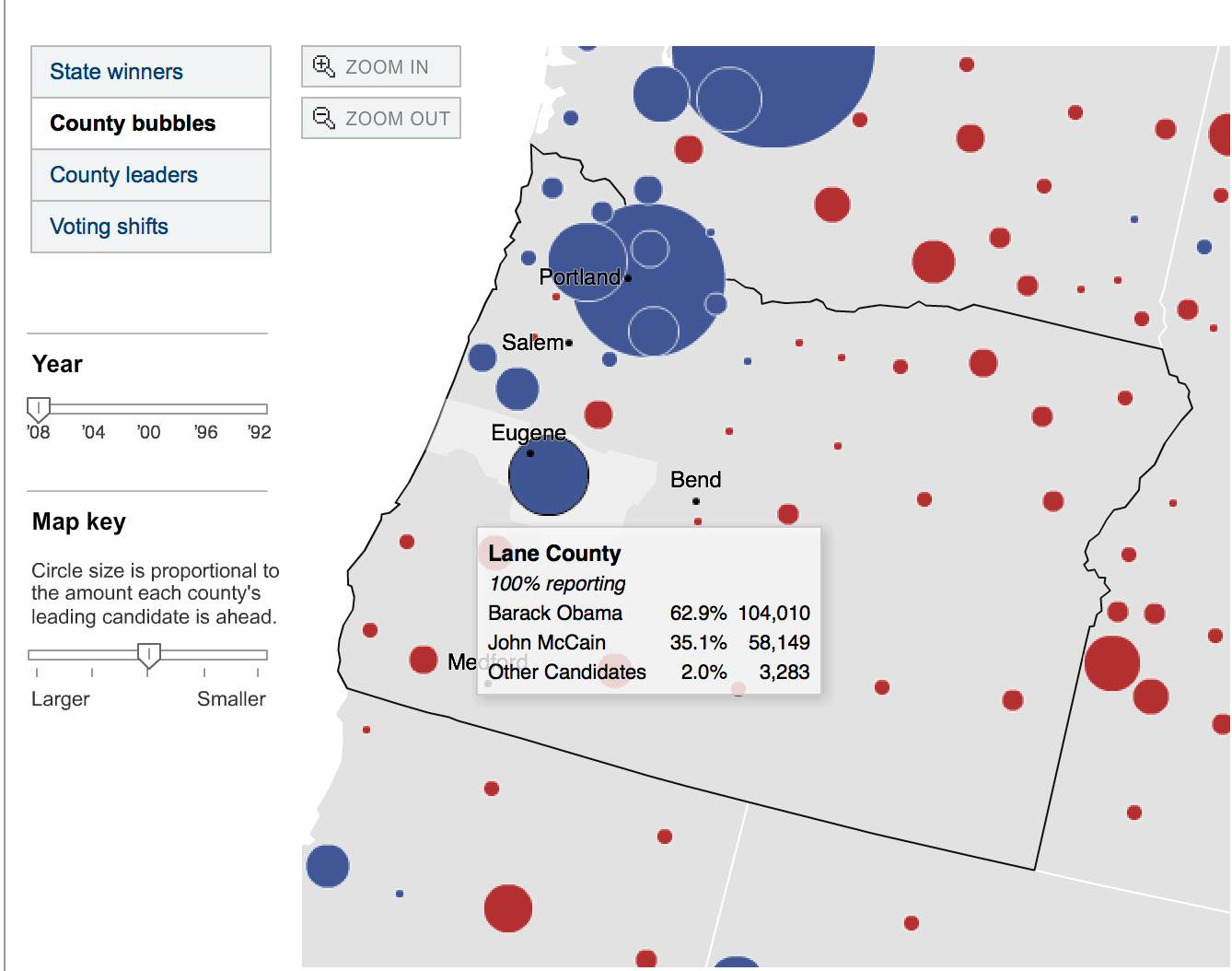
Things to Avoid
The difference between a GOOD map and a BAD map
Weird Clashing colors
h/t AggieMapper
Weird Clashing colors
h/t Visual.ly
Bright, Primary Colors
via Wikimedia
Experiment with your colors and you'll know what's aesthetically pleasing
Not Colorblind friendly
h/t Misguided Maps
Too much red and green might not be readeable at all for colorblind readers
Not Colorblind friendly
h/t Vis4.net
Too much red and green might not be readeable at all for colorblind readers
Color Oracle is a good tool to test whether your colors are color-blind accessible.
Need better suggestions for colors?
Check out Color Brewer.
Be very careful how you use your colors
h/t DaBrownstein
Think about how we as a culture perceive certain color.
If your map needs a tutorial or lots of directions, SCALE IT BACK
The experience should be as intuitive as possible.
Because you never want to overwhelm the reader
h/t this Stack Exchange thread
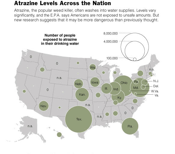
Be very careful with the data you plug in to your map
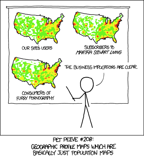
What's wrong with this map?
How do we solve this?
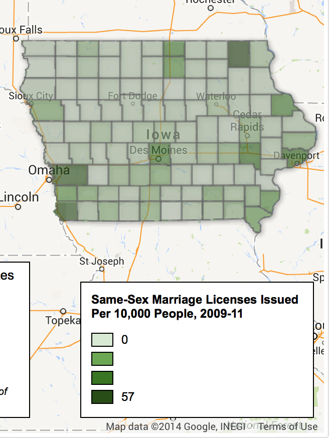
Number of licenses divided by population * 10,000
This is an accidental population map.
(Don't do it!)

via xkcd
Please.
Please.
Please.
Please.
FACT CHECK YOUR WORK
It's all still journalism. Accuracy counts.
via Mapfail Tumblr
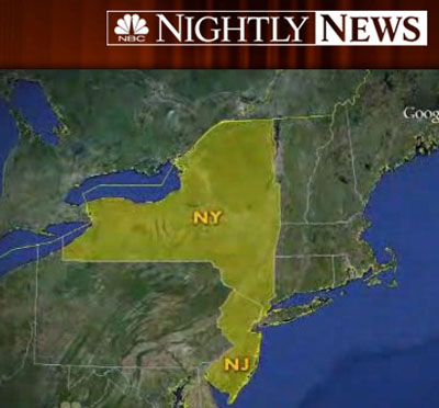
via Mapfail Tumblr
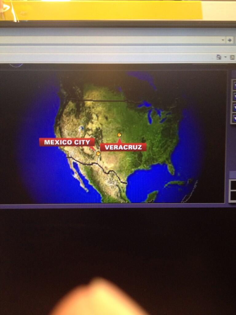
via Mapfail Tumblr
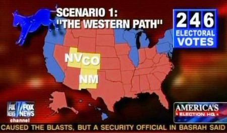
via Geographer At Large
People are very trusting of maps
If you’re going for click-baity, be as accurate as possible.
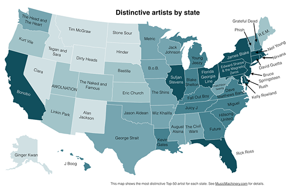
What's your state's favorite band/artist?
BETTER: What's your state's most distinctive band/artist?
That's why it's important to contextualize, especially if there are outliers.
What’s the most dangerous neighborhood in New York City? The answer may shock you.

What’s the most dangerous neighborhood in New York City? The answer may shock you.
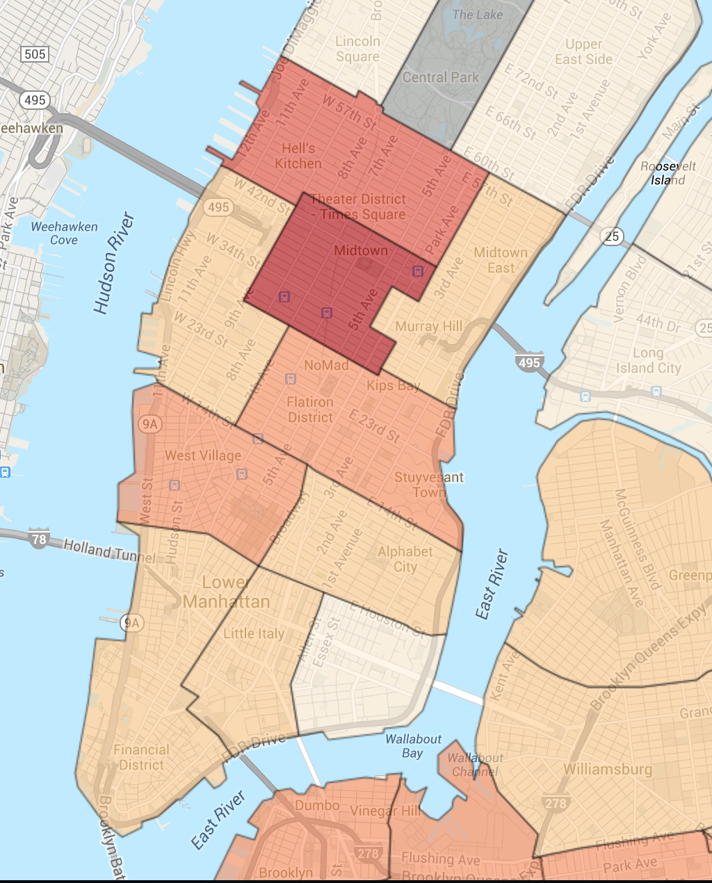
Is Midtown really the most dangerous neighborhood? Could it be because of all the people out there during the day increases the chances of crime happening? Also, what kind of crime does the map include: murder, robbery, rape, etc.?
Treat data like you would any other source
ALWAYS BE SKEPTICAL
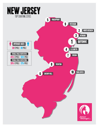
Where do New Jersey's cheaters live?
Explain the limits in your data
Because it's very easy to mislead
 Read "How to Lie with Maps" by Mark Monmonier for more.
Time for some Google Fusion Tables
- With lots of pictures
- And lots of GIFS!
Choropleth Map
What we want:
Take the data from the Census and make it plug it into shapefiles to show the Median Household Income for Asians living in New Jersey.
Get data from the Census
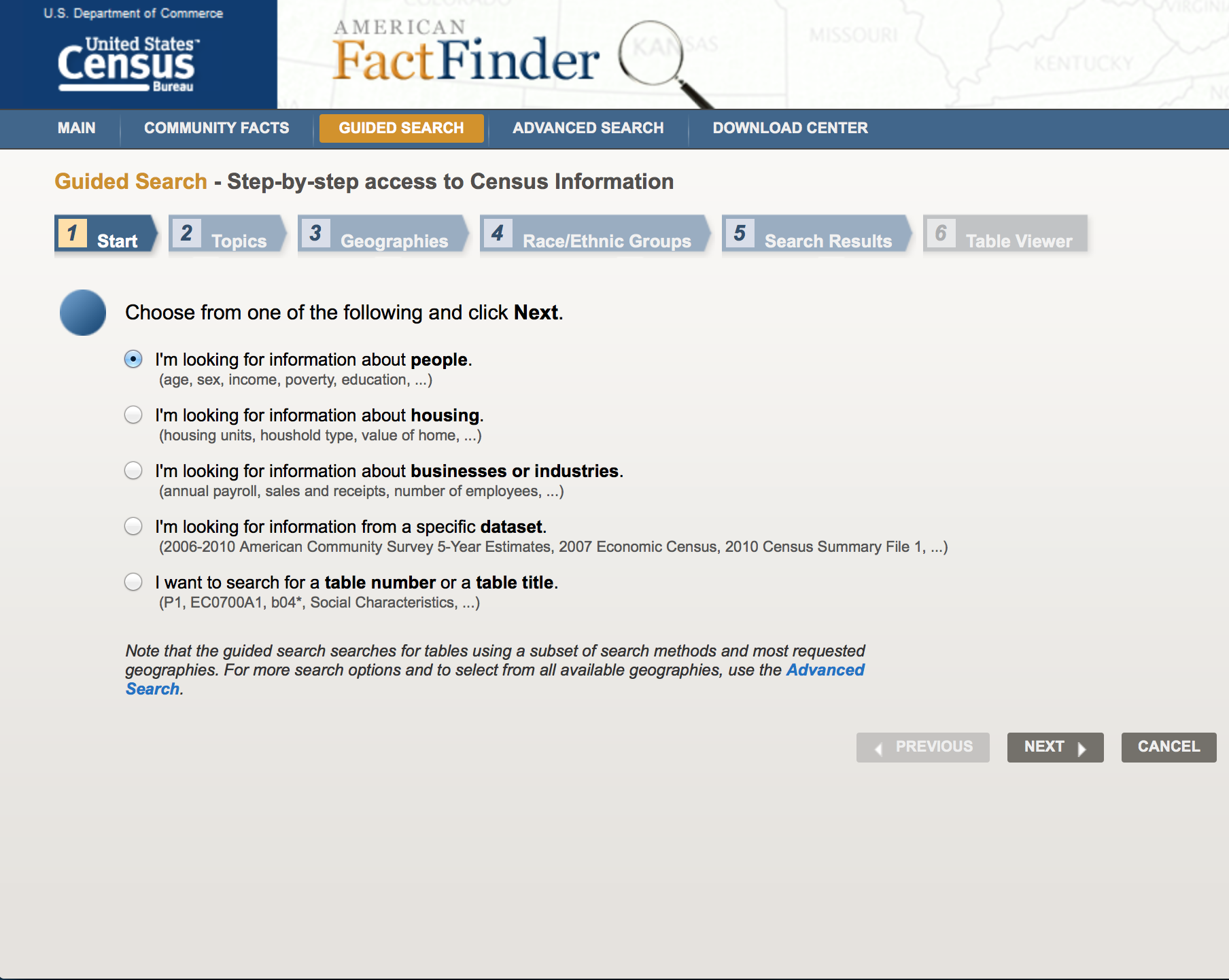
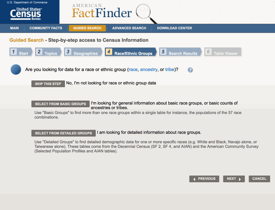
Go to American Fact Finder Site and click "Guided Search"
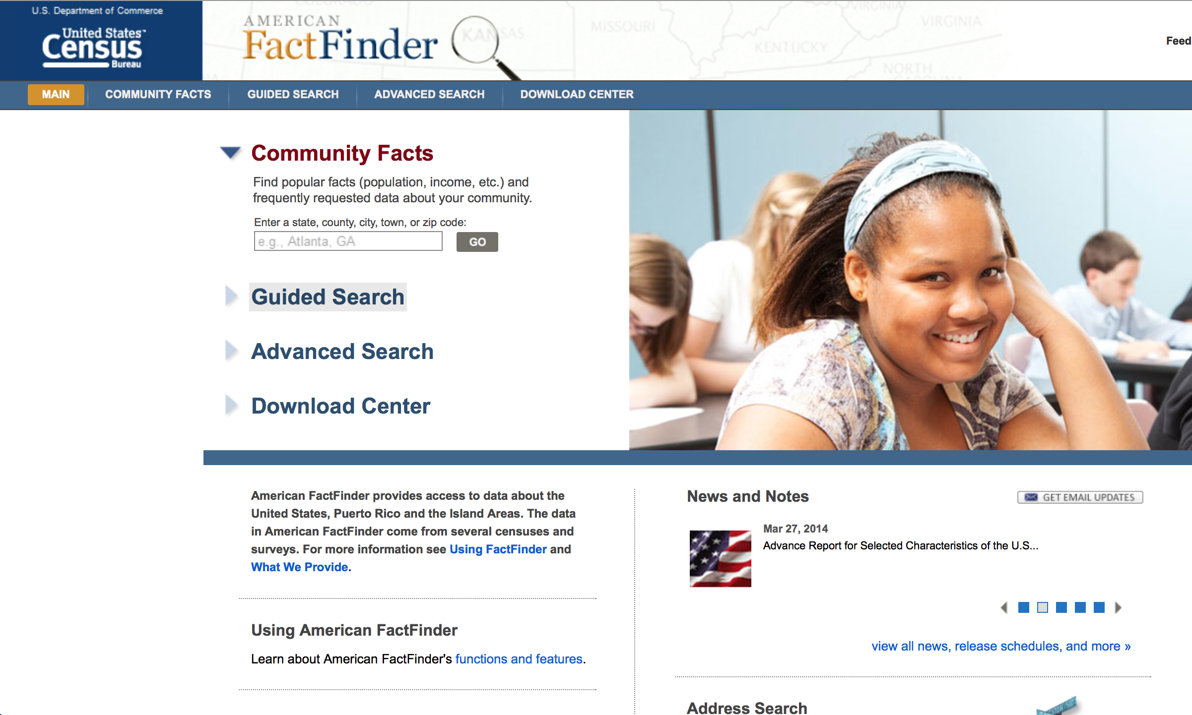
This is what your page should look like.
Click Next and then add Income/Earnings (Households) to your topics.
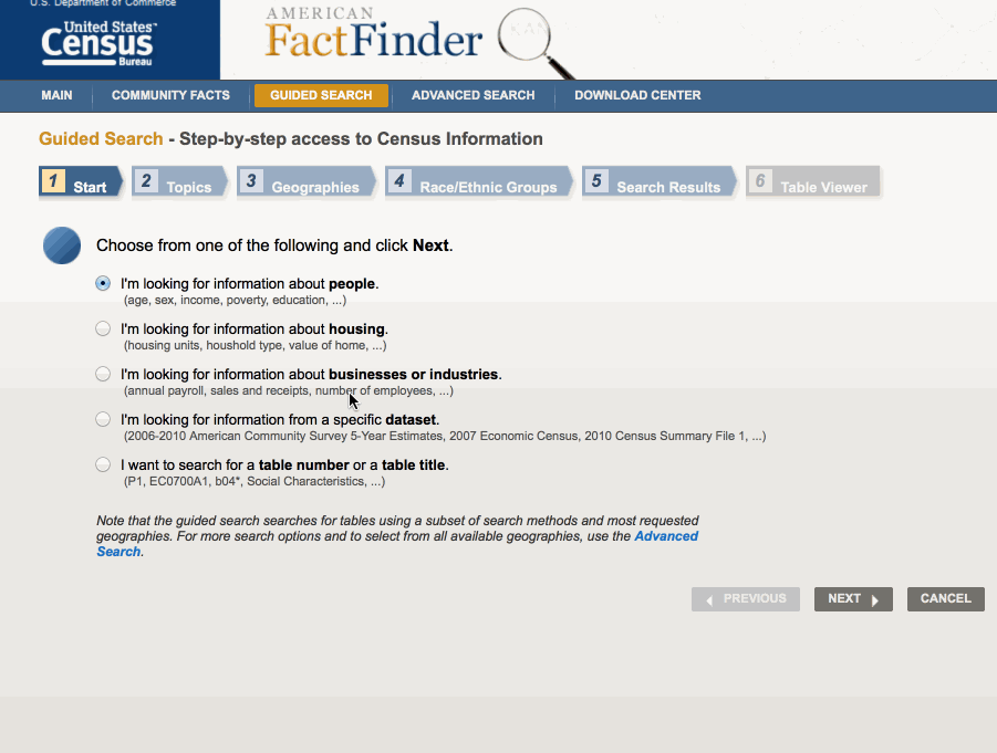
After you hit next, this is what it should look like.
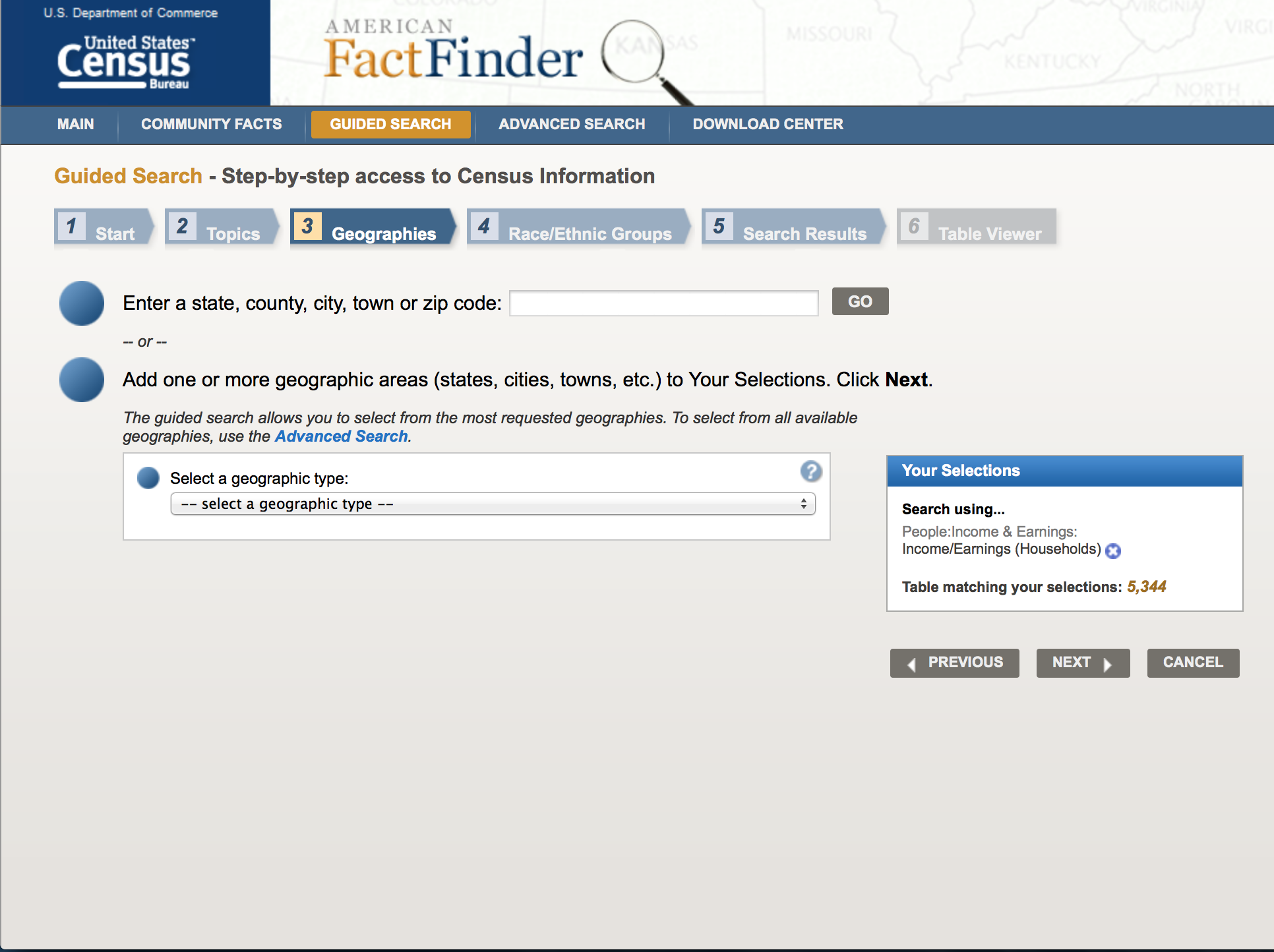
Select a "Geographic Type" of County and then select "New Jersey" as state. Then click on the option "All Counties within New Jersey". Hit next.
After you hit next, this is what it should look like.
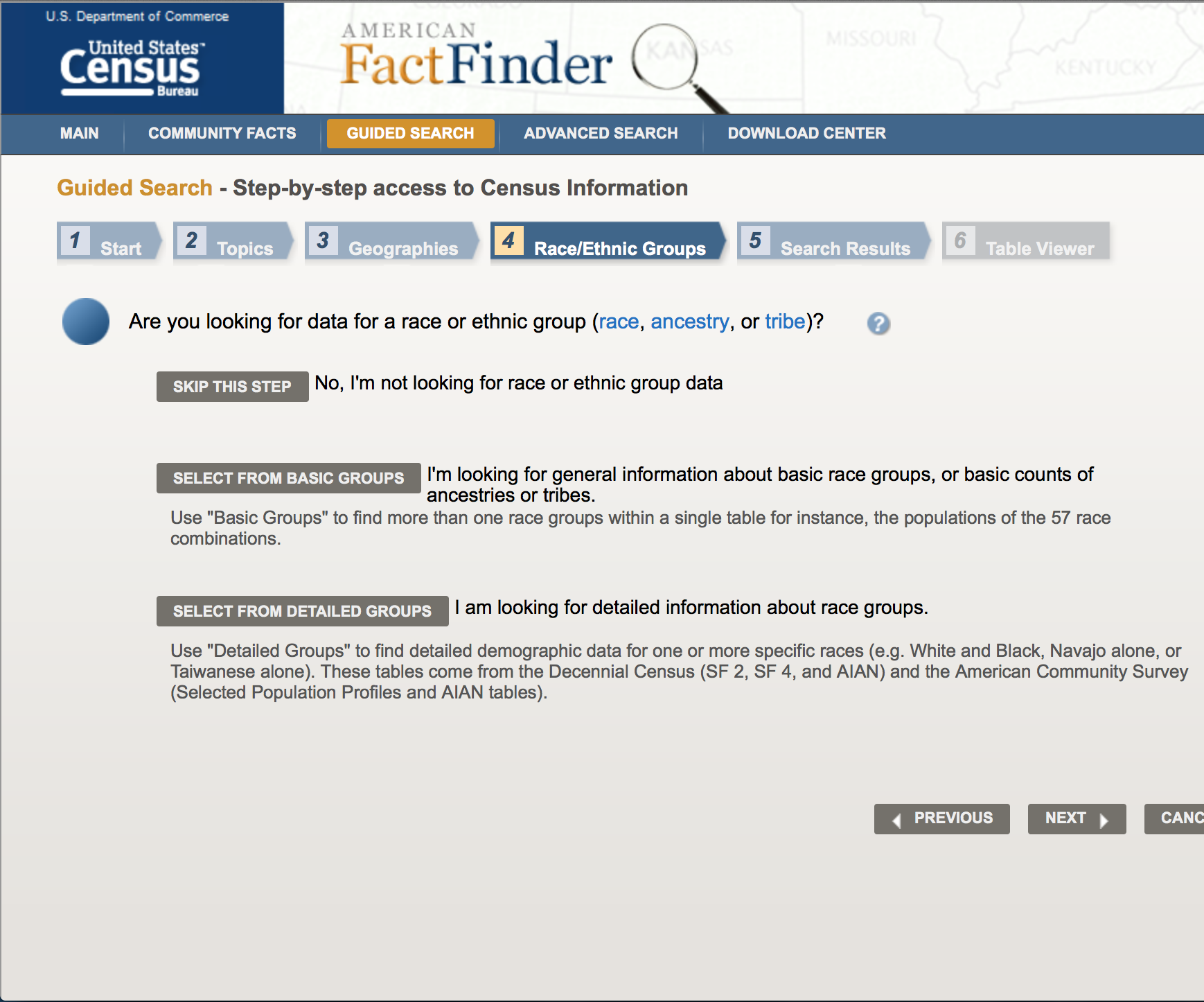
Click on "Select from Basic Groups" and then click on "Asian". Hit next.
Out of all options, let's select B19013D -MEDIAN HOUSEHOLD INCOME IN THE PAST 12 MONTHS (IN 2012 INFLATION-ADJUSTED DOLLARS)(ASIAN ALONE HOUSEHOLDER) 2012 ACS 5 Year Estimate.
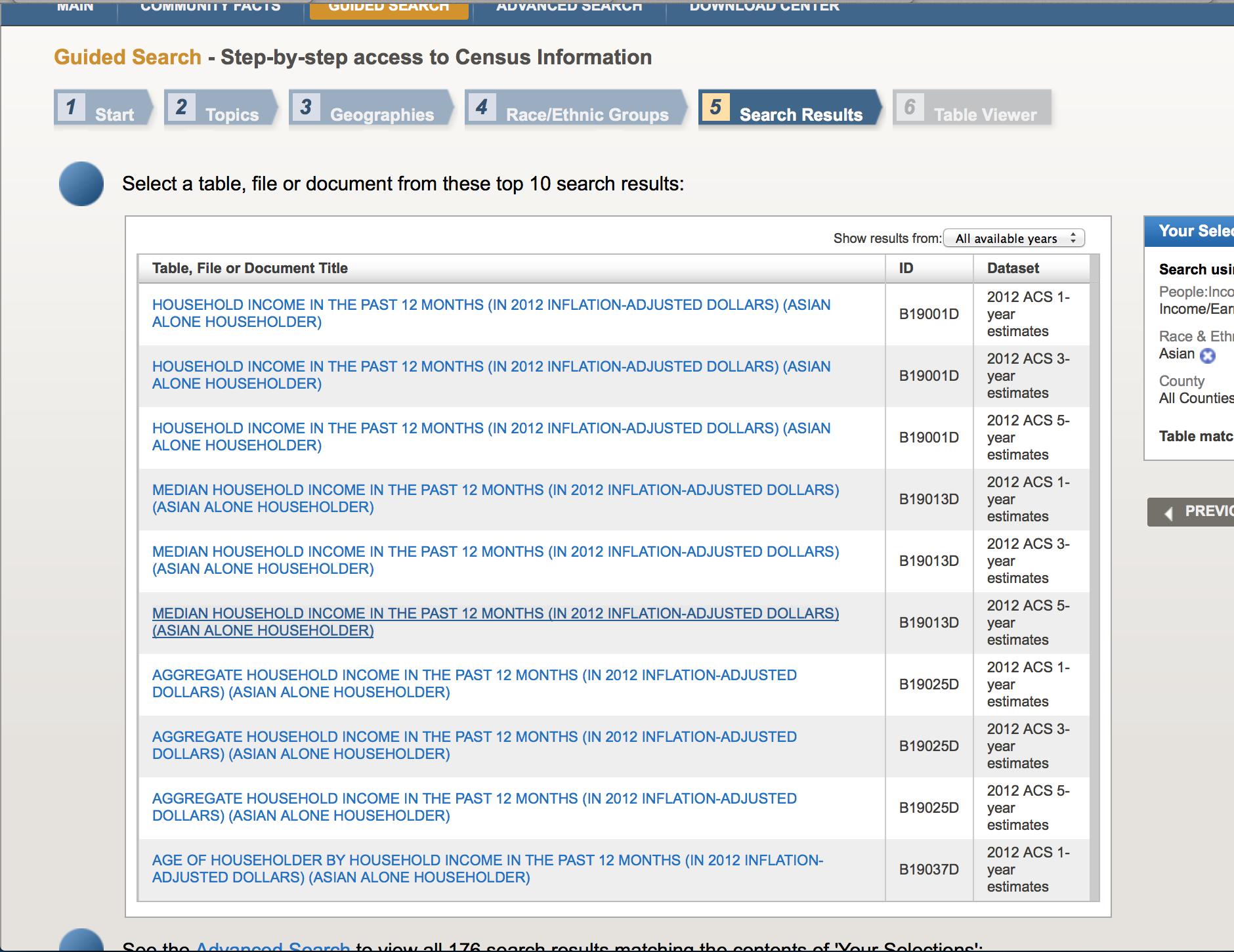
This is what it should look like.
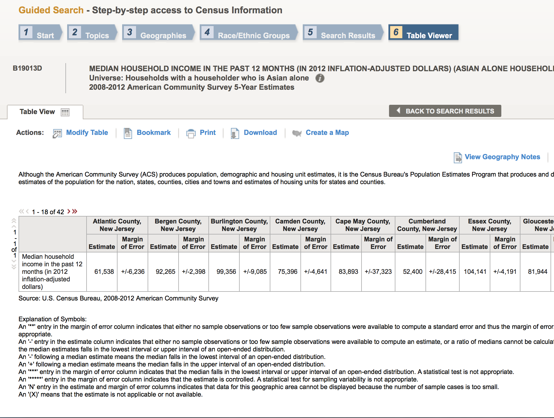
Click "Download" to Download the data.
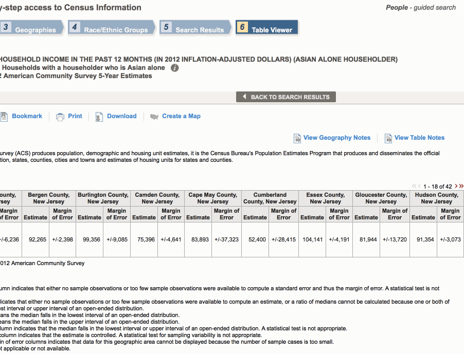
Find your file. Remember that we are gonna be working with ends with "...with_ann.csv"
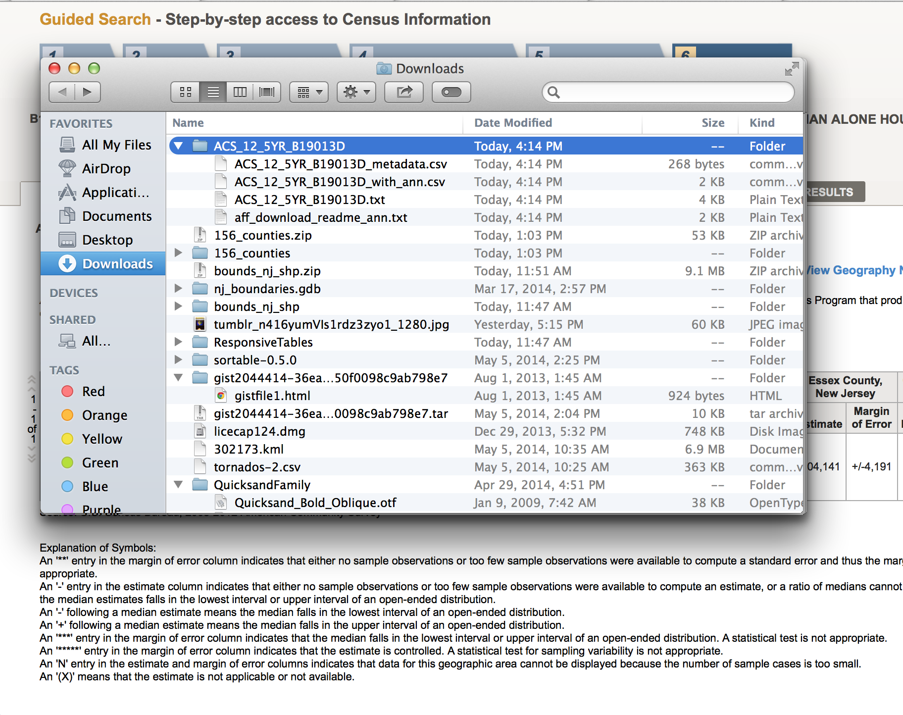
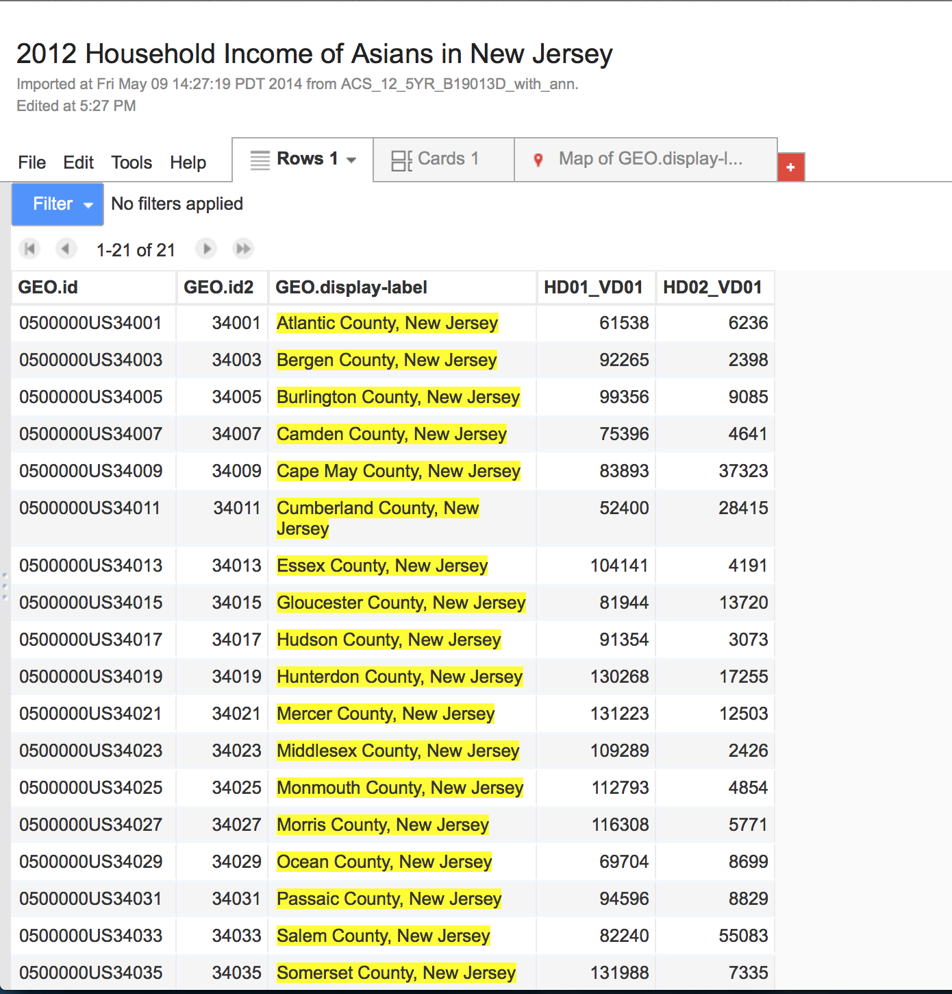
Good job! We have data.
Here's the link to the data:
Now to upload!
Let's go to Google Drive.
Go to the folder in Google Drive where you want to upload your file.
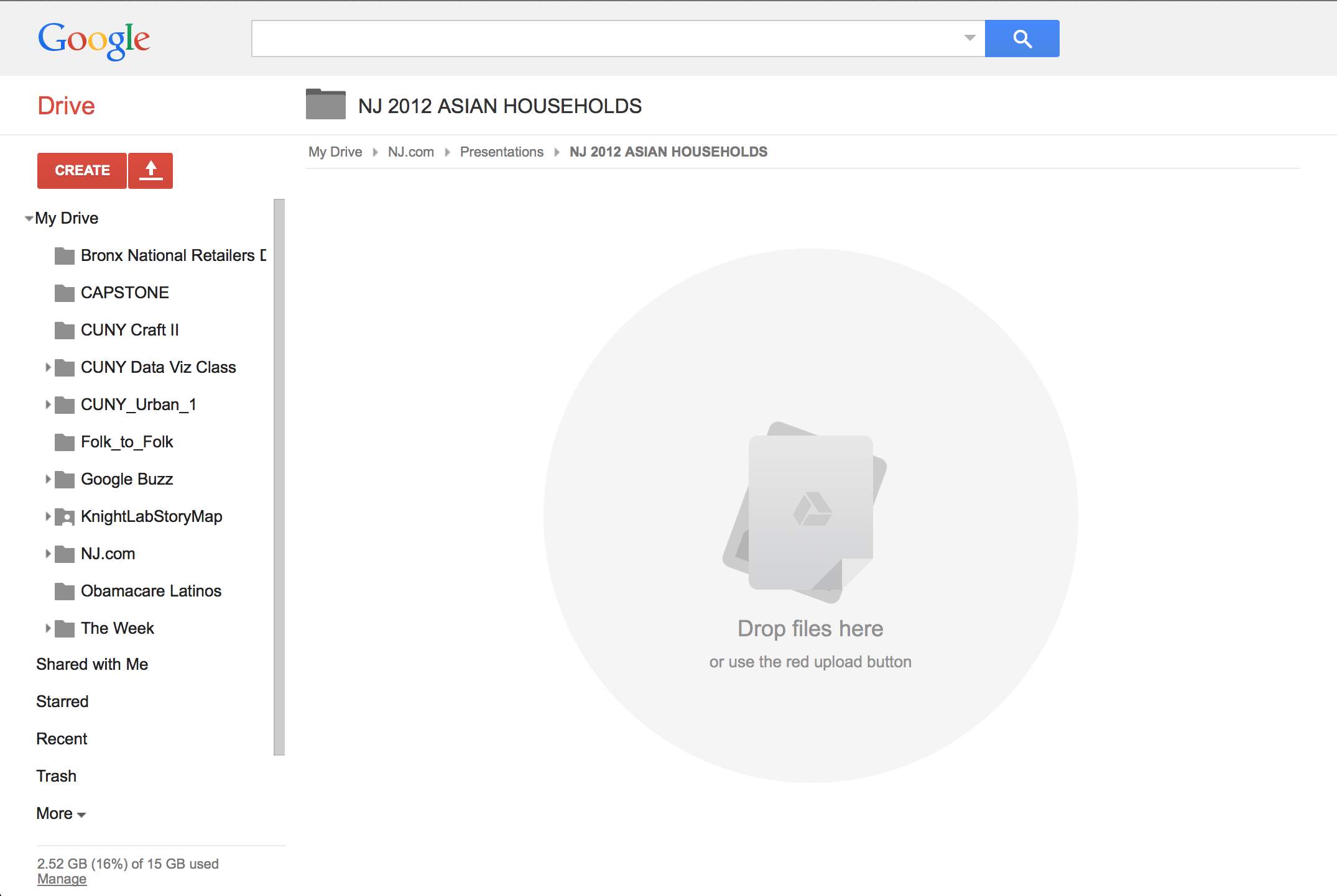
Upload your file into Google Drive.
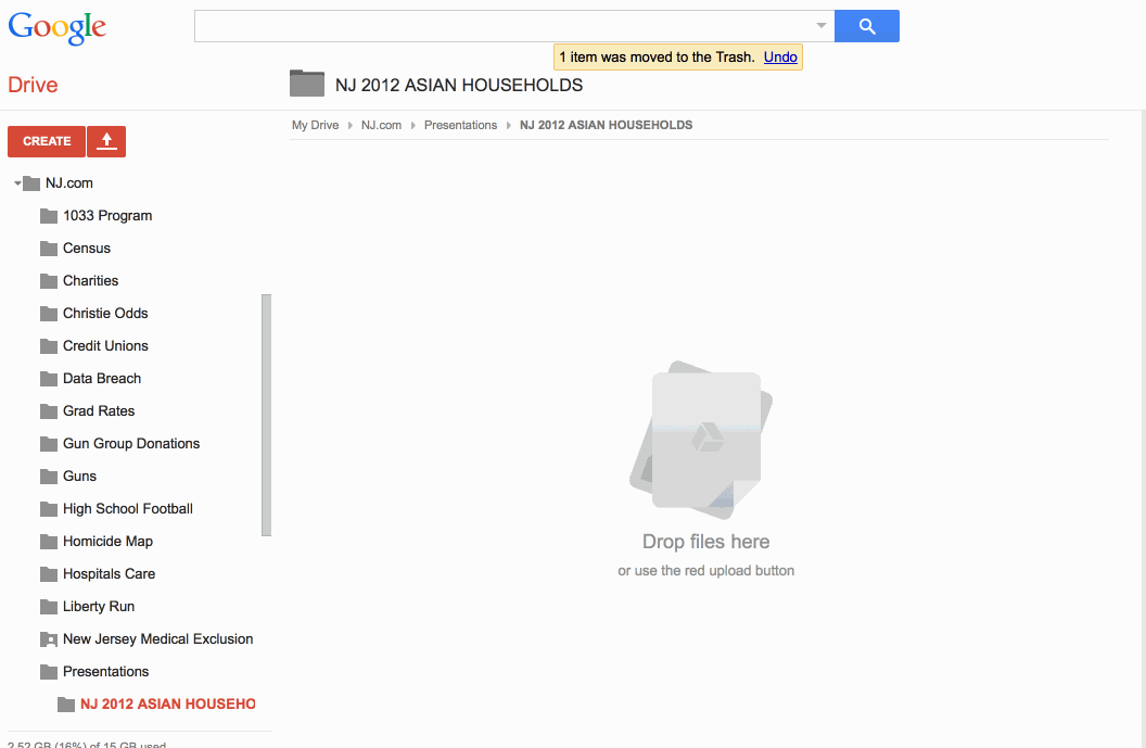
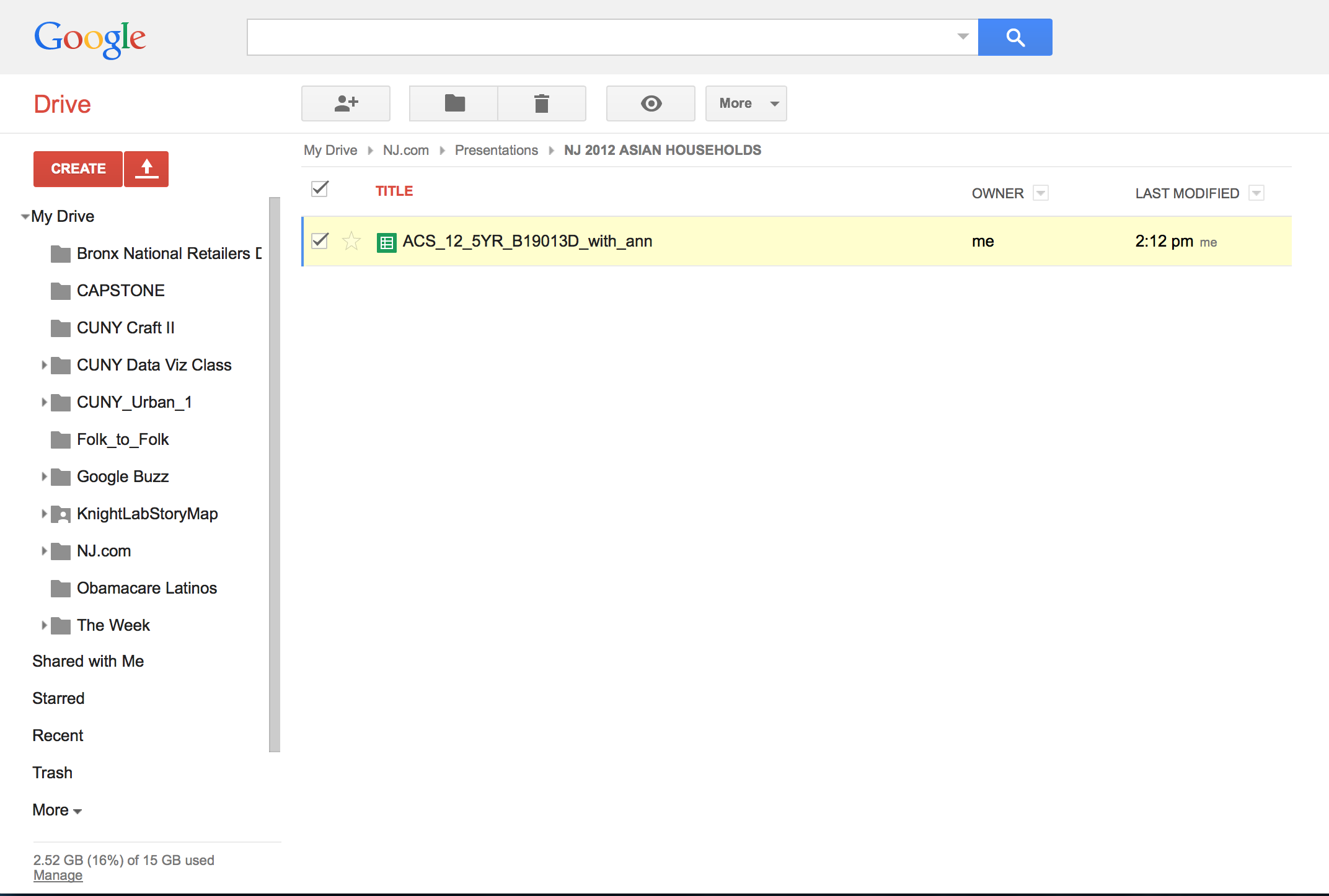
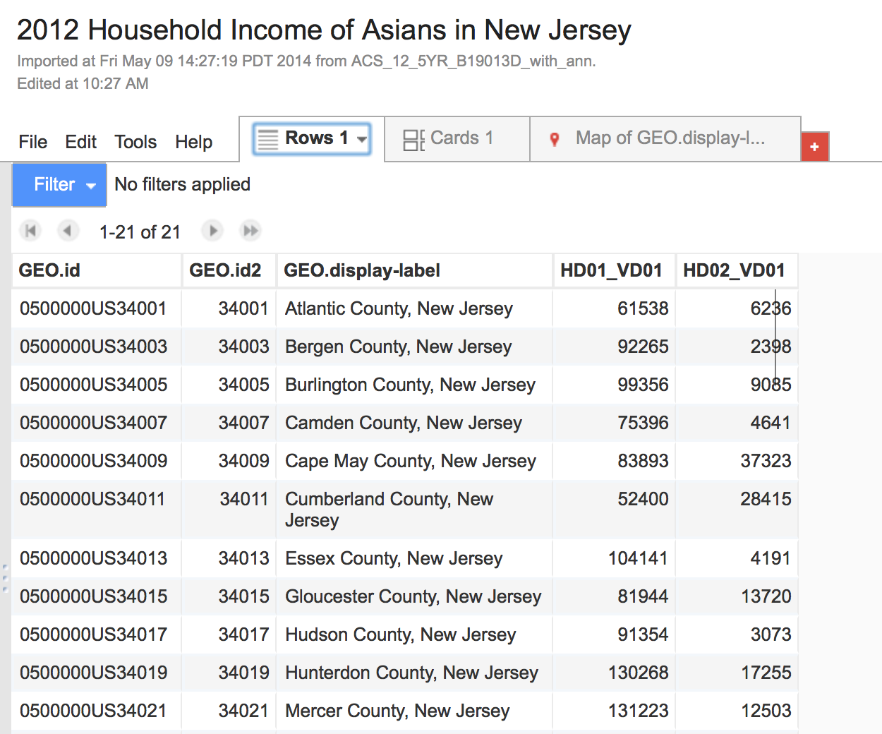
Click on your file. This is what it should look like.
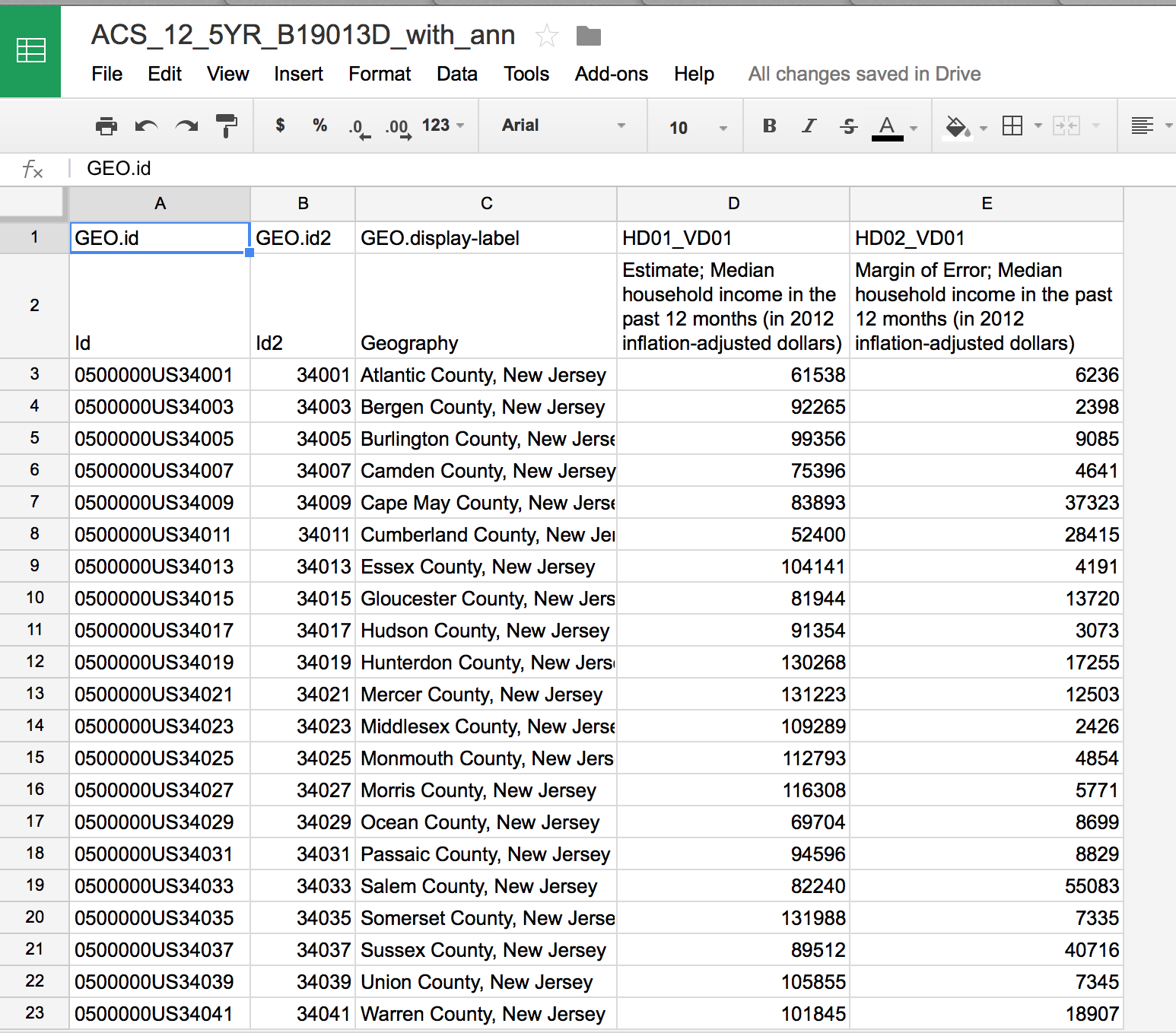
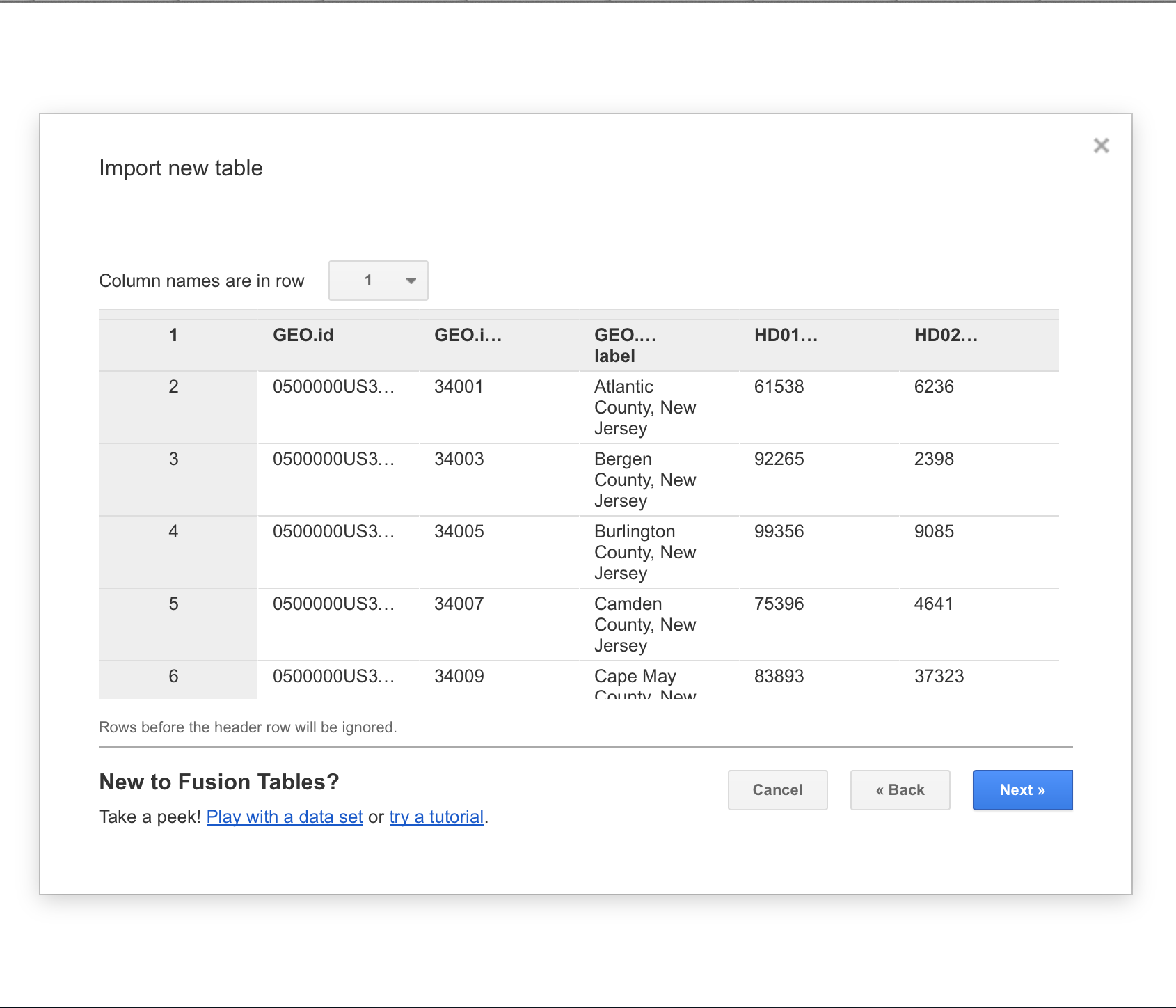
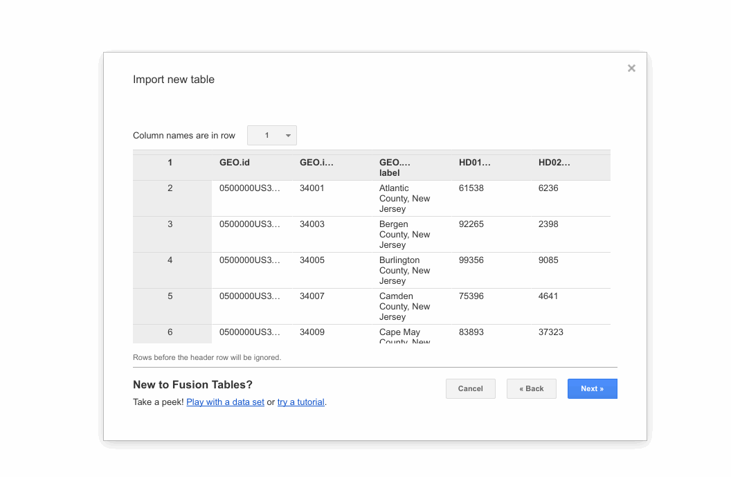
We only need one row to be the header. Erase the second row.
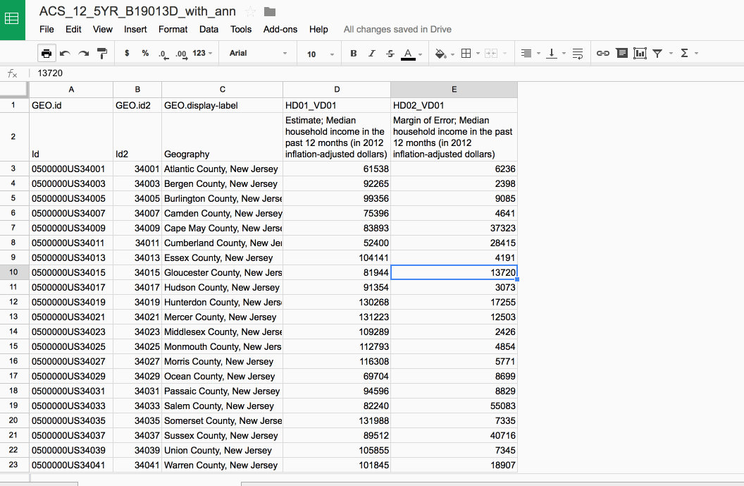
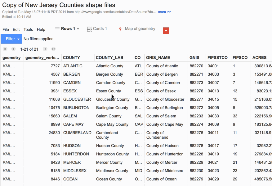
This is what it should look like. Pay attention to the column named GEO.id2. This is the individual ID for each county. This will come in handy later.
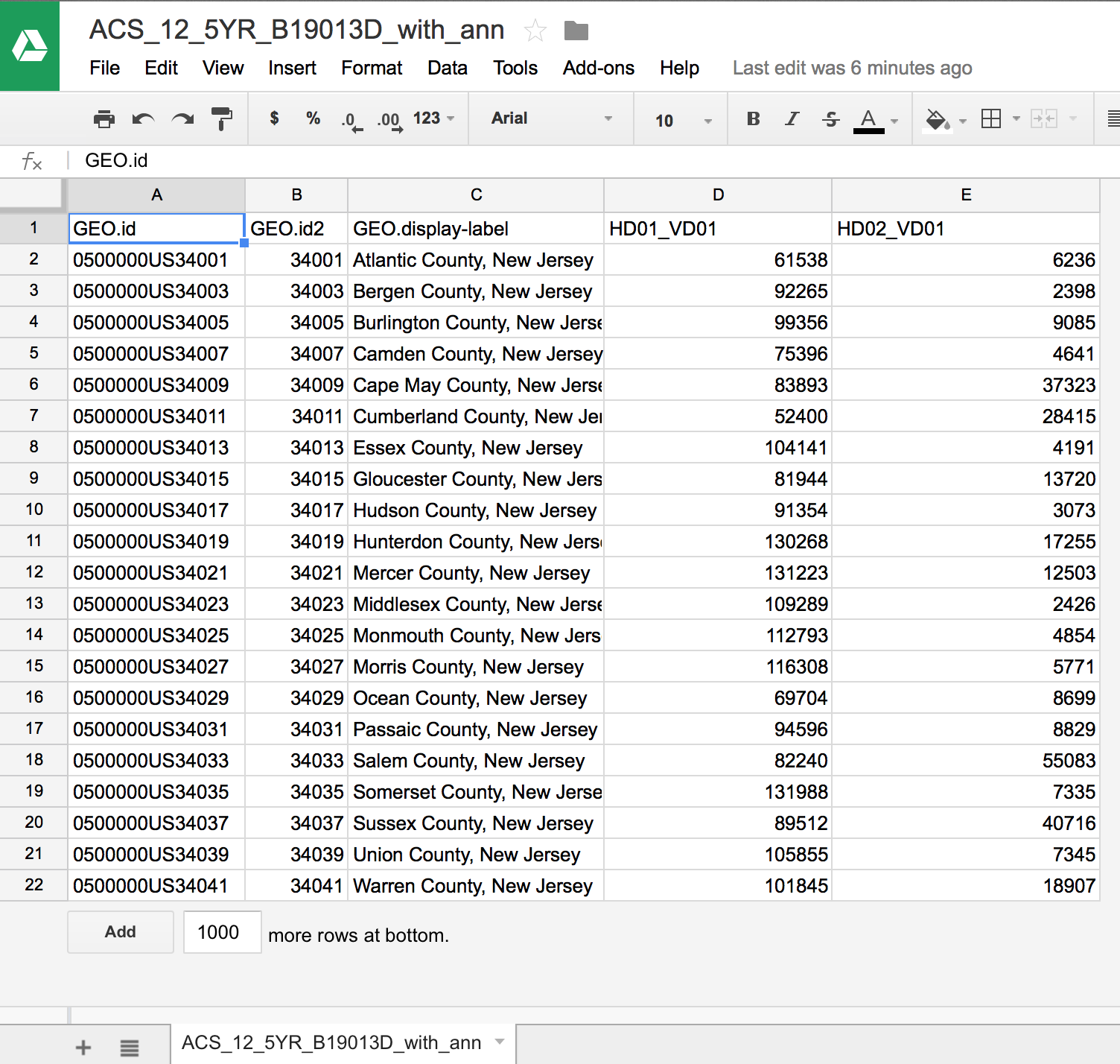
Go back to your Google Drive menu and let's create a Google Fusion Tables
Click "Create" and then select Fusion Tables (experimental). If you haven't already uploaded your file, click "Choose Files". However, if your file has already been uploaded in Google Drive, on the menu on the left side, select "Google Spreadsheets" (as shown below). Click on the spreadsheet you want to upload and click "Select"
This is what it should look like. Click "Next"
It will ask you for "Table name" and a whole bunch of attribution information that you can fill out. Click "Finish" when you're done.
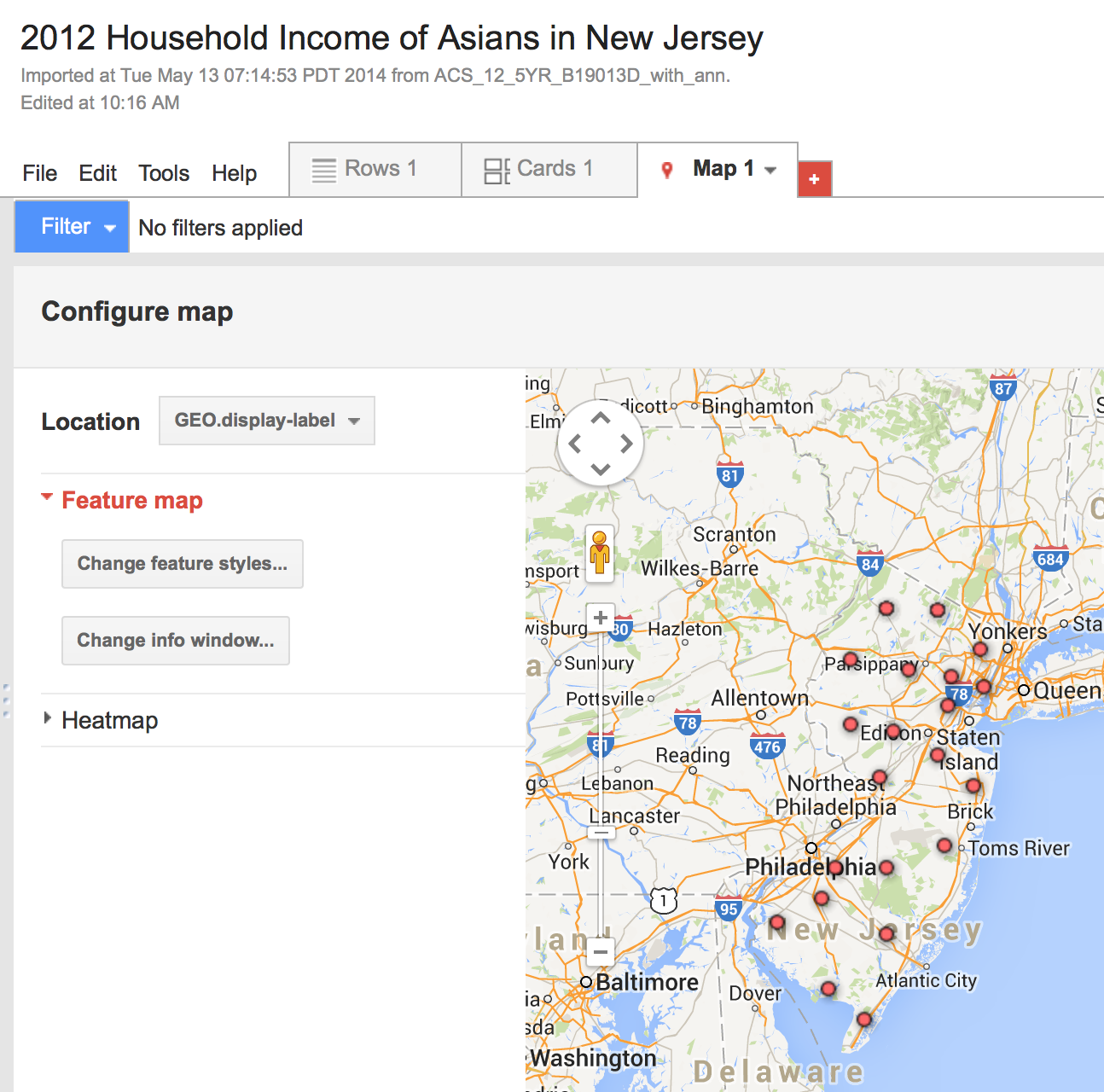
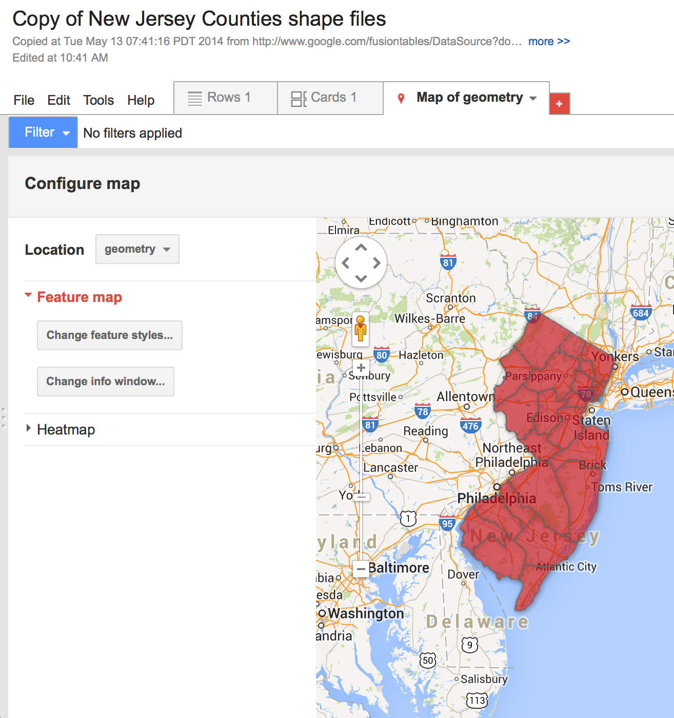
This is what it looks like. Click on the Map tab at the top right to see what the map looks like.
Right now, it's using the name of the county as the "location" of the county. Google basically thinks that the middle of the county. That's not what we want though.
This is where shapefiles come in!
A little bit about shapefiles
- Shapefiles is vector data that spatially describes geographical data.
- It's GIS data, which we talked about earlier today!
- The ones we want represent the shapes of our counties.
- Two types of shapefile formats you're usually going to be dealing with:
- .shp or ESRI shapefiles
- .kml or Keyhole Markup Language
- Google Fusion Tables only accepts .kml files
- But a lot of gov't agencies deal mostly with .shp
A little bit about shapefiles
- Luckily, you can use Shape Escape to turn a shp file into a kml file.
- It saves it right into your Google Drive.

Get the shapefile
What it should look like.
Please make your own copy of it to store in Google Drive.
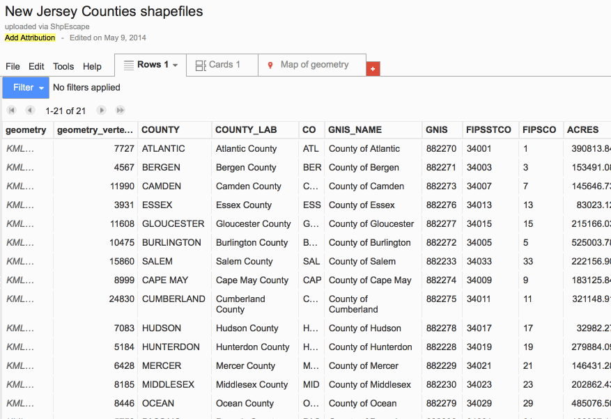
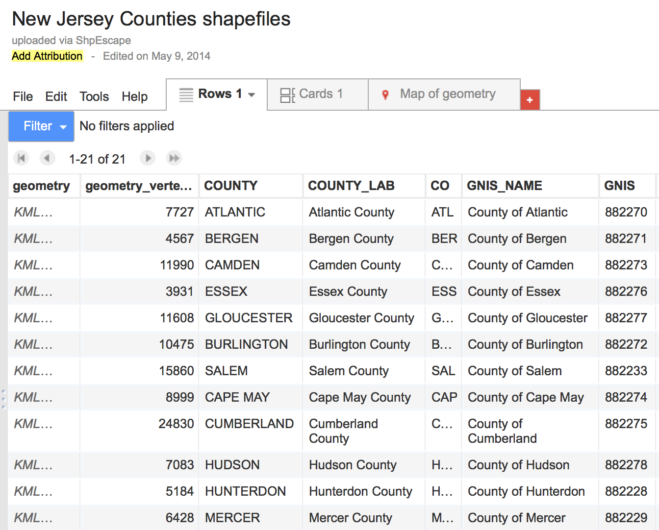
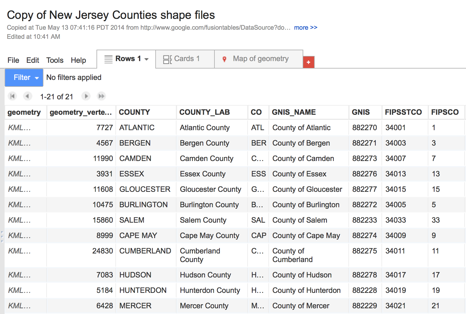
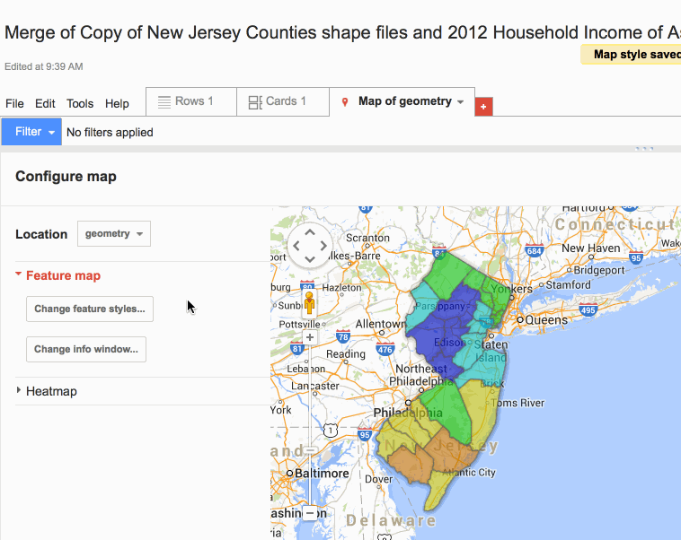
This is what it should look like. Look at the column "FIPSTCO". Those numbers should look familiar. (Again, this is gonna be important later.) Click on "Map of Geometry"
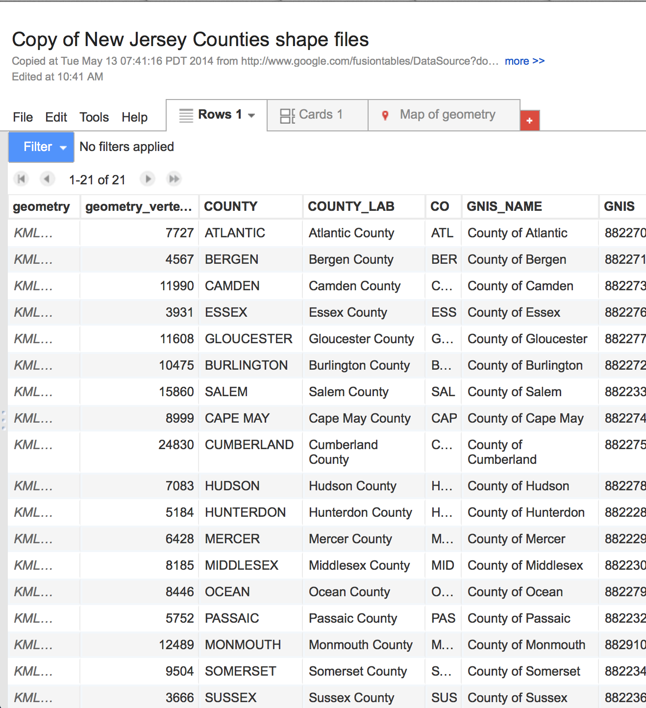
And you'll see that those are our shapefiles of the counties.
But it doesn't have our income data!
So now our goal is to merge this table--
-- with this one.
So let's merge.
Let's take our New Jersey County shape file Google Fusion Table and merge it.
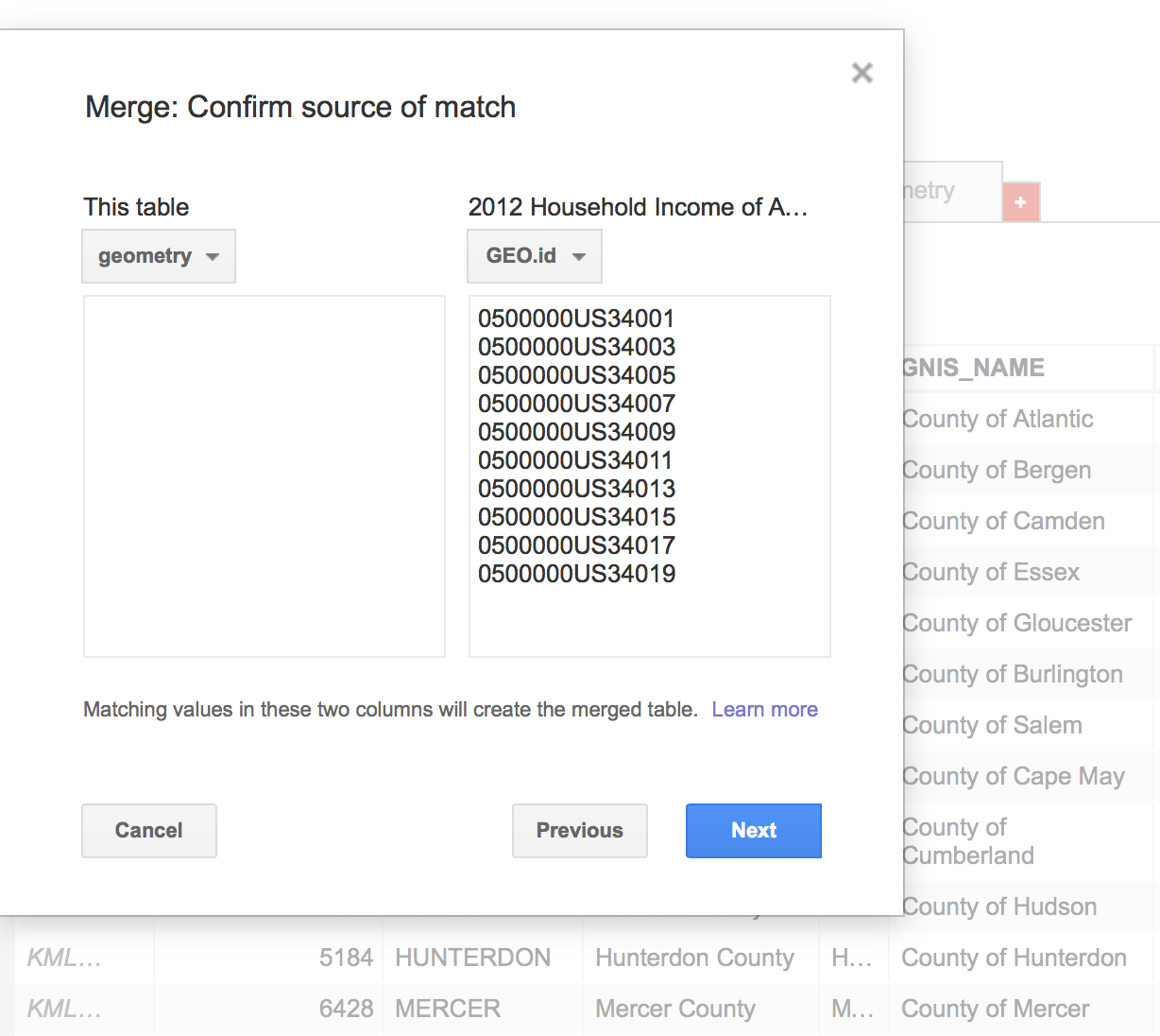
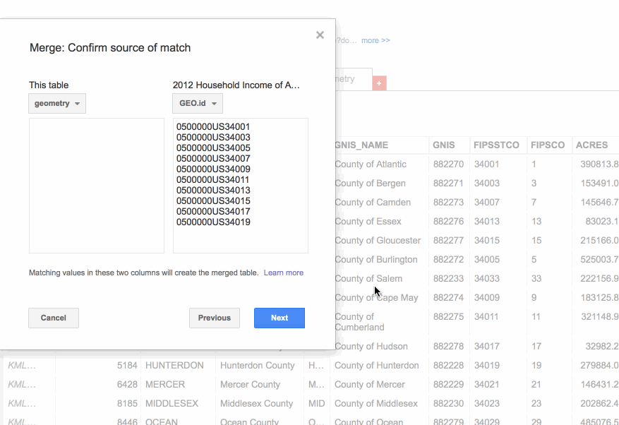
Click File, then Merge and select the table you want to merge it with (2012 New Jersey Asians Household Income table)
In the pop-up window, asks you which columns from each table you want to match. The values in the columns should be identical in order for the two tables to match and join correctly.
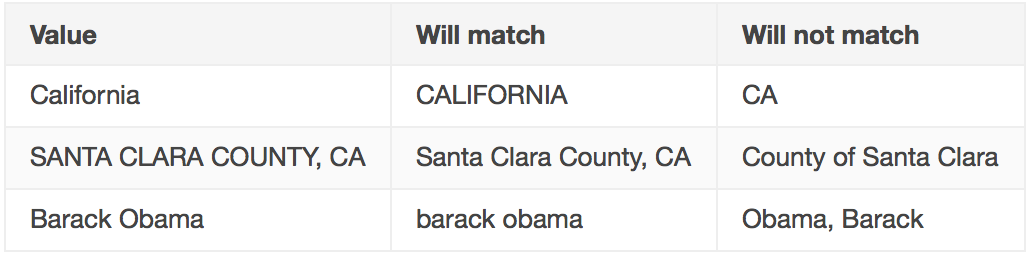
Matches in Google Fusion Tables are case-insensitive
Read this entry for more info about matching
If you remember, the "FIPSTCO" column in our Shapefile table is identical to the "GEO.id2" column in our income table. That's what we're going to use to match up the two columns! :)
In our pop-up window, under "This table", select "FIPSTCO" and for the "2012 Household Income..." table, select "GEO.id2". Click Next.
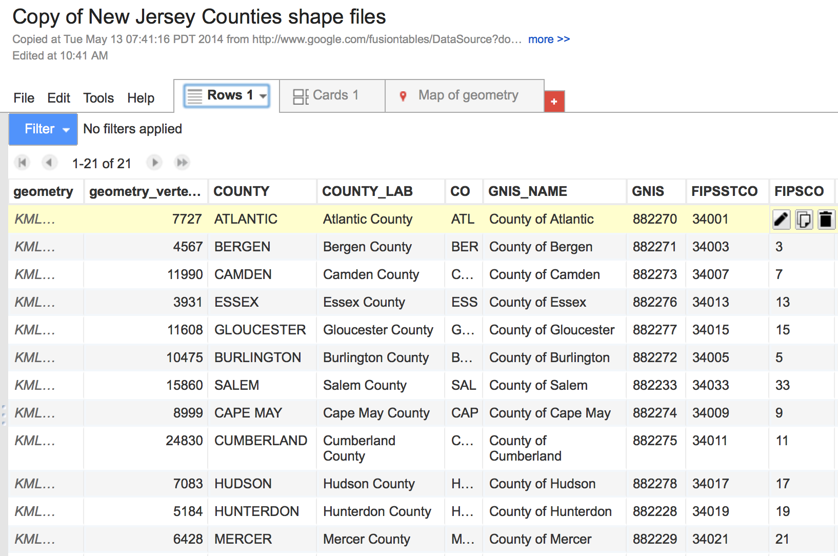
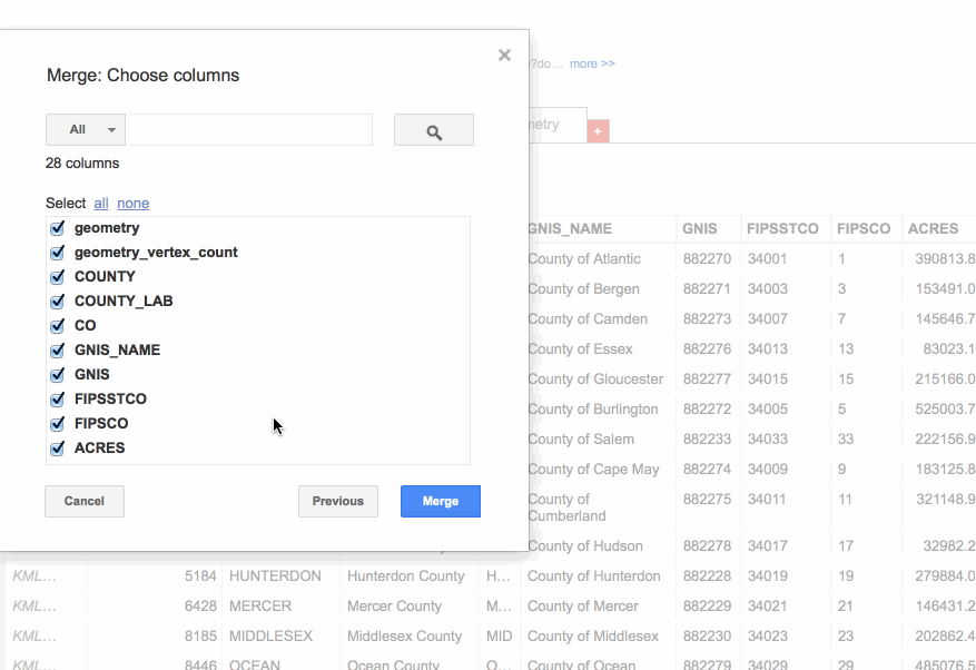
It's gonna merge ALL of the columns, and there are many of them (and some that we may not want at all). Google Fusion Table gives the option to take some out by unchecking the boxes next to the column names. Click Merge when you're done.
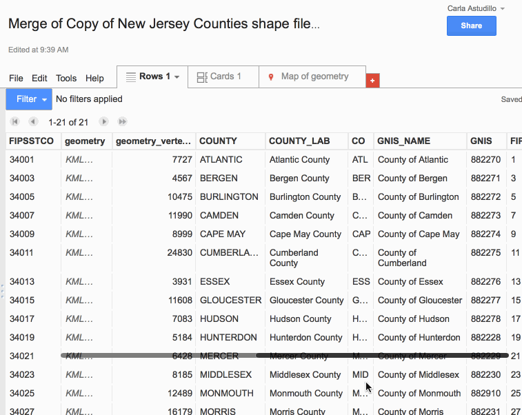
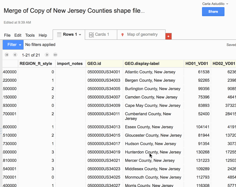
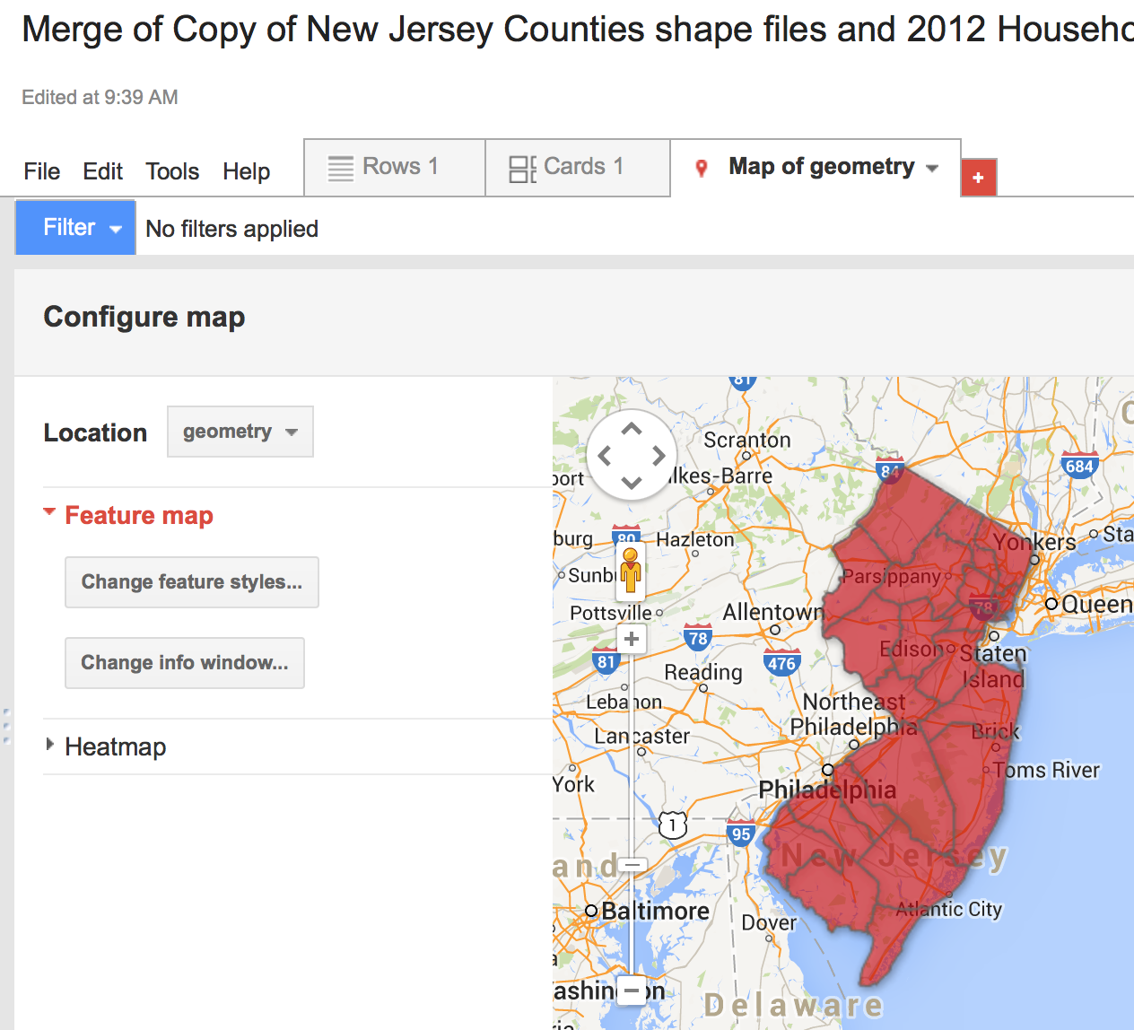
And our table is merged. Scroll over to the right to make absolutely sure that our table merged (and merged correctly!)
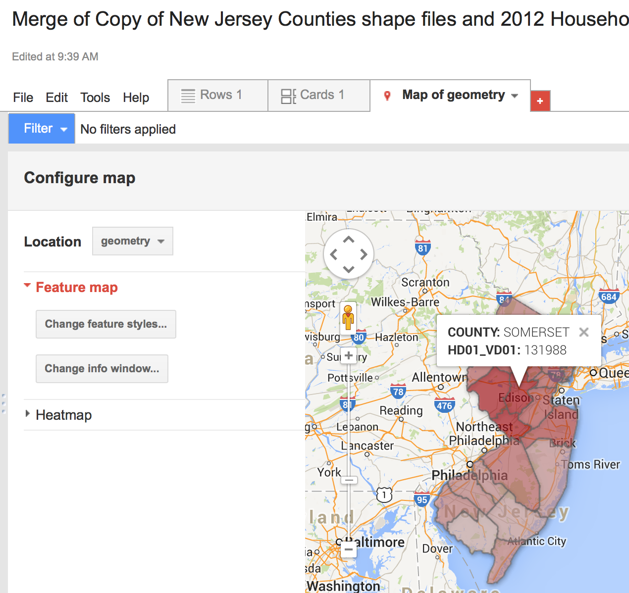
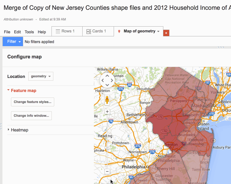
When you're done checking, click on "Map of geometry".
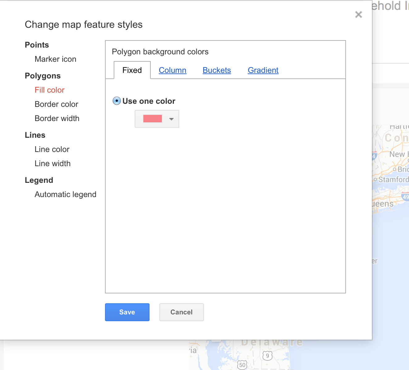
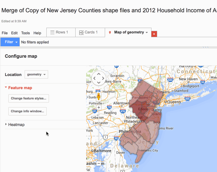
Take a look and it should look... the same... That's because we haven't assigned our income data into buckets (or equally divided increments). Let's do that. Click on "Change feature styles".
The pop-up window says that it's dividing them into one fixed color because we don't have buckets yet. So click on the "Buckets" tab and add some.
We can divide it into how many buckets we want and using whatever colors we want.
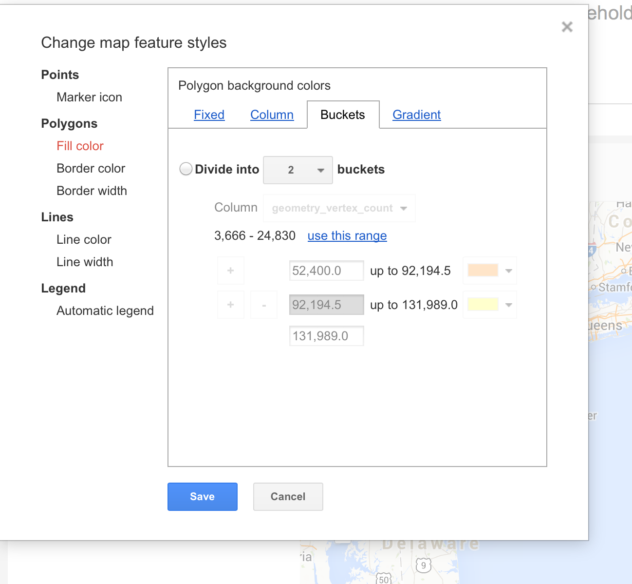
So let's add five buckets. And don't forget to changed the column to "HD01_VD01", which is the column with our income data. Then click on "Use this range" and make sure that the range matches the range of income data. Click "Save".
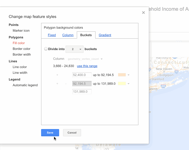
Those colors clash badly. Instead, let's add gradient which uses one color with many different shadings of that color. Click on the "Gradient" tab to do so.
You can add or delete a bucket if you want.

You can also change the county shapefile colors.
You can also change border color and width.

You can also change border color and width.
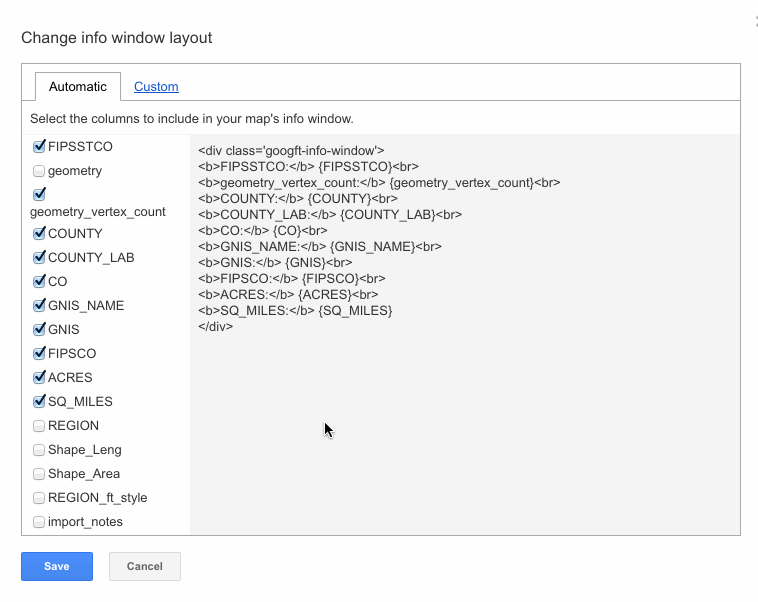
Let's customize the info window.
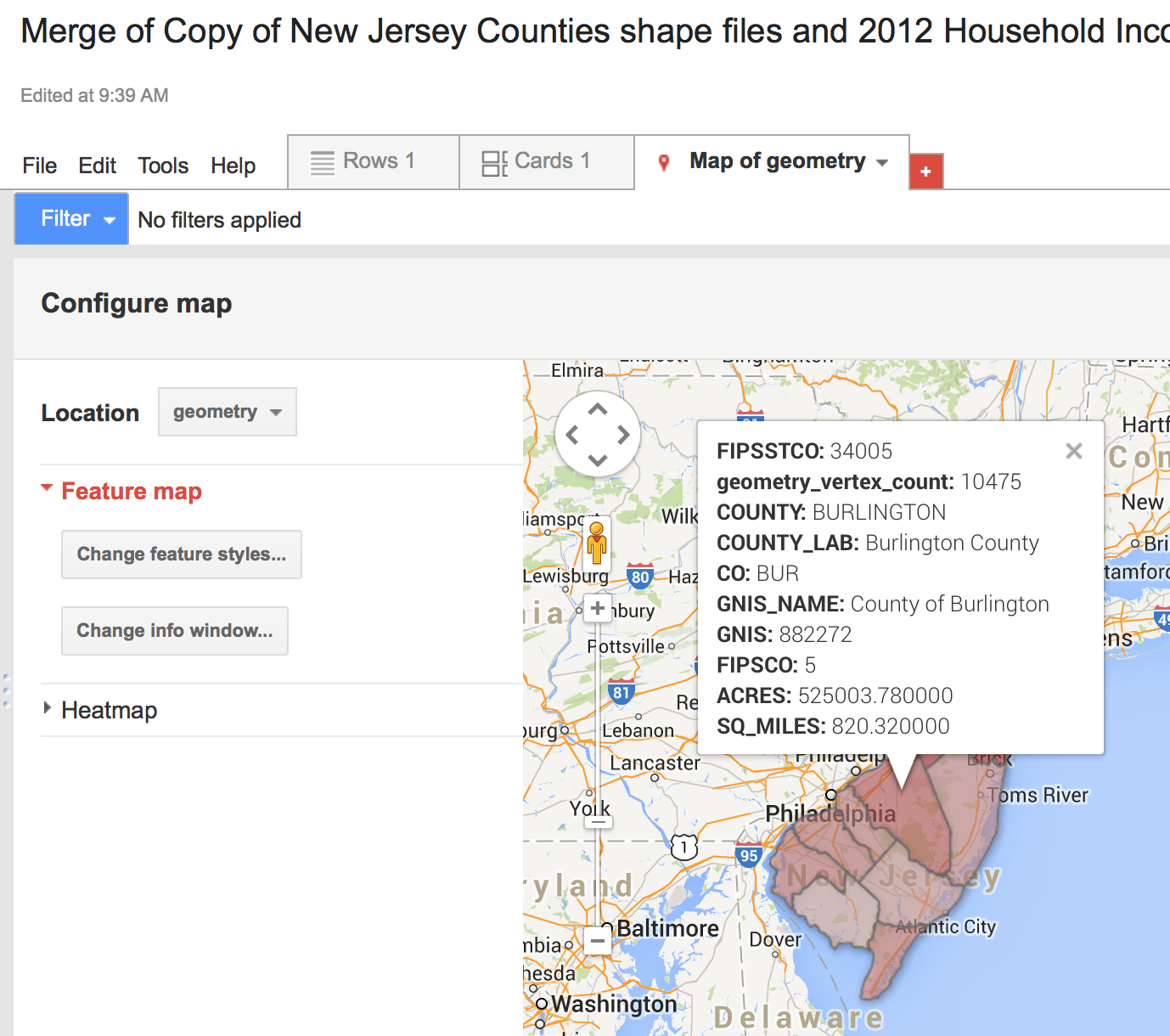
If you click on one of the counties, an info window pops up. However, you can't even see the income data! On the left-side menu, click "Change info window".
This is the window that should pop-up over your map. It gives you the chance to customize you info window.
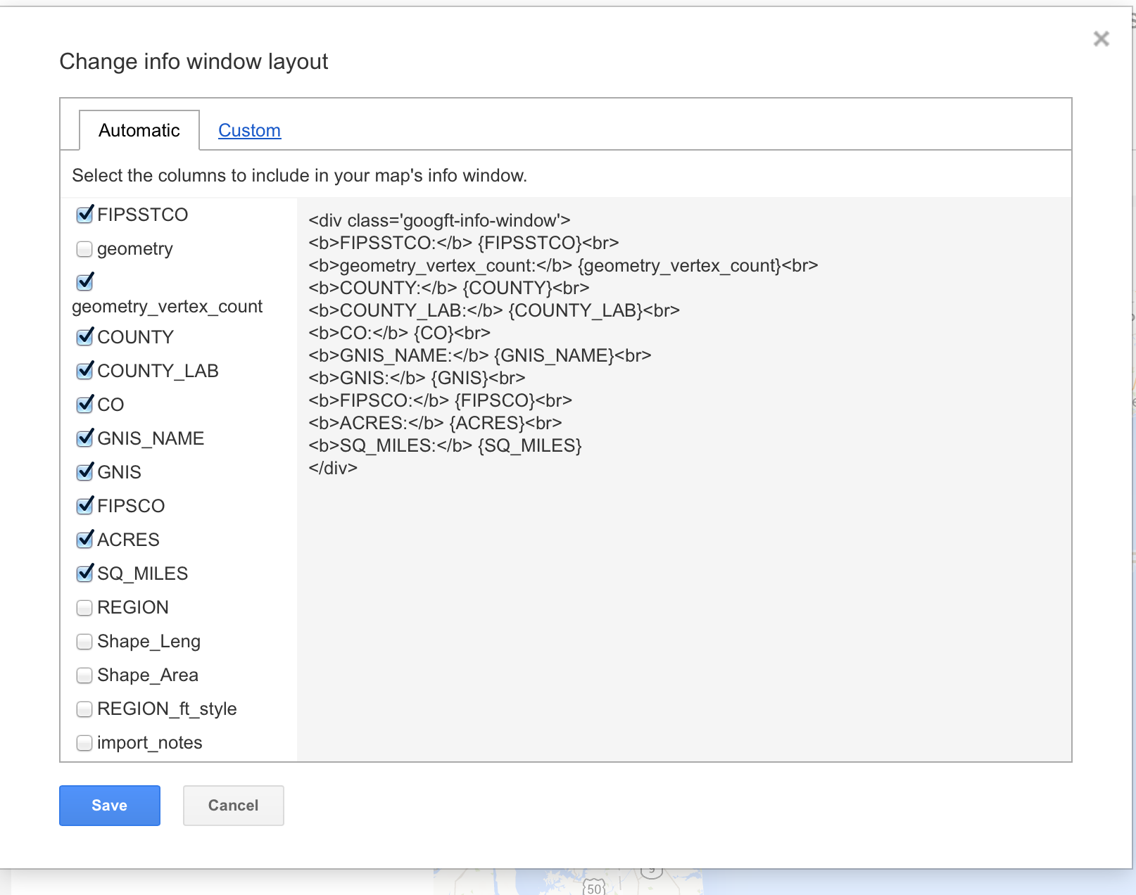
Uncheck whatever information (by column name) you DON'T want popping up on the info window. Check the column names that you DO, like county name or "HD01_VD01" (income census data)
Check it out! However, what if you don't want to change "HD01_VD01" or if you want to remove it altogether?
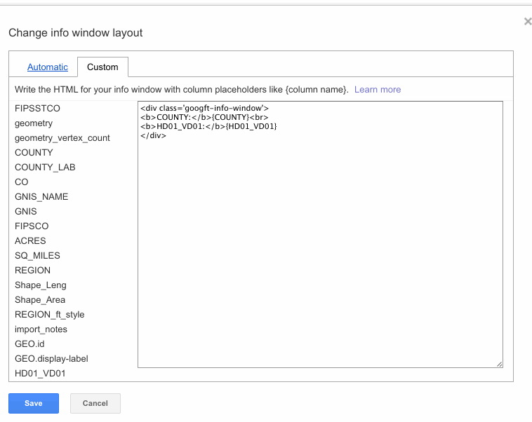
Go back to "Change info window" and then click on the "Custom" tab.
The curly brackets with the column names are the placeholders where your income data is gonna go. So we want to change the words wrapped in HTML tags to the left-- those are our titles.
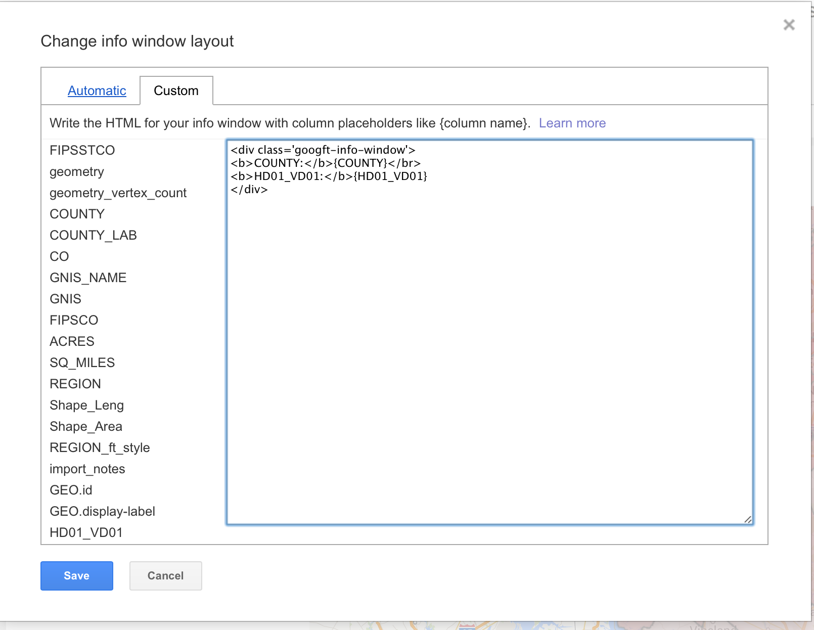
Change the title to something a little more appropriate. Click Save.
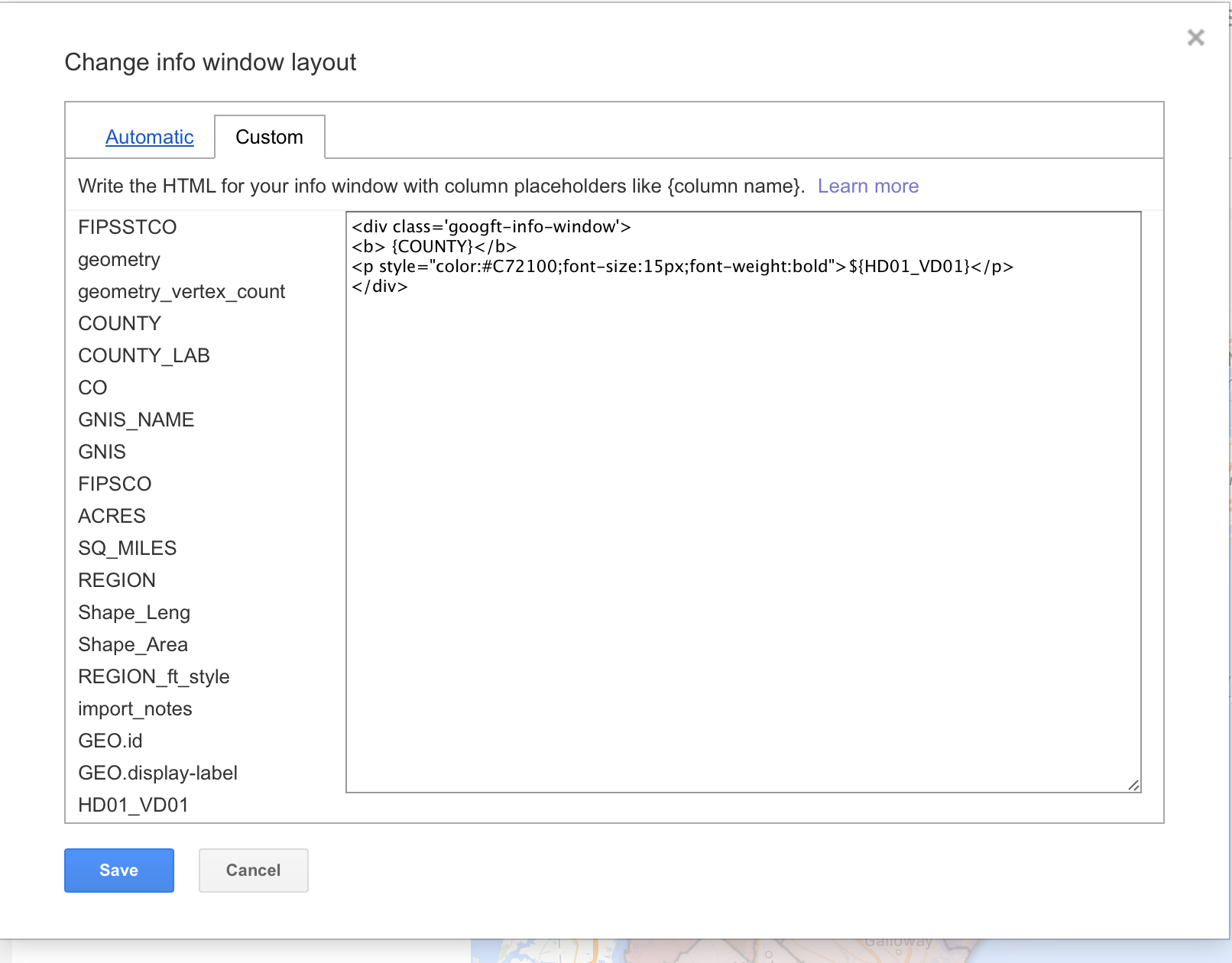
You can go back and add more HTML tags to decorate your info window as seen below. You can read more about adding styles using HTML here.
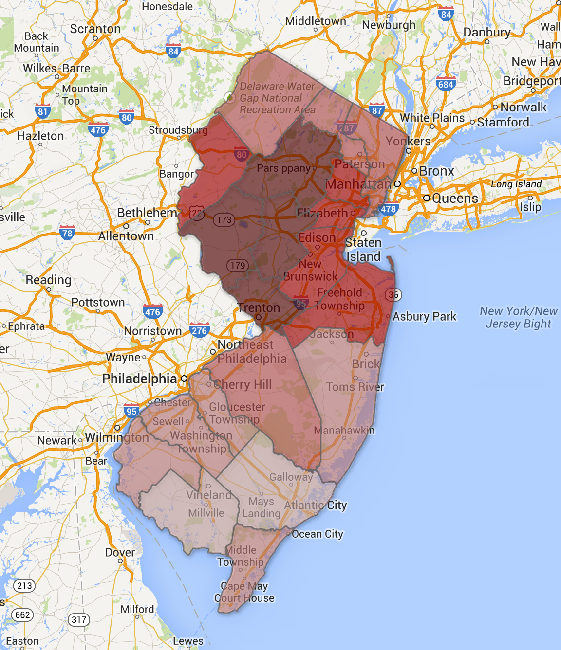
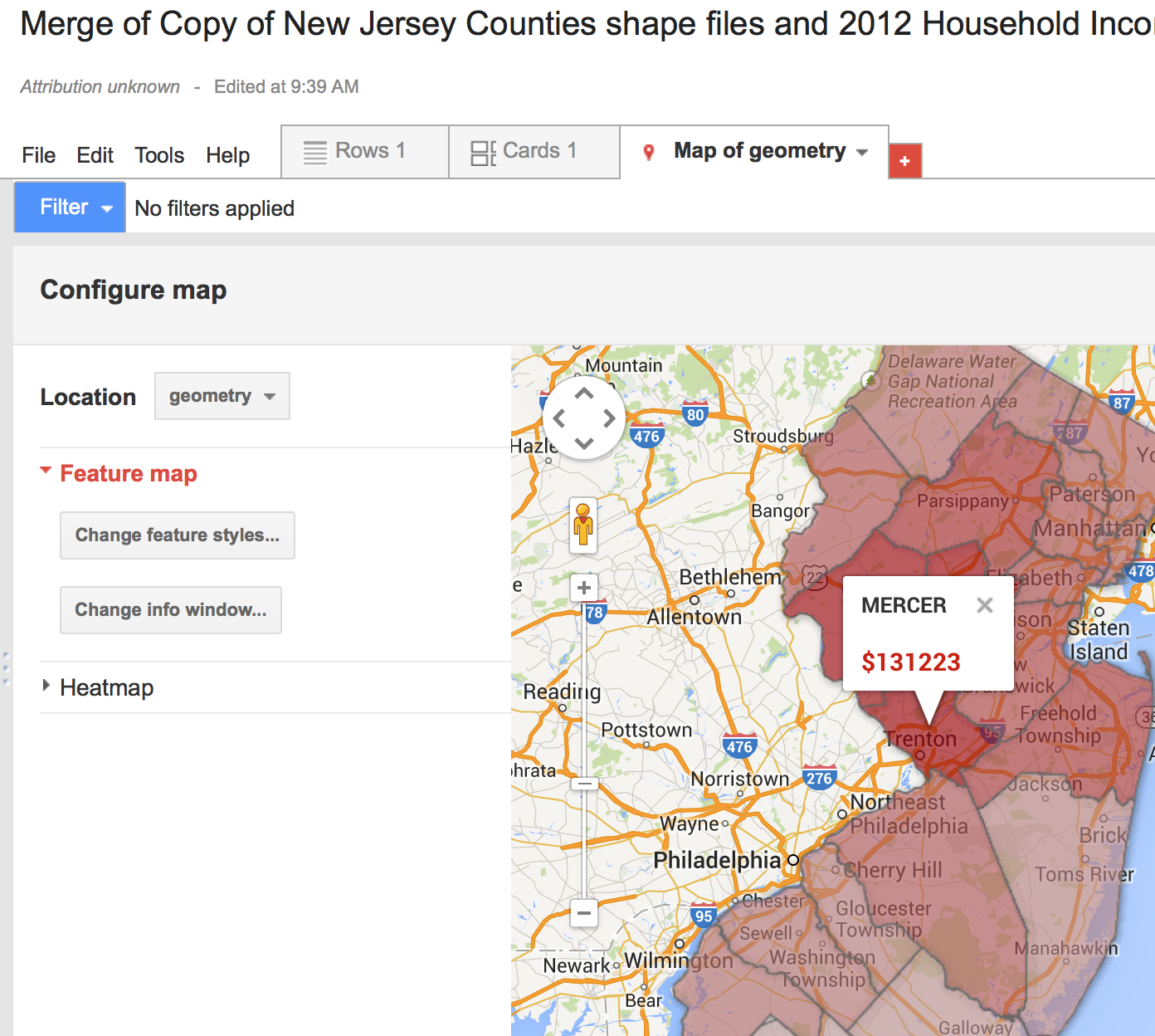
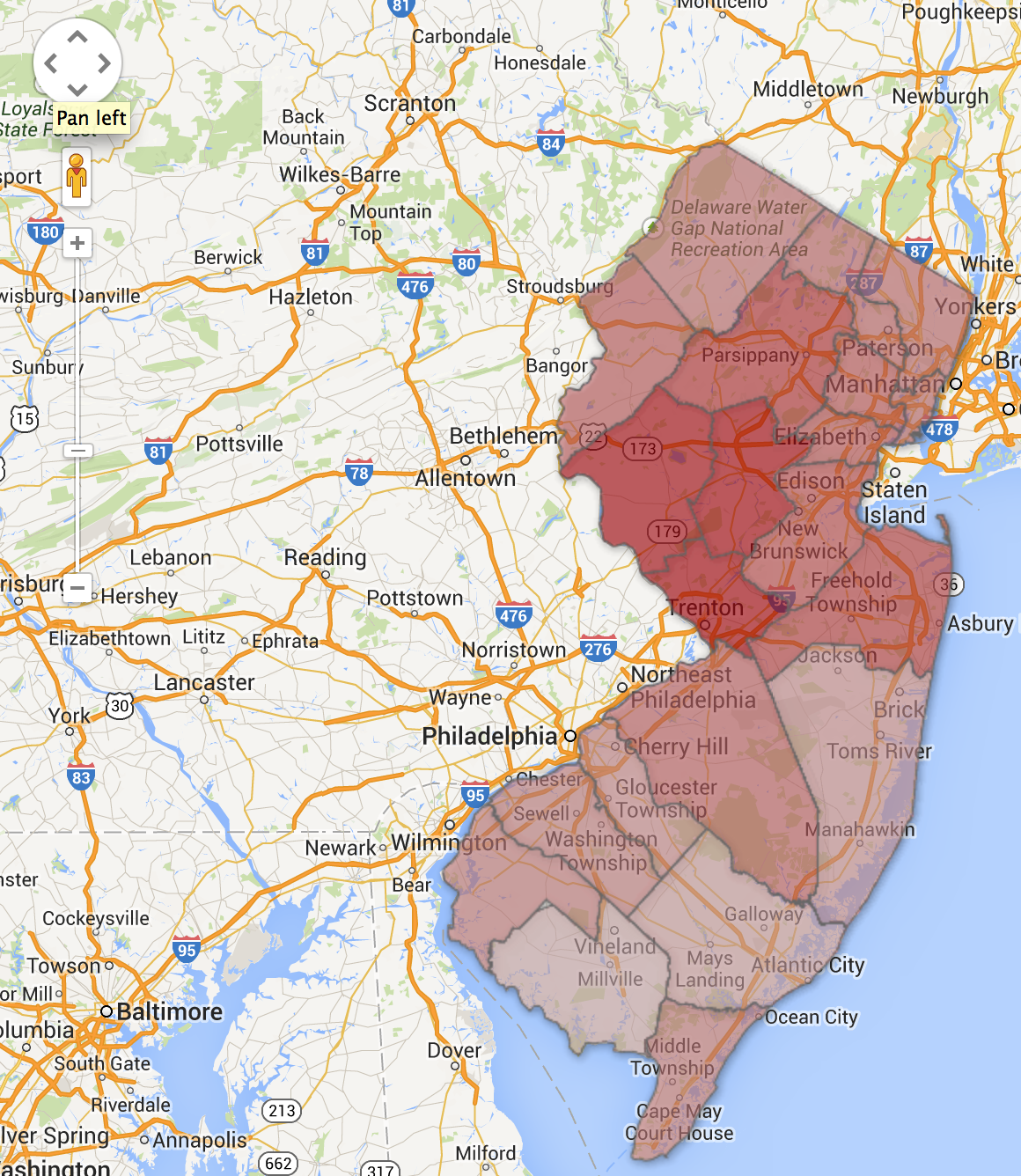
This is what we end up with.
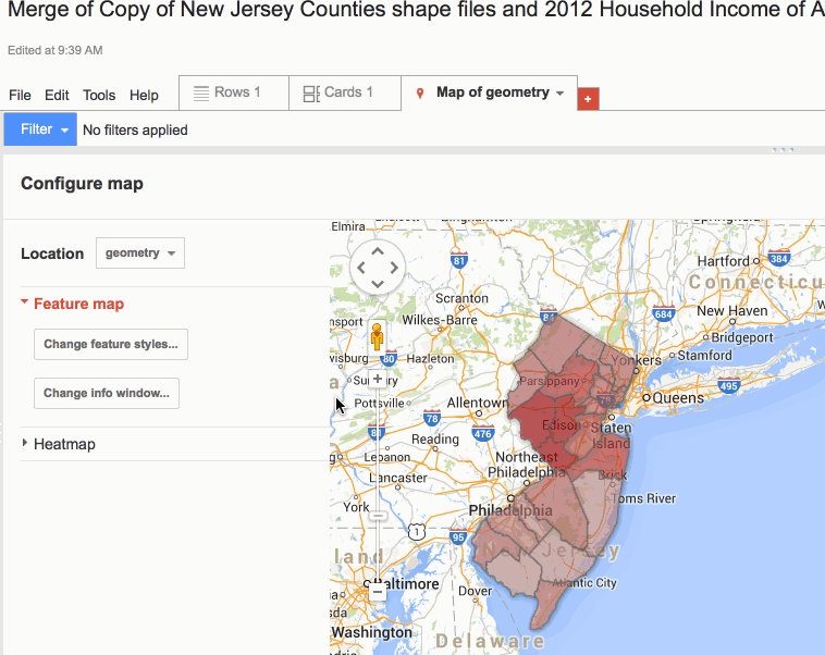
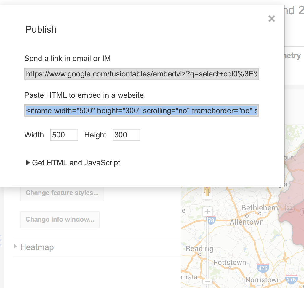
Looks good. Let's publish this sucker.
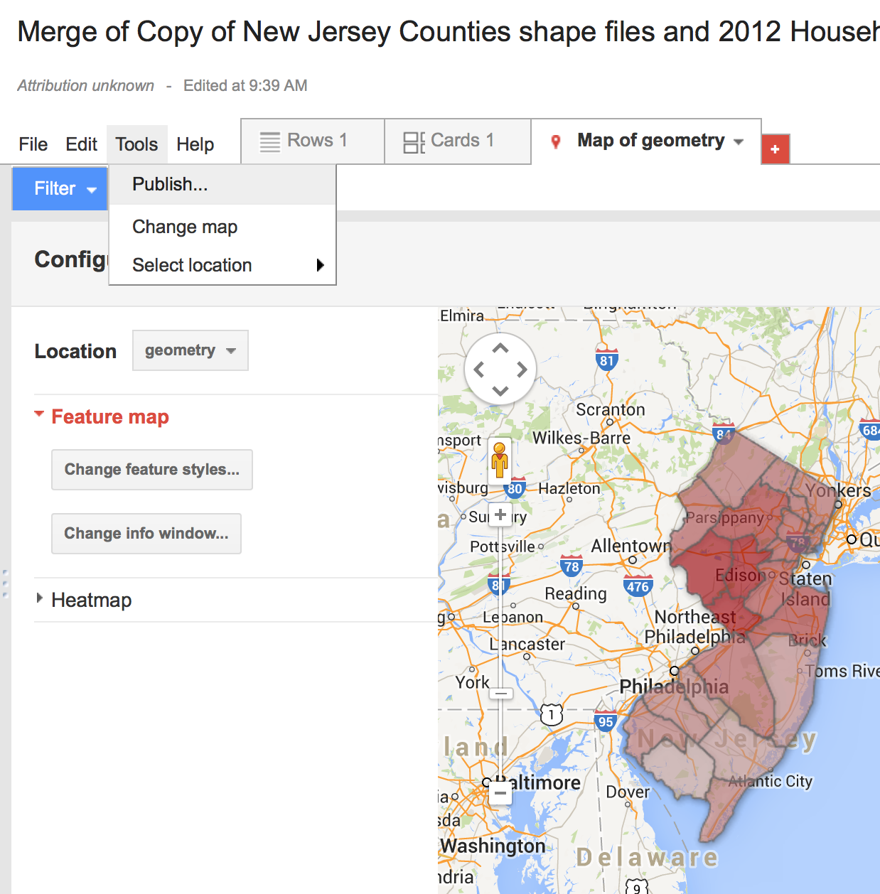
In the "Tools" Menu, click "Publish".
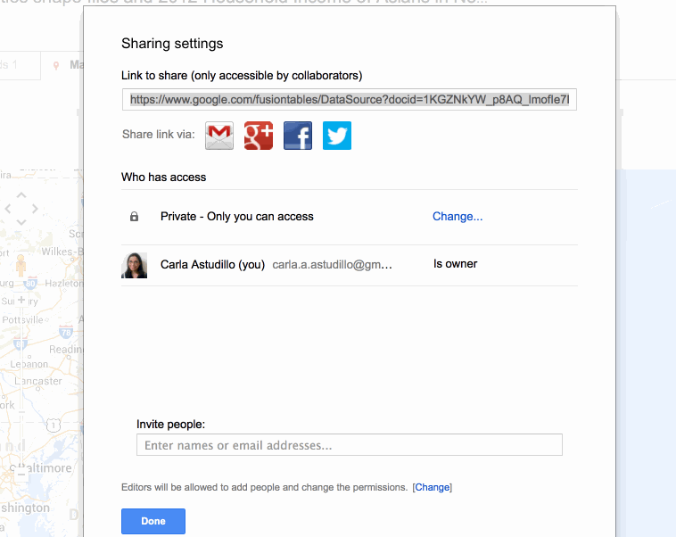
The warning at the top means that our table is private, and it won't be visible to anyone. We need to change it so click on "Change visibility".
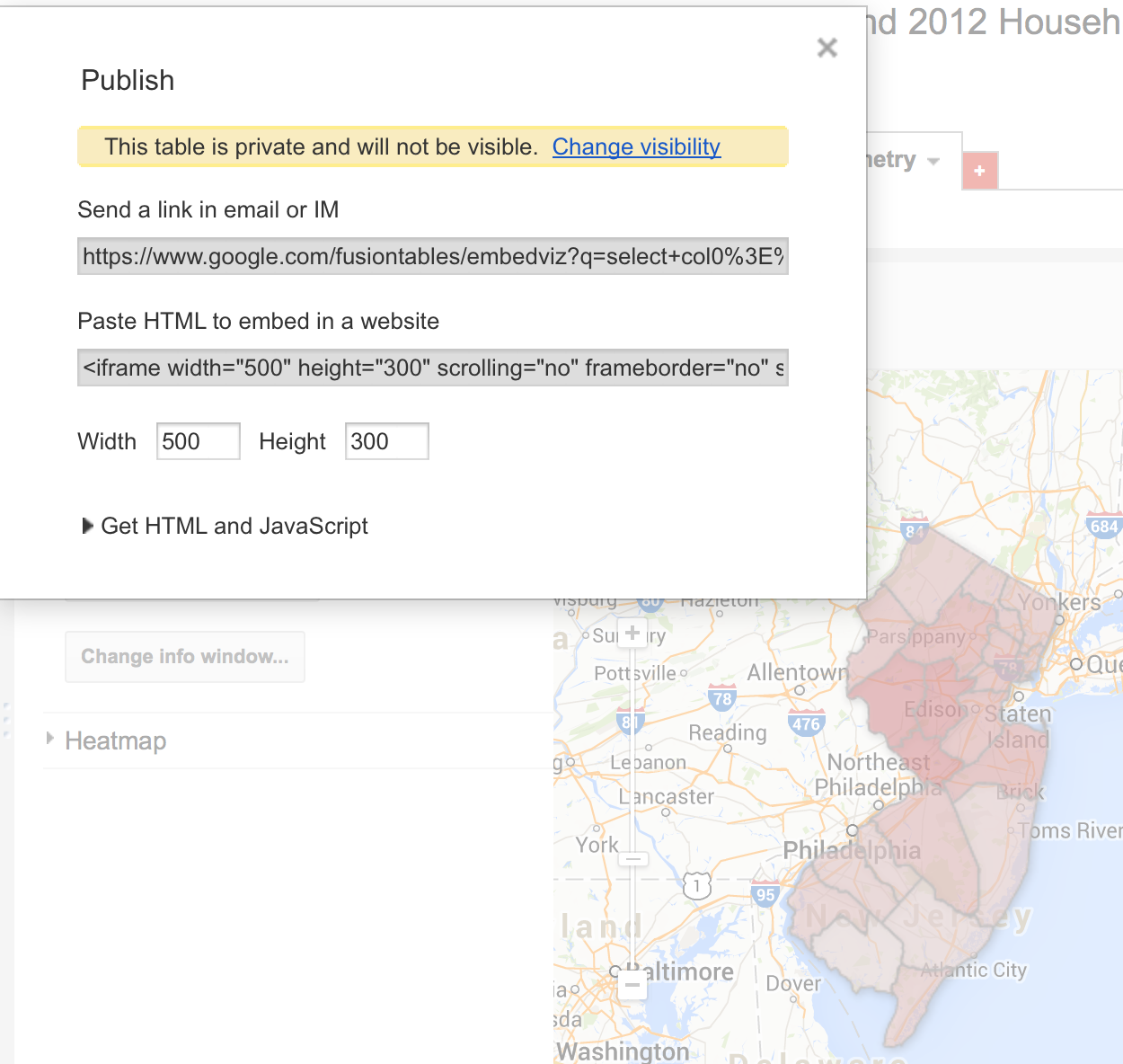
It will then take you to this menu where you can click "Change..." under "Who has Access" and change it to "Public on the web". Click "Save" and then "Done".
Now that it's visible to everyone. Let's try that again. Click "Tools" then "Publish".
We have two choices. The "Send a Link in email..." shows you a full page view of your map.
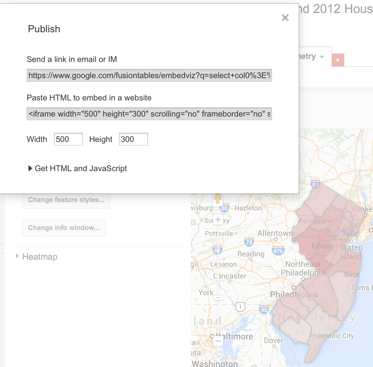
Like this! It's perfect to send to editors to show your work.
However, if we want to embed the map in a blog post or in our CMS, we need to copy the iframe code highlighted here. We can even change the width and height below, and it will automatically change it.
Paste it into your blog or CMS post. And voila!
WE DID IT!
Everybody dance now!